Measured entry
8bitcn-character-sheet
A pixel-art RPG profile card delivered as a shadcn registry block. It renders identity, resource meters, attributes, secondary stats, equipment, and custom sections from React props. It brings themed Card, Badge, Avatar, Progress, and Separator pieces, uses Tailwind utilities and Radix primitives, and imports a retro stylesheet with a hosted font.
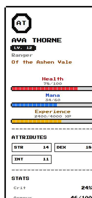
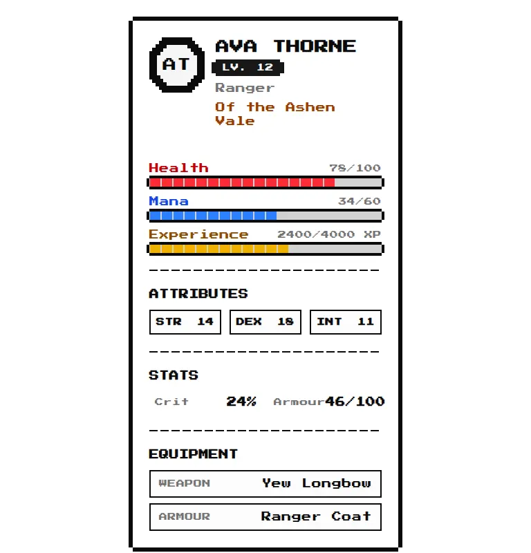
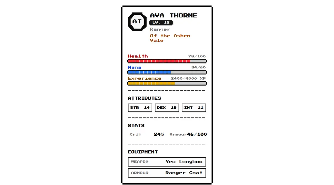
Measured
Every value below was written by the harness on the run that produced the frames above. None of it is derived from the prose.
| Build | OK |
|---|---|
| Mount | OK |
| Console errors | 0 |
| Uncaught page errors | 0 |
| Horizontal overflow | flagged at 375 |
| Axe critical | 0 |
| Axe serious | 1 |
| Axe moderate | 0 |
| Axe minor | 0 |
| Gzip marginal | 37.8 KB (103.3 KB build, 65.5 KB baseline) |
| Bare mode | FAIL |
| Provider required | NO |
| Demo used | written from the component source API |
What the harness recorded
BARE BUILD
✗ Build failed in 930ms
error during build:
[vite]: Rollup failed to resolve import "class-variance-authority" from "<sandbox>re-23e768b7b090/src/cut/components/ui/8bit/blocks/character-sheet.tsx".
Verdict
A focused, usable character summary that builds and mounts without a provider, with flexible section controls and a convincing retro treatment. Adopt it only if you can fix the unnamed progress meters and tune the narrow layout, where the current presentation overflows.
Use it if
- You are building an RPG profile, companion panel, or game-themed account summary with health, mana, experience, attributes, and equipment.
- Your interface already embraces a pixel-art visual language and can accommodate the supplied retro font and heavy borders.
- You want optional sections and custom React content without adding a context provider.
Skip it if
- You need a narrow mobile layout that never clips or scrolls horizontally without component-level adjustments.
- You require accessible resource meters out of the box, since the progress bars lack accessible names.
- You need a neutral or compact stats card that should inherit an unrelated product style with minimal restyling.
- You expect equipment rarity to change the presentation, since rarity is accepted as data but is not rendered.
Install
| Declared dependencies | radix-ui, @radix-ui/react-progress, @radix-ui/react-separator, clsx, tailwind-merge |
|---|---|
| Missing on install | none |
| Bare install | fails once the shadcn-style helpers are removed, so it needs that setup |
| Provider | no provider required in the harness |
For a non-shadcn project, add Tailwind with compatible theme tokens, the path alias and class-merging helper, base Card and Badge primitives, the required Radix primitives, class variance utilities, clsx, and tailwind-merge. Copy the supplied themed components and retro stylesheet, and decide whether its externally hosted font fits your loading and privacy policy.
Source and credit
This page is a review, not a copy. The component source lives with its author and this site does not republish it. Read the license before you use anything.
Author repository
github.com/TheOrcDev/8bitcn-uiAlternatives
Other published entries for the stats pattern, ordered by what they measured: mounts first, then clean axe scans, then bare-mode passes, then the smaller bundle.
- hyperui-stats-1unclassified
- Renders
- YES
- A11y
- 0
- Gzip
- 3.4KB
- Bare
- pass
- Prov
- NO
- hyperui-app-stats-4editorial
- Renders
- YES
- A11y
- 0
- Gzip
- 17.5KB
- Bare
- pass
- Prov
- NO
- tailark-mist-stats-2minimal-flat
- Renders
- YES
- A11y
- 0
- Gzip
- 17.6KB
- Bare
- pass
- Prov
- NO
- tailark-mist-stats-4minimal-flat
- Renders
- YES
- A11y
- 0
- Gzip
- 17.6KB
- Bare
- pass
- Prov
- NO
- tailark-veil-stats-1minimal-flat
- Renders
- YES
- A11y
- 0
- Gzip
- 17.6KB
- Bare
- pass
- Prov
- NO
- hyperui-stats-2editorial
- Renders
- YES
- A11y
- 0
- Gzip
- 17.8KB
- Bare
- pass
- Prov
- NO