Measured entry
clay-search-input
inputclaymorphismfirst party
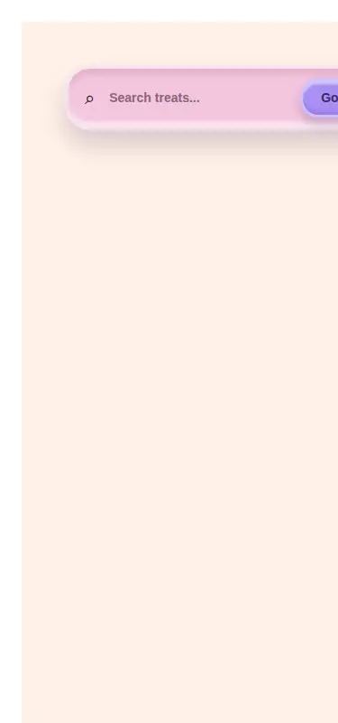
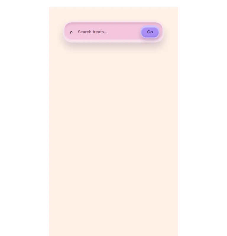
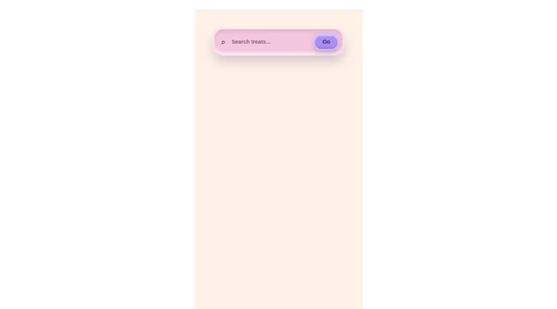
A single-file React search form with a claymorphism treatment, a hidden text label, a query field, and a submit button. It ships as a default-exported component, returns the entered query through an optional callback, and relies on Tailwind utility classes, including arbitrary values, for all styling. It needs no icon or provider package.
Measured
Every value below was written by the harness on the run that produced the frames above. None of it is derived from the prose.
| Build | OK |
|---|---|
| Mount | OK |
| Console errors | 0 |
| Uncaught page errors | 0 |
| Horizontal overflow | flagged at 375 |
| Axe critical | 0 |
| Axe serious | 0 |
| Axe moderate | 0 |
| Axe minor | 0 |
| Gzip marginal | 18.3 KB (83.7 KB build, 65.4 KB baseline) |
| Bare mode | OK |
| Provider required | NO |
| Demo used | written from the component source API |
Verdict
A sound, dependency-light choice for a deliberately playful search form, with clean submission behavior and no detected accessibility violations. Use it after addressing the narrow-screen overflow and make the input identifier configurable if the form can appear more than once.
Use it if
- You want a playful, self-contained search control for a pastel or clay-styled interface.
- Your React project already processes Tailwind utility classes and arbitrary values.
- You want submission handled locally through a callback instead of a search library or form provider.
Skip it if
- The search bar must fit narrow mobile layouts without adapting its button or spacing.
- You need several instances on one page, since the fixed input identifier would be duplicated.
- Your design system cannot accept hard-coded colors, shadows, borders, and corner treatments.
- You need built-in loading, clearing, suggestions, validation, or asynchronous search states.
Install
| Declared dependencies | none declared |
|---|---|
| Missing on install | none |
| Bare install | builds and mounts without the shadcn-style helpers |
| Provider | no provider required in the harness |
First-party component from the sir-originals set. In a non-shadcn project, add React and a Tailwind CSS pipeline that scans this component and supports arbitrary utility values. Include Tailwind's screen-reader-only utility, then copy the component and wire its submission callback. No provider or icon package is required.
Source and credit
This page is a review, not a copy. The component source lives with its author and this site does not republish it. Read the license before you use anything.
Author repository
mrkeyoor/sir-originalsAlternatives
Other published entries for the input pattern, ordered by what they measured: mounts first, then clean axe scans, then bare-mode passes, then the smaller bundle.
- clay-inputclaymorphism
- Renders
- YES
- A11y
- 0
- Gzip
- 17.9KB
- Bare
- pass
- Prov
- NO
- neu-search-inputneumorphism
- Renders
- YES
- A11y
- 0
- Gzip
- 18.1KB
- Bare
- pass
- Prov
- NO
- originui-comp-33minimal-flat
- Renders
- YES
- A11y
- 0
- Gzip
- 20.7KB
- Bare
- pass
- Prov
- NO
- hextaui-labelminimal-flat
- Renders
- YES
- A11y
- 0
- Gzip
- 31.3KB
- Bare
- pass
- Prov
- NO
- ruixen-circular-stepper-inputliquid-glass
- Renders
- YES
- A11y
- 0
- Gzip
- 61.1KB
- Bare
- pass
- Prov
- NO
- ruixen-floating-toolbargradient-glow
- Renders
- YES
- A11y
- 0
- Gzip
- 61.3KB
- Bare
- pass
- Prov
- NO