Measured entry
cultui-bg-animated-fractal-dot-grid
background-effectdark-futuristicmotion on file
A client-side React background that draws a responsive dot field on canvas, bends it around the pointer, and layers optional glow and SVG noise over a fade-in wrapper. It ships as a shadcn registry component, depends on Motion, Tailwind-style utility classes, and browser animation and canvas APIs.
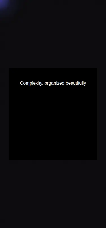
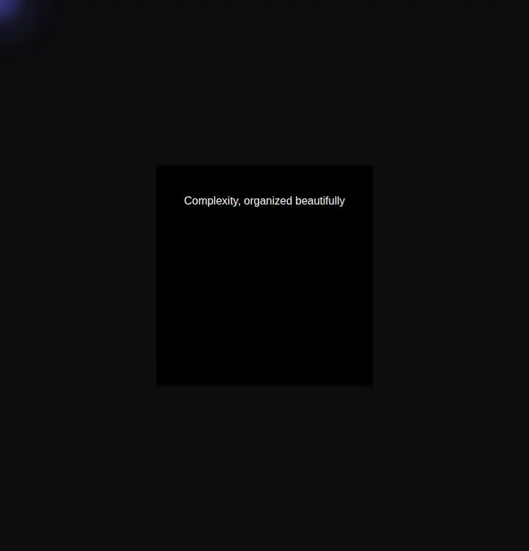
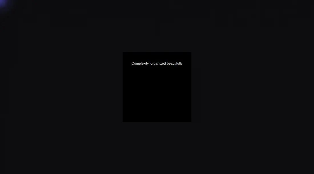
Measured
Every value below was written by the harness on the run that produced the frames above. None of it is derived from the prose.
| Build | OK |
|---|---|
| Mount | OK |
| Console errors | 0 |
| Uncaught page errors | 0 |
| Horizontal overflow | clean at 375, 768, 1440 |
| Axe critical | 0 |
| Axe serious | 0 |
| Axe moderate | 0 |
| Axe minor | 0 |
| Gzip marginal | 61.3 KB (126.7 KB build, 65.4 KB baseline) |
| Bare mode | OK |
| Provider required | NO |
| Demo used | written from the component source API |
Verdict
A credible choice for an interactive hero backdrop: it builds and mounts cleanly, adapts its drawing density, and exposes useful visual controls. Adopt it with care around motion preferences and container sizing; the viewport-sized canvas and perpetual animation make it less suitable as a casual accent.
Use it if
- You need an interactive full-bleed backdrop for a hero or landing-page section.
- Your design benefits from configurable dot color, density, glow, noise, and wave behavior.
- You can place it inside a positioned container and keep foreground content in a separate layer.
Skip it if
- You need a static or reduced-motion-first background, since the source does not honor the user's motion preference.
- You want a lightweight decorative texture without a continuous canvas loop and pointer tracking.
- You need the effect tightly scoped to a small card, since its canvas is sized from the browser viewport.
- You expect children passed to the component to render, because this implementation ignores them.
Install
| Declared dependencies | motion |
|---|---|
| Missing on install | none |
| Bare install | builds and mounts without the shadcn-style helpers |
| Provider | no provider required in the harness |
In a non-shadcn React project, add Motion and place the file in a client-rendered part of the app. Provide Tailwind or replace its utility classes with equivalent positioning, sizing, overflow, background, and pointer-event CSS. Give the parent a positioned box with an explicit size, and layer content above the background.
Source and credit
This page is a review, not a copy. The component source lives with its author and this site does not republish it. Read the license before you use anything.
Author repository
github.com/nolly-studio/cult-uiAlternatives
Other published entries for the background-effect pattern, ordered by what they measured: mounts first, then clean axe scans, then bare-mode passes, then the smaller bundle.
- ruixen-loading-circlegradient-glow
- Renders
- YES
- A11y
- 0
- Gzip
- 17.7KB
- Bare
- pass
- Prov
- NO
- eldora-hacker-backgrounddark-futuristic
- Renders
- YES
- A11y
- 0
- Gzip
- 17.8KB
- Bare
- pass
- Prov
- NO
- ruixen-ripple-circlesgradient-glow
- Renders
- YES
- A11y
- 0
- Gzip
- 17.9KB
- Bare
- pass
- Prov
- NO
- ruixen-dual-tone-rain-backgroundunclassified
- Renders
- YES
- A11y
- 0
- Gzip
- 18.4KB
- Bare
- pass
- Prov
- NO
- cultui-lightboardliquid-glass
- Renders
- YES
- A11y
- 0
- Gzip
- 19.6KB
- Bare
- pass
- Prov
- NO
- ruixen-mouse-sparkunclassified
- Renders
- YES
- A11y
- 0
- Gzip
- 20.6KB
- Bare
- pass
- Prov
- NO