Measured entry
cultui-bg-animated-gradient
background-effectaurora-meshmotion on file
A client-side React background layer that animates between radial-gradient definitions. It ships as a shadcn registry TypeScript component, renders an absolutely positioned Motion div, and depends on the motion package plus utility classes for sizing and placement.
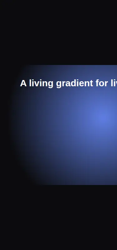
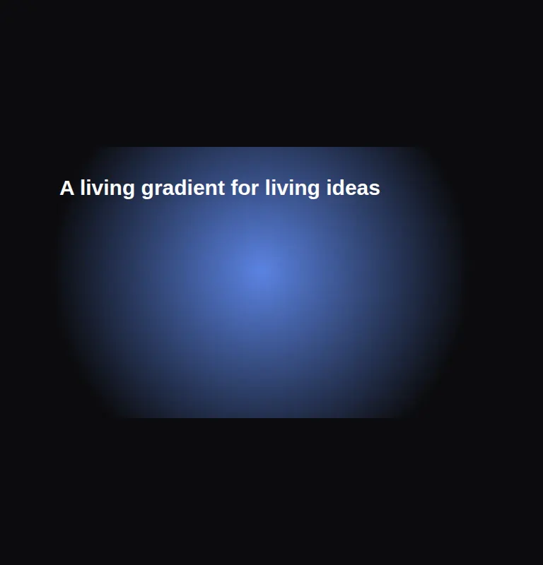
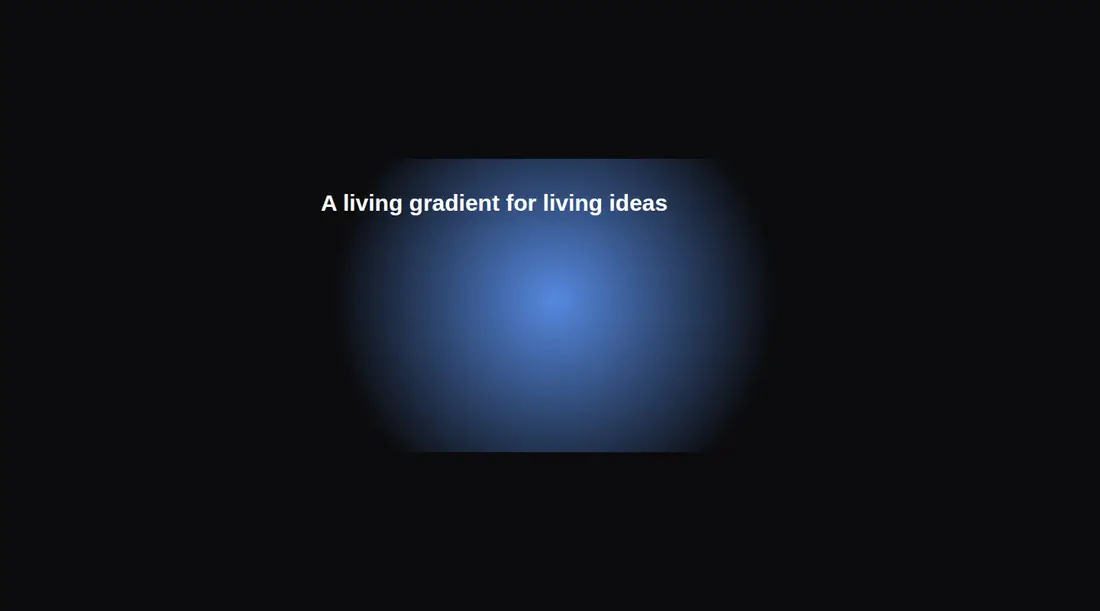
Measured
Every value below was written by the harness on the run that produced the frames above. None of it is derived from the prose.
| Build | OK |
|---|---|
| Mount | OK |
| Console errors | 0 |
| Uncaught page errors | 0 |
| Horizontal overflow | flagged at 375 |
| Axe critical | 0 |
| Axe serious | 0 |
| Axe moderate | 0 |
| Axe minor | 0 |
| Gzip marginal | 58.6 KB (124.0 KB build, 65.4 KB baseline) |
| Bare mode | OK |
| Provider required | NO |
| Demo used | written from the component source API |
Verdict
A focused, working decorative background with a small API and no provider requirement. It is a sensible fit when Motion is already present, but the missing reduced-motion handling and narrow-screen demo overflow deserve fixes before production use.
Use it if
- You need a configurable ambient gradient behind hero or feature content.
- Your React app already uses Motion and can supply gradient stops and animation timing.
- You can place it inside a positioned, clipped container with foreground content layered above it.
Skip it if
- You need reduced-motion behavior without modifying the component.
- You want a CSS-only background and do not want to add Motion for a decorative effect.
- Your layout cannot guarantee a positioned parent with explicit dimensions and clipping.
- You need the supplied fixed-width demo to fit narrow screens without responsive changes.
Install
| Declared dependencies | motion |
|---|---|
| Missing on install | none |
| Bare install | builds and mounts without the shadcn-style helpers |
| Provider | no provider required in the harness |
Install the motion package, copy the client component, and ensure your build supports the utility classes it uses or replace them with equivalent CSS. Render it inside a relatively positioned container with defined dimensions and hidden overflow, then layer content above it.
Source and credit
This page is a review, not a copy. The component source lives with its author and this site does not republish it. Read the license before you use anything.
Author repository
github.com/nolly-studio/cult-uiAlternatives
Other published entries for the background-effect pattern, ordered by what they measured: mounts first, then clean axe scans, then bare-mode passes, then the smaller bundle.
- ruixen-loading-circlegradient-glow
- Renders
- YES
- A11y
- 0
- Gzip
- 17.7KB
- Bare
- pass
- Prov
- NO
- eldora-hacker-backgrounddark-futuristic
- Renders
- YES
- A11y
- 0
- Gzip
- 17.8KB
- Bare
- pass
- Prov
- NO
- ruixen-ripple-circlesgradient-glow
- Renders
- YES
- A11y
- 0
- Gzip
- 17.9KB
- Bare
- pass
- Prov
- NO
- ruixen-dual-tone-rain-backgroundunclassified
- Renders
- YES
- A11y
- 0
- Gzip
- 18.4KB
- Bare
- pass
- Prov
- NO
- cultui-lightboardliquid-glass
- Renders
- YES
- A11y
- 0
- Gzip
- 19.6KB
- Bare
- pass
- Prov
- NO
- ruixen-mouse-sparkunclassified
- Renders
- YES
- A11y
- 0
- Gzip
- 20.6KB
- Bare
- pass
- Prov
- NO