Measured entry
cultui-text-animate
text-effectspatialmotion on file
A client-side React heading that splits supplied text into animated characters and offers several reveal styles. It ships as copy-in source through a shadcn registry item, uses Motion for animation, and relies on Tailwind utility classes for its default spacing, typography, color, and responsive styling.
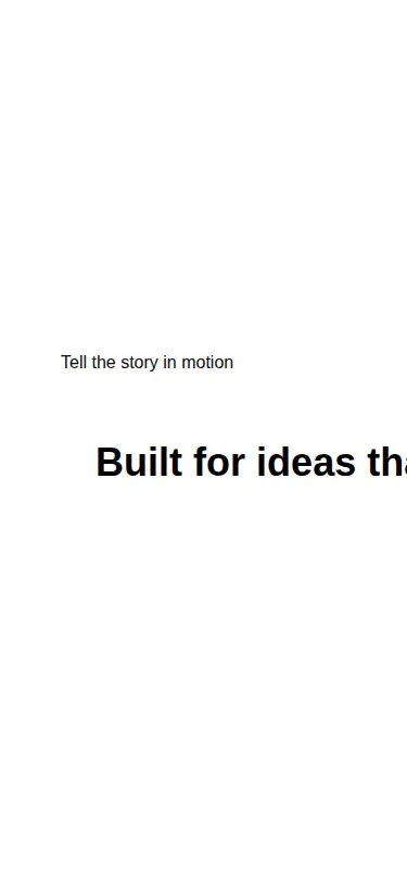
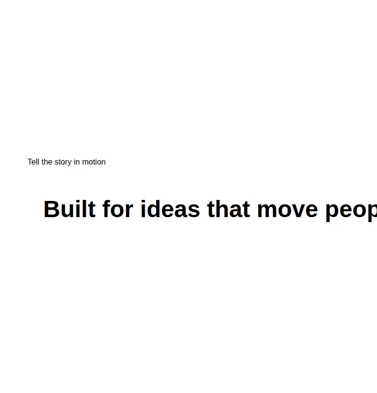
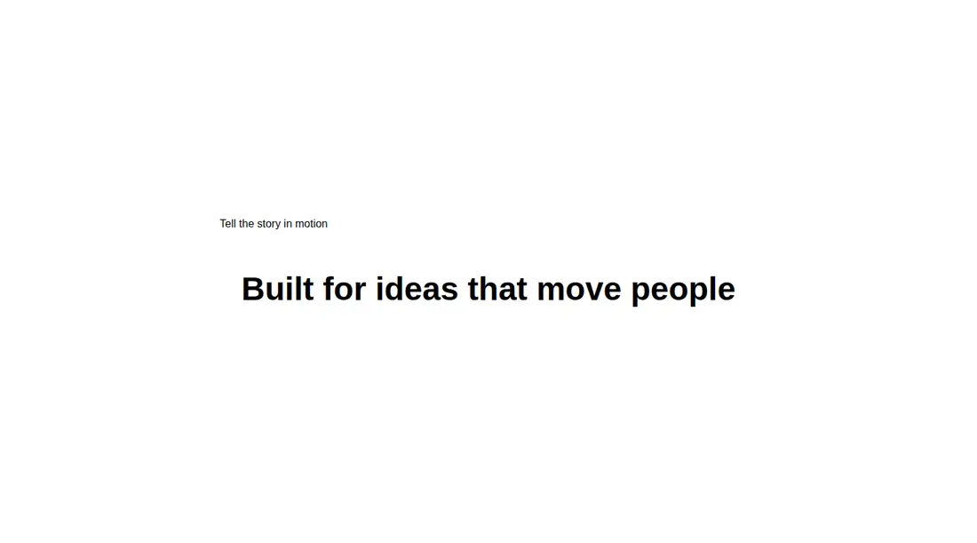
Measured
Every value below was written by the harness on the run that produced the frames above. None of it is derived from the prose.
| Build | OK |
|---|---|
| Mount | OK |
| Console errors | 0 |
| Uncaught page errors | 0 |
| Horizontal overflow | flagged at 375, 768 |
| Axe critical | 0 |
| Axe serious | 0 |
| Axe moderate | 0 |
| Axe minor | 0 |
| Gzip marginal | 59.1 KB (124.5 KB build, 65.4 KB baseline) |
| Bare mode | OK |
| Provider required | NO |
| Demo used | written from the component source API |
Verdict
A workable effect for short, controlled display copy: it builds and mounts cleanly, but the tested text clips on narrower layouts and Motion adds meaningful weight. Adopt it only with responsive wrapping, reduced-motion handling, and accessible treatment for the modes that hide their words.
Use it if
- You need a short hero or campaign heading with a character-by-character entrance.
- Your React app already uses Motion and can absorb another client component.
- You are prepared to tune the copied source to your type scale and layout.
Skip it if
- Your heading must wrap cleanly on narrow screens without source changes.
- You need animation that follows reduced-motion preferences out of the box.
- Bundle weight is tightly constrained and Motion is not already present.
- You plan to use the roll or whip modes without adding an accessible text equivalent.
Install
| Declared dependencies | motion |
|---|---|
| Missing on install | none |
| Bare install | builds and mounts without the shadcn-style helpers |
| Provider | no provider required in the harness |
In a non-shadcn project, copy the component into your source tree, install Motion, and ensure the file runs as a React client component. Add Tailwind with support for the utility syntax used here, or replace every utility class with your own styles.
Source and credit
This page is a review, not a copy. The component source lives with its author and this site does not republish it. Read the license before you use anything.
Author repository
github.com/nolly-studio/cult-uiAlternatives
Other published entries for the text-effect pattern, ordered by what they measured: mounts first, then clean axe scans, then bare-mode passes, then the smaller bundle.
- uilayouts-randomized-text-effectdark-futuristic
- Renders
- YES
- A11y
- 0
- Gzip
- 17.5KB
- Bare
- pass
- Prov
- NO
- uilayouts-randomized-text-unveildark-futuristic
- Renders
- YES
- A11y
- 0
- Gzip
- 17.7KB
- Bare
- pass
- Prov
- NO
- fancy-scramble-indark-futuristic
- Renders
- YES
- A11y
- 0
- Gzip
- 17.8KB
- Bare
- pass
- Prov
- NO
- magicui-aurora-textaurora-mesh
- Renders
- YES
- A11y
- 0
- Gzip
- 20.7KB
- Bare
- pass
- Prov
- NO
- magicui-highlighterskeuomorphism
- Renders
- YES
- A11y
- 0
- Gzip
- 24.8KB
- Bare
- pass
- Prov
- NO
- fancy-text-along-pathspatial
- Renders
- YES
- A11y
- 0
- Gzip
- 25.7KB
- Bare
- pass
- Prov
- NO