Measured entry
efferd-cta-4
A static call-to-action card shipped as a shadcn registry block, despite its contact-form label. It combines a short trial pitch with sales and signup buttons. The source relies on the shadcn Button primitive, its Radix-backed setup, Lucide icons, Tailwind utilities, and theme color tokens.
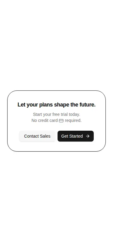
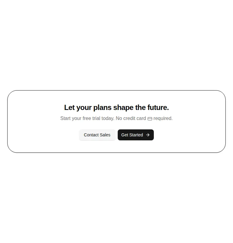
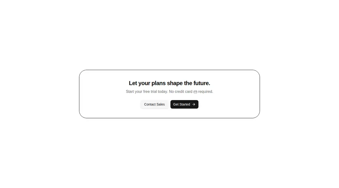
Measured
Every value below was written by the harness on the run that produced the frames above. None of it is derived from the prose.
| Build | OK |
|---|---|
| Mount | OK |
| Console errors | 0 |
| Uncaught page errors | 0 |
| Horizontal overflow | clean at 375, 768, 1440 |
| Axe critical | 0 |
| Axe serious | 0 |
| Axe moderate | 0 |
| Axe minor | 0 |
| Gzip marginal | 32.3 KB (97.7 KB build, 65.4 KB baseline) |
| Bare mode | FAIL |
| Provider required | NO |
| Demo used | written from the component source API |
What the harness recorded
BARE BUILD
✗ Build failed in 1m 43s
error during build:
[vite:load-fallback] Could not load <sandbox>/src/lib/utils (imported by src/components/ui/button.tsx): ENOENT: no such file or directory, open '<sandbox>/src/lib/utils'
Verdict
A clean, reliable two-action CTA with sound responsive behavior and no observed accessibility issues. The queue label is misleading because this is not a form, and it needs a shadcn-style setup to mount. Best for teams already using that stack and willing to replace the placeholder copy and actions.
Use it if
- You need a restrained trial or sales CTA with two clear next actions.
- Your app already uses shadcn components, Tailwind theme tokens, and Lucide icons.
- You want a responsive card that can drop into a landing page without a provider.
Skip it if
- You need an actual contact form with fields, validation, or submission handling.
- Your design system does not use shadcn primitives or Tailwind utility classes.
- You need richer proof, pricing context, or product imagery inside the CTA.
- You want working navigation before adding destinations and click behavior yourself.
Install
| Declared dependencies | radix-ui |
|---|---|
| Missing on install | none |
| Bare install | fails once the shadcn-style helpers are removed, so it needs that setup |
| Provider | no provider required in the harness |
In a non-shadcn project, add a compatible Button component, the class-name utility it imports, the expected path aliases, Tailwind processing, card and muted theme tokens, and Lucide React icons. Then wire both buttons to real destinations or handlers.
Source and credit
This page is a review, not a copy. The component source lives with its author and this site does not republish it. Read the license before you use anything.
Author repository
github.com/shabanhr/efferd-uiAlternatives
Other published entries for the contact-form pattern, ordered by what they measured: mounts first, then clean axe scans, then bare-mode passes, then the smaller bundle.
- hyperui-contact-forms-1editorial
- Renders
- YES
- A11y
- 0
- Gzip
- 17.4KB
- Bare
- pass
- Prov
- NO
- hyperui-contact-forms-2editorial
- Renders
- YES
- A11y
- 0
- Gzip
- 17.5KB
- Bare
- pass
- Prov
- NO
- hyperui-contact-forms-4editorial
- Renders
- YES
- A11y
- 0
- Gzip
- 17.5KB
- Bare
- pass
- Prov
- NO
- hyperui-contact-forms-3editorial
- Renders
- YES
- A11y
- 0
- Gzip
- 17.6KB
- Bare
- pass
- Prov
- NO
- hyperui-contact-forms-5editorial
- Renders
- YES
- A11y
- 0
- Gzip
- 18.4KB
- Bare
- pass
- Prov
- NO
- efferd-contact-2minimal-flat
- Renders
- YES
- A11y
- 0
- Gzip
- 30.4KB
- Bare
- fail
- Prov
- NO