Measured entry
efferd-logo-cloud-2
A static responsive logo wall that arranges vendor wordmarks in a bordered grid with alternating fills and decorative plus marks. It ships as a shadcn registry block built with React and Tailwind utilities, and depends on Lucide, a cn helper, theme tokens, and remotely hosted SVG assets.
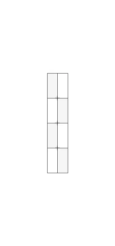
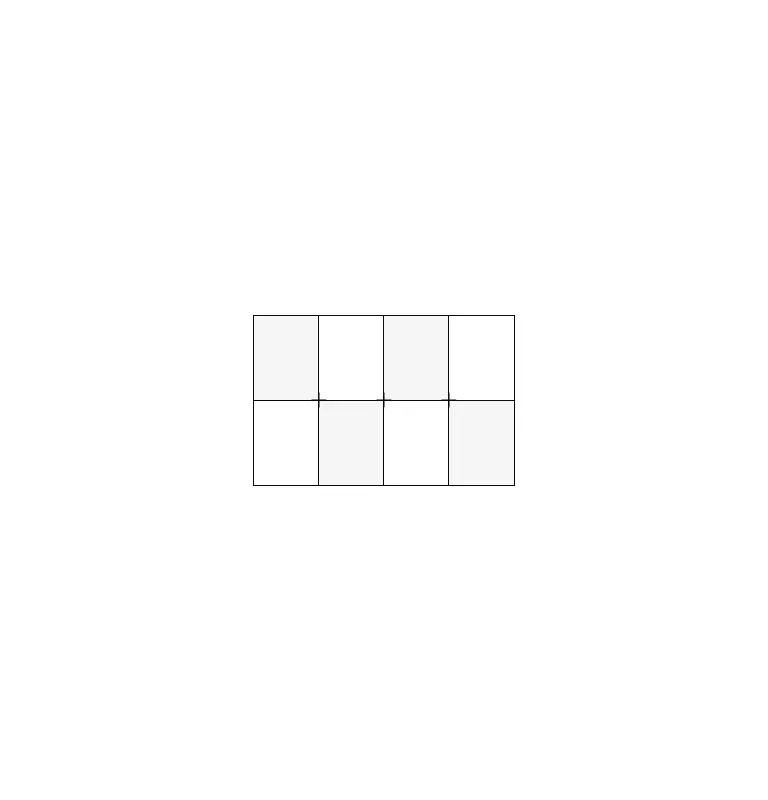
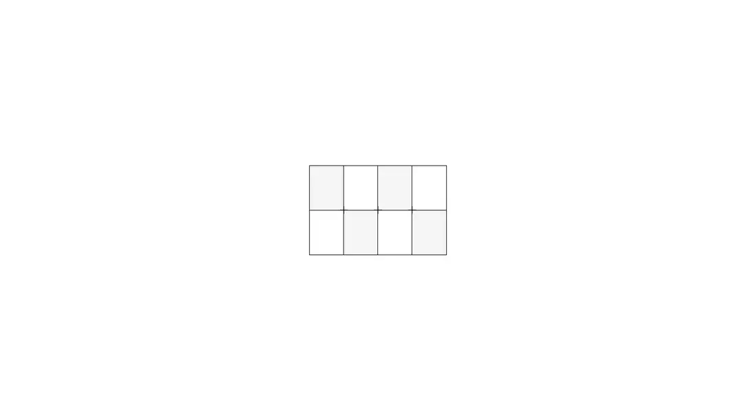
Measured
Every value below was written by the harness on the run that produced the frames above. None of it is derived from the prose.
| Build | OK |
|---|---|
| Mount | OK |
| Console errors | 0 |
| Uncaught page errors | 0 |
| Horizontal overflow | clean at 375, 768, 1440 |
| Axe critical | 0 |
| Axe serious | 0 |
| Axe moderate | 0 |
| Axe minor | 0 |
| Gzip marginal | 30.4 KB (95.8 KB build, 65.4 KB baseline) |
| Bare mode | FAIL |
| Provider required | NO |
| Demo used | written from the component source API |
What the harness recorded
BARE BUILD
✗ Build failed in 1m 32s
error during build:
[vite:load-fallback] Could not load <sandbox>/src/lib/utils (imported by src/cut/logo-cloud/2/logo-cloud.tsx): ENOENT: no such file or directory, open '<sandbox>/src/lib/utils'
Verdict
A tidy, responsive frame with sensible alt text, but the captured render showed empty cells where remote wordmarks should appear. Use it as a layout starter after validating or self-hosting the assets. It needs a shadcn-style setup and does not work in a bare React project as supplied.
Use it if
- You need a compact customer, partner, or technology logo grid that collapses cleanly for narrow screens.
- Your project already uses shadcn conventions, Tailwind theme tokens, and the cn utility.
- You are prepared to replace the bundled vendor list and verify each remote wordmark in your color themes.
Skip it if
- Your content security policy blocks third-party SVG hosts or you require all brand assets to be self-hosted.
- You need links, captions, interaction, or richer partner metadata rather than a purely presentational grid.
- You want a drop-in component whose logos remain visible without checking remote asset behavior and theme contrast.
Install
| Declared dependencies | none declared |
|---|---|
| Missing on install | none |
| Bare install | fails once the shadcn-style helpers are removed, so it needs that setup |
| Provider | no provider required in the harness |
In a non-shadcn project, add Lucide React, configure Tailwind with background, secondary, and border theme tokens, provide the aliased cn utility, and allow or self-host the external SVG wordmarks. Also ensure your build resolves the source alias used by the utility import.
Source and credit
This page is a review, not a copy. The component source lives with its author and this site does not republish it. Read the license before you use anything.
Author repository
github.com/shabanhr/efferd-uiAlternatives
Other published entries for the logo-wall pattern, ordered by what they measured: mounts first, then clean axe scans, then bare-mode passes, then the smaller bundle.
- hyperui-logo-wall-1editorial
- Renders
- YES
- A11y
- 0
- Gzip
- 22.4KB
- Bare
- pass
- Prov
- NO
- hyperui-logo-wall-2editorial
- Renders
- YES
- A11y
- 0
- Gzip
- 22.7KB
- Bare
- pass
- Prov
- NO
- hyperui-logo-wall-3editorial
- Renders
- YES
- A11y
- 0
- Gzip
- 22.8KB
- Bare
- pass
- Prov
- NO
- meraki-logo-wall-trusted-byminimal-flat
- Renders
- YES
- A11y
- 0
- Gzip
- 25.1KB
- Bare
- pass
- Prov
- NO
- tailark-mist-logo-cloud-1minimal-flat
- Renders
- YES
- A11y
- 0
- Gzip
- 27.1KB
- Bare
- pass
- Prov
- NO
- tailark-mist-logo-cloud-2minimal-flat
- Renders
- YES
- A11y
- 0
- Gzip
- 27.1KB
- Bare
- pass
- Prov
- NO