Measured entry
hextaui-ai-prompt-input
A client-side React prompt composer with context chips, model and agent selectors, search and thinking toggles, attachment and voice controls. It ships as a shadcn registry TSX block and depends on React, Next Image, Lucide icons, Tailwind utilities, shadcn UI primitives, and their Radix packages.
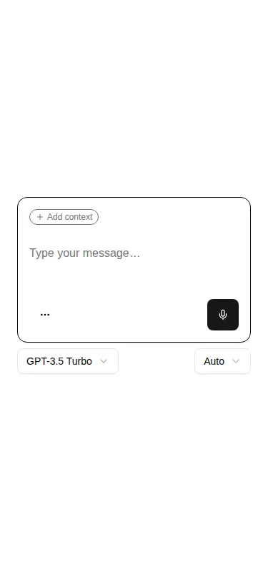
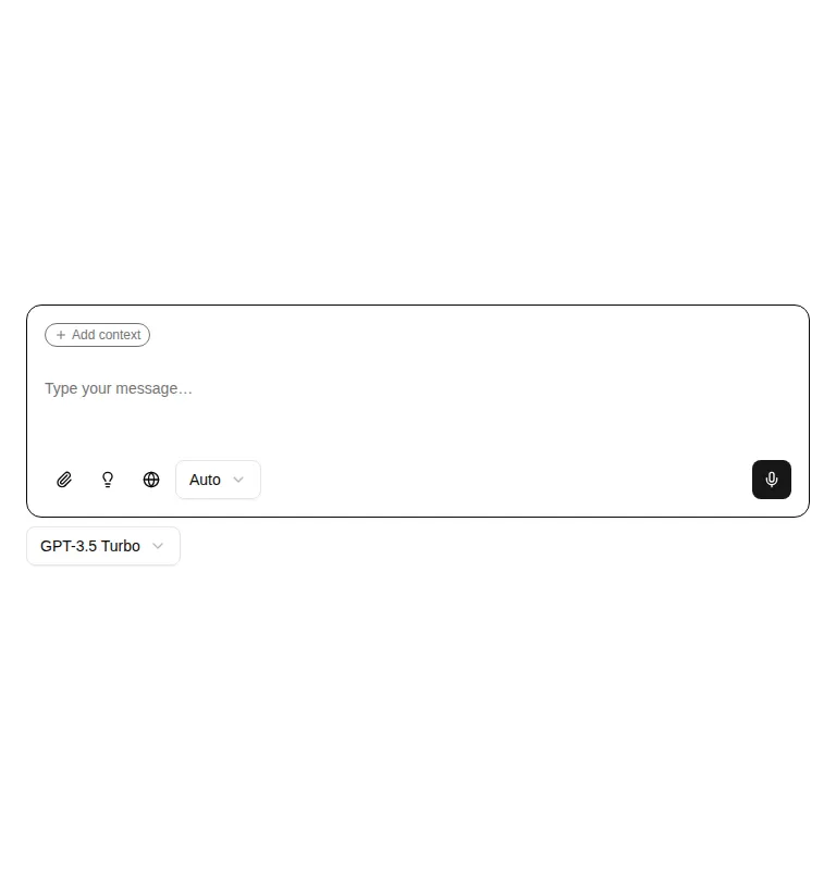
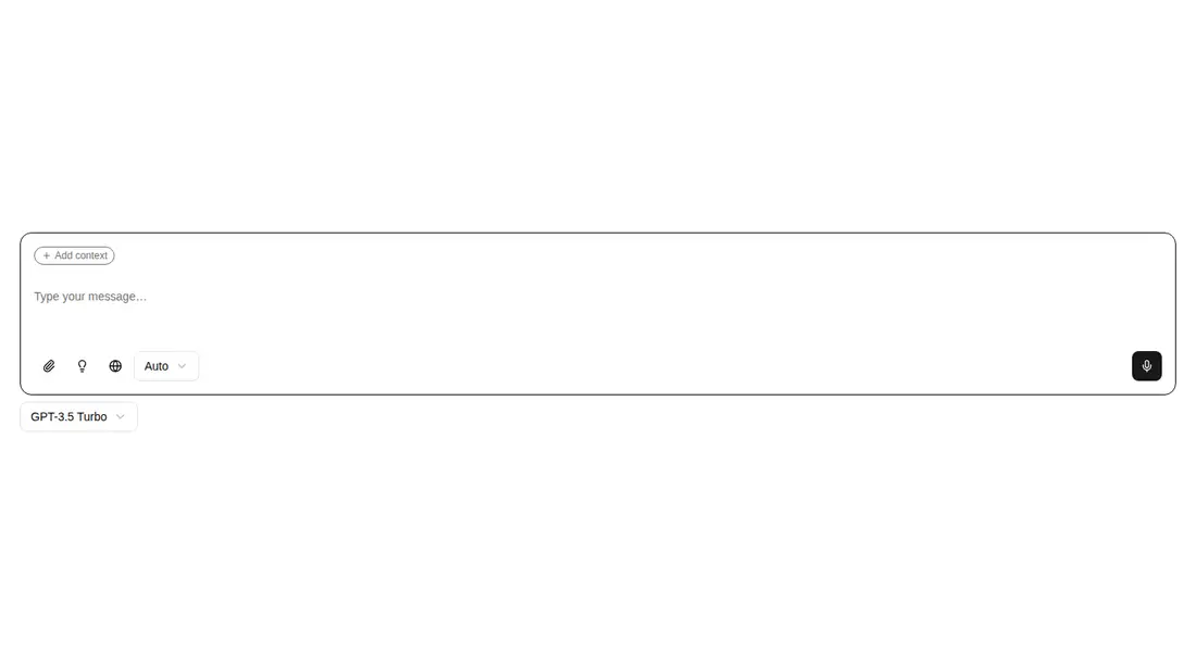
Measured
Every value below was written by the harness on the run that produced the frames above. None of it is derived from the prose.
| Build | OK |
|---|---|
| Mount | OK |
| Console errors | 0 |
| Uncaught page errors | 0 |
| Horizontal overflow | clean at 375, 768, 1440 |
| Axe critical | 1 |
| Axe serious | 1 |
| Axe moderate | 0 |
| Axe minor | 0 |
| Gzip marginal | 79.1 KB (144.5 KB build, 65.4 KB baseline) |
| Bare mode | FAIL |
| Provider required | NO |
| Demo used | written from the component source API |
What the harness recorded
BARE BUILD
✗ Build failed in 2m 1s
error during build:
[vite:load-fallback] Could not load <sandbox>/src/lib/utils (imported by src/components/ui/dropdown-menu.tsx): ENOENT: no such file or directory, open '<sandbox>/src/lib/utils'
Verdict
A credible starting shell for a full AI composer, with responsive layout and useful interaction states. It needs a shadcn-style setup, real service wiring, and accessibility repairs before production, so it fits teams seeking a customizable scaffold rather than a finished input.
Use it if
- You need a feature-rich AI chat composer and are prepared to connect its placeholder actions to real services.
- Your app already uses Next.js, Tailwind, shadcn conventions, and the required UI primitives.
- You want context selection, model choice, and responsive action menus in one adaptable starting point.
Skip it if
- You need an accessible production control without first fixing the unnamed button and invalid ARIA usage found by the audit.
- You need working upload, voice, or message delivery out of the box; the source leaves these as mock or console-only behavior.
- You use a non-Next React stack and do not want to replace the Next Image dependency.
- You want a lean text composer without the added menu, popover, select, toggle, tooltip, and icon dependencies.
Install
| Declared dependencies | @radix-ui/react-slot, @radix-ui/react-dropdown-menu, @radix-ui/react-popover, @radix-ui/react-select, @radix-ui/react-toggle, @radix-ui/react-tooltip |
|---|---|
| Missing on install | none |
| Bare install | fails once the shadcn-style helpers are removed, so it needs that setup |
| Provider | no provider required in the harness |
In a non-shadcn project, add Tailwind and the expected theme tokens, configure the source alias and utility helper, install or recreate the button, card, textarea, dropdown, popover, select, toggle, and tooltip primitives with their Radix dependencies, add Lucide icons, and replace Next Image if the app is not on Next.js.
Source and credit
This page is a review, not a copy. The component source lives with its author and this site does not republish it. Read the license before you use anything.
Author repository
github.com/preetsuthar17/HextaUIAlternatives
Other published entries for the chat pattern, ordered by what they measured: mounts first, then clean axe scans, then bare-mode passes, then the smaller bundle.
- hextaui-alertminimal-flat
- Renders
- YES
- A11y
- 0
- Gzip
- 26.8KB
- Bare
- fail
- Prov
- NO
- kibo-bannerminimal-flat
- Renders
- YES
- A11y
- 0
- Gzip
- 33.0KB
- Bare
- fail
- Prov
- NO
- ruixen-comment-threadunclassified
- Renders
- YES
- A11y
- 0
- Gzip
- 40.2KB
- Bare
- fail
- Prov
- NO
- ruixen-smart-paste-inputunclassified
- Renders
- YES
- A11y
- 0
- Gzip
- 44.4KB
- Bare
- fail
- Prov
- NO
- ruixen-faq-chat-accordionunclassified
- Renders
- YES
- A11y
- 0
- Gzip
- 67.7KB
- Bare
- fail
- Prov
- NO
- ruixen-gradient-chat-inputgradient-glow
- Renders
- YES
- A11y
- 0
- Gzip
- 72.6KB
- Bare
- fail
- Prov
- NO