Measured entry
hextaui-ai-usage-quota
A client-side React status card for token consumption, request limits, reset timing, and an optional upgrade prompt. It ships as shadcn registry source and composes alert, badge, button, card, progress, and tooltip primitives. It depends on Tailwind theme utilities, the cn helper, Radix-backed UI pieces, and Lucide icons.
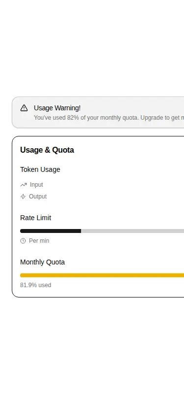
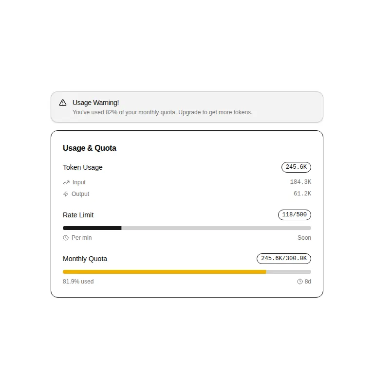
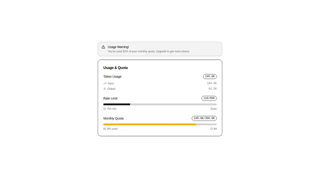
Measured
Every value below was written by the harness on the run that produced the frames above. None of it is derived from the prose.
| Build | OK |
|---|---|
| Mount | OK |
| Console errors | 0 |
| Uncaught page errors | 0 |
| Horizontal overflow | flagged at 375 |
| Axe critical | 0 |
| Axe serious | 1 |
| Axe moderate | 0 |
| Axe minor | 0 |
| Gzip marginal | 55.0 KB (120.5 KB build, 65.5 KB baseline) |
| Bare mode | FAIL |
| Provider required | NO |
| Demo used | written from the component source API |
What the harness recorded
BARE BUILD
✗ Build failed in 1.08s
error during build:
[vite]: Rollup failed to resolve import "lucide-react" from "<sandbox>re-85f97ba7c2dc/src/cut/blocks/ai/ai-usage-quota.tsx".
Verdict
A useful, focused dashboard block for an existing design system, with sensible conditional sections and accessible progress labeling. It needs a shadcn-style setup, and teams should fix the narrow-screen overflow and muted-text contrast before shipping it.
Use it if
- You need one account or billing panel that combines token totals, quota progress, and request limits.
- Your app already uses shadcn conventions and can supply the matching UI primitives and theme tokens.
- You want reset countdowns, warning thresholds, and an optional upgrade action handled inside the component.
Skip it if
- Your usage screen must fit narrow mobile layouts without adapting the component, since the verified view clips content.
- You require an accessibility-clean result without remediation, since the muted text has a contrast violation.
- You want a standalone or dependency-light widget that does not rely on a shadcn component layer and icon package.
Install
| Declared dependencies | @radix-ui/react-slot, @radix-ui/react-progress, @radix-ui/react-tooltip, clsx, tailwind-merge |
|---|---|
| Missing on install | none |
| Bare install | fails once the shadcn-style helpers are removed, so it needs that setup |
| Provider | no provider required in the harness |
In a non-shadcn project, add React client-component support, Tailwind with the expected theme tokens, a cn utility, Lucide React, and equivalent alert, badge, button, card, progress, and tooltip primitives backed by the required Radix packages. Update the source aliases to match your project.
Source and credit
This page is a review, not a copy. The component source lives with its author and this site does not republish it. Read the license before you use anything.
Author repository
github.com/preetsuthar17/HextaUIAlternatives
Other published entries for the form pattern, ordered by what they measured: mounts first, then clean axe scans, then bare-mode passes, then the smaller bundle.
- hextaui-kbdminimal-flat
- Renders
- YES
- A11y
- 0
- Gzip
- 29.8KB
- Bare
- pass
- Prov
- NO
- shadcn-labelunclassified
- Renders
- YES
- A11y
- 0
- Gzip
- 31.1KB
- Bare
- pass
- Prov
- NO
- neobrutalism-labelbrutalism
- Renders
- YES
- A11y
- 0
- Gzip
- 31.5KB
- Bare
- pass
- Prov
- NO
- neobrutalism-nlabelbrutalism
- Renders
- YES
- A11y
- 0
- Gzip
- 31.5KB
- Bare
- pass
- Prov
- NO
- shadcn-formunclassified
- Renders
- YES
- A11y
- 0
- Gzip
- 43.9KB
- Bare
- pass
- Prov
- NO
- neobrutalism-formbrutalism
- Renders
- YES
- A11y
- 0
- Gzip
- 44.4KB
- Bare
- pass
- Prov
- NO