Measured entry
hextaui-billing-payment-form
A client-side React card-entry form distributed as a shadcn registry item. It manages card, expiry, security code, cardholder, optional billing address, and save or default state, then hands raw values to a callback. It relies on HextaUI or shadcn primitives, Radix-backed controls, Lucide icons, Tailwind classes, and the shared cn utility.
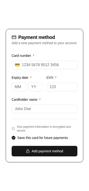
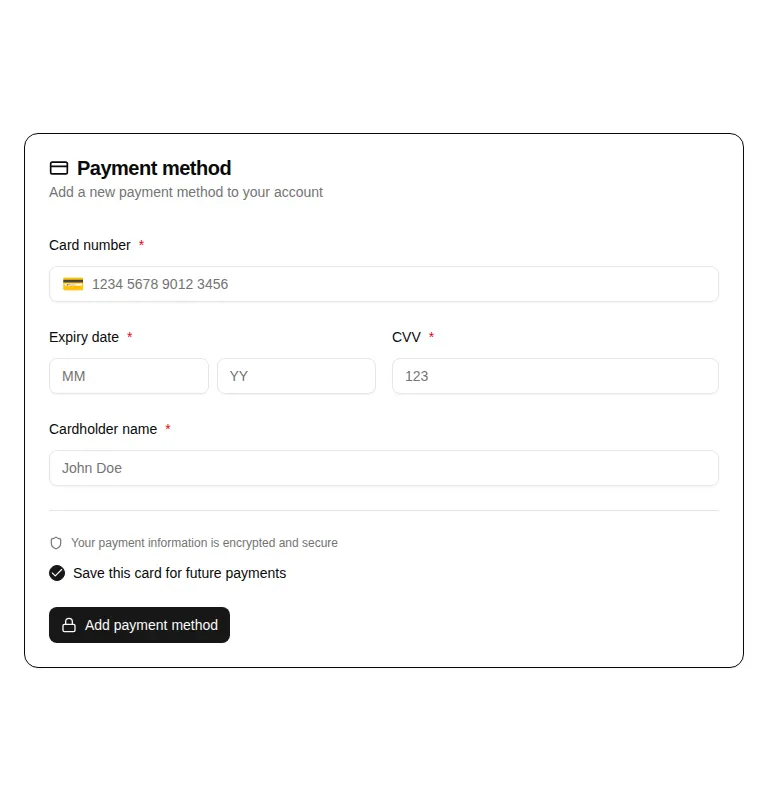
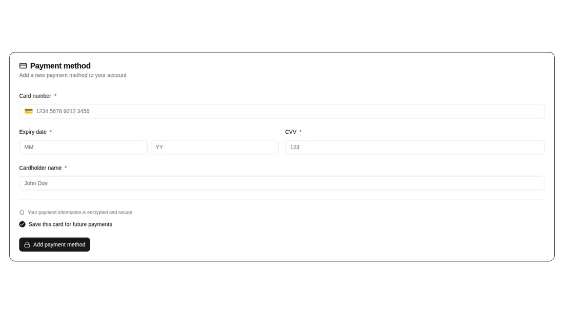
Measured
Every value below was written by the harness on the run that produced the frames above. None of it is derived from the prose.
| Build | OK |
|---|---|
| Mount | OK |
| Console errors | 0 |
| Uncaught page errors | 0 |
| Horizontal overflow | clean at 375, 768, 1440 |
| Axe critical | 1 |
| Axe serious | 0 |
| Axe moderate | 0 |
| Axe minor | 0 |
| Gzip marginal | 42.8 KB (108.2 KB build, 65.4 KB baseline) |
| Bare mode | FAIL |
| Provider required | NO |
| Demo used | written from the component source API |
What the harness recorded
BARE BUILD
✗ Build failed in 2m 4s
error during build:
[vite:load-fallback] Could not load <sandbox>/src/lib/utils (imported by src/cut/blocks/billing/billing-payment-form.tsx): ENOENT: no such file or directory, open '<sandbox>/src/lib/utils'
Verdict
A useful scaffold with a responsive layout and practical prop hooks, but not production-ready untouched. It needs a shadcn-style setup to mount, exposes raw card data rather than tokenizing it, and has a critical unsupported ARIA finding to fix before release.
Use it if
- You need an account settings form that collects a new card and passes the values into your own submission flow.
- You want optional billing address, save-card, default-card, loading, cancellation, and server-error states exposed as props.
- Your app already uses shadcn-style primitives, Tailwind theme tokens, and matching path aliases.
Skip it if
- You require hosted payment fields or browser-side tokenization so raw card details never enter your React state.
- Your release gate rejects critical accessibility findings until the unsupported ARIA attribute is corrected.
- You want a drop-in form for a plain React project without importing the surrounding component system and utility setup.
- You need built-in card validation, payment-provider integration, or submission handling rather than a callback-only shell.
Install
| Declared dependencies | @radix-ui/react-slot, @radix-ui/react-checkbox, @radix-ui/react-label, @radix-ui/react-separator |
|---|---|
| Missing on install | none |
| Bare install | fails once the shadcn-style helpers are removed, so it needs that setup |
| Provider | no provider required in the harness |
In a non-shadcn app, add compatible button, card, checkbox, field, input-group, and separator primitives; install the required Radix packages and Lucide React; configure Tailwind theme tokens and path aliases; provide the cn utility; then replace registry imports if your layout differs. Correct the unsupported ARIA usage before release.
Source and credit
This page is a review, not a copy. The component source lives with its author and this site does not republish it. Read the license before you use anything.
Author repository
github.com/preetsuthar17/HextaUIAlternatives
Other published entries for the form pattern, ordered by what they measured: mounts first, then clean axe scans, then bare-mode passes, then the smaller bundle.
- hextaui-kbdminimal-flat
- Renders
- YES
- A11y
- 0
- Gzip
- 29.8KB
- Bare
- pass
- Prov
- NO
- shadcn-labelunclassified
- Renders
- YES
- A11y
- 0
- Gzip
- 31.1KB
- Bare
- pass
- Prov
- NO
- neobrutalism-labelbrutalism
- Renders
- YES
- A11y
- 0
- Gzip
- 31.5KB
- Bare
- pass
- Prov
- NO
- neobrutalism-nlabelbrutalism
- Renders
- YES
- A11y
- 0
- Gzip
- 31.5KB
- Bare
- pass
- Prov
- NO
- shadcn-formunclassified
- Renders
- YES
- A11y
- 0
- Gzip
- 43.9KB
- Bare
- pass
- Prov
- NO
- neobrutalism-formbrutalism
- Renders
- YES
- A11y
- 0
- Gzip
- 44.4KB
- Bare
- pass
- Prov
- NO