Measured entry
hextaui-billing-usage-billing
A client-side billing usage card for current and previous period totals, category progress, warnings, trend direction, and a simple bar history. It ships as a shadcn registry block and imports local Button, Card, Progress, Separator, and cn utilities, plus Lucide icons and Radix-backed UI dependencies.
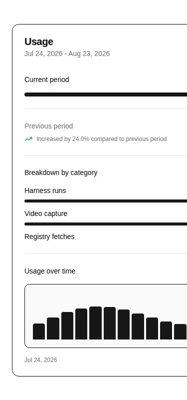
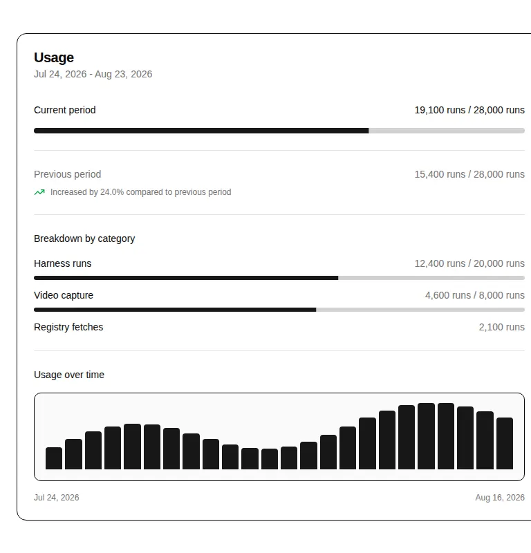
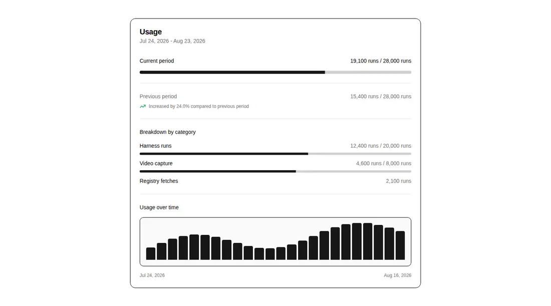
Measured
Every value below was written by the harness on the run that produced the frames above. None of it is derived from the prose.
| Build | OK |
|---|---|
| Mount | OK |
| Console errors | 0 |
| Uncaught page errors | 0 |
| Horizontal overflow | flagged at 375, 768 |
| Axe critical | 1 |
| Axe serious | 0 |
| Axe moderate | 0 |
| Axe minor | 0 |
| Gzip marginal | 36.1 KB (101.6 KB build, 65.5 KB baseline) |
| Bare mode | FAIL |
| Provider required | NO |
| Demo used | written from the component source API |
What the harness recorded
BARE BUILD
✗ Build failed in 749ms
error during build:
[vite]: Rollup failed to resolve import "lucide-react" from "<sandbox>re-d0a6adcca566/src/cut/blocks/billing/billing-usage-billing.tsx".
Verdict
A useful all-in-one usage summary for shadcn dashboards, but it needs a shadcn-style setup and is not ready for narrow screens or strict accessibility gates. Adopt it only if you can repair the responsive rows and progress ARIA output.
Use it if
- You need a dashboard card that combines quota status, period comparison, and category breakdowns.
- Your usage data is already available as dates, totals, limits, and optional categories.
- Your app uses shadcn conventions and can supply its local UI primitives and theme tokens.
Skip it if
- The card must fit narrow layouts without horizontal clipping or hidden usage values.
- You require a chart with axes, legends, keyboard exploration, or accessible point details.
- You cannot accept unsupported ARIA attributes on the rendered progress elements.
Install
| Declared dependencies | @radix-ui/react-slot, @radix-ui/react-progress, @radix-ui/react-separator, clsx, tailwind-merge |
|---|---|
| Missing on install | none |
| Bare install | fails once the shadcn-style helpers are removed, so it needs that setup |
| Provider | no provider required in the harness |
In a non-shadcn project, add Lucide React, the Radix slot, progress, and separator packages, clsx, and tailwind-merge. Provide equivalent Button, Card, Progress, Separator, and cn modules, configure the import aliases, and reproduce the Tailwind theme tokens used by the block.
Source and credit
This page is a review, not a copy. The component source lives with its author and this site does not republish it. Read the license before you use anything.
Author repository
github.com/preetsuthar17/HextaUIAlternatives
Other published entries for the pricing pattern, ordered by what they measured: mounts first, then clean axe scans, then bare-mode passes, then the smaller bundle.
- hyperui-pricing-1unclassified
- Renders
- YES
- A11y
- 0
- Gzip
- 3.8KB
- Bare
- pass
- Prov
- NO
- hyperui-pricing-2editorial
- Renders
- YES
- A11y
- 0
- Gzip
- 18.2KB
- Bare
- pass
- Prov
- NO
- meraki-pricing-side-by-sideminimal-flat
- Renders
- YES
- A11y
- 0
- Gzip
- 18.8KB
- Bare
- pass
- Prov
- NO
- efferd-pricing-2glassmorphism
- Renders
- YES
- A11y
- 0
- Gzip
- 29.8KB
- Bare
- pass
- Prov
- NO
- ruixen-pricing-plansunclassified
- Renders
- YES
- A11y
- 0
- Gzip
- 60.6KB
- Bare
- pass
- Prov
- NO
- tripled-glassmorphism-pricing-block-shadcnuiglassmorphism
- Renders
- YES
- A11y
- 0
- Gzip
- 30.4KB
- Bare
- fail
- Prov
- NO