Measured entry
hextaui-settings-account
A React client-side account settings card shipped as a shadcn registry block. It presents plan status, team and storage usage, ownership transfer, and account deletion. It depends on Tailwind theme conventions, aliased local UI primitives, Radix-backed dialogs, utility class helpers, and Lucide icons.
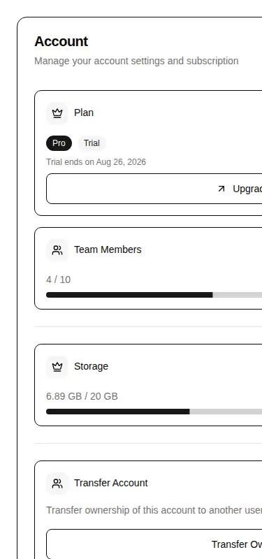
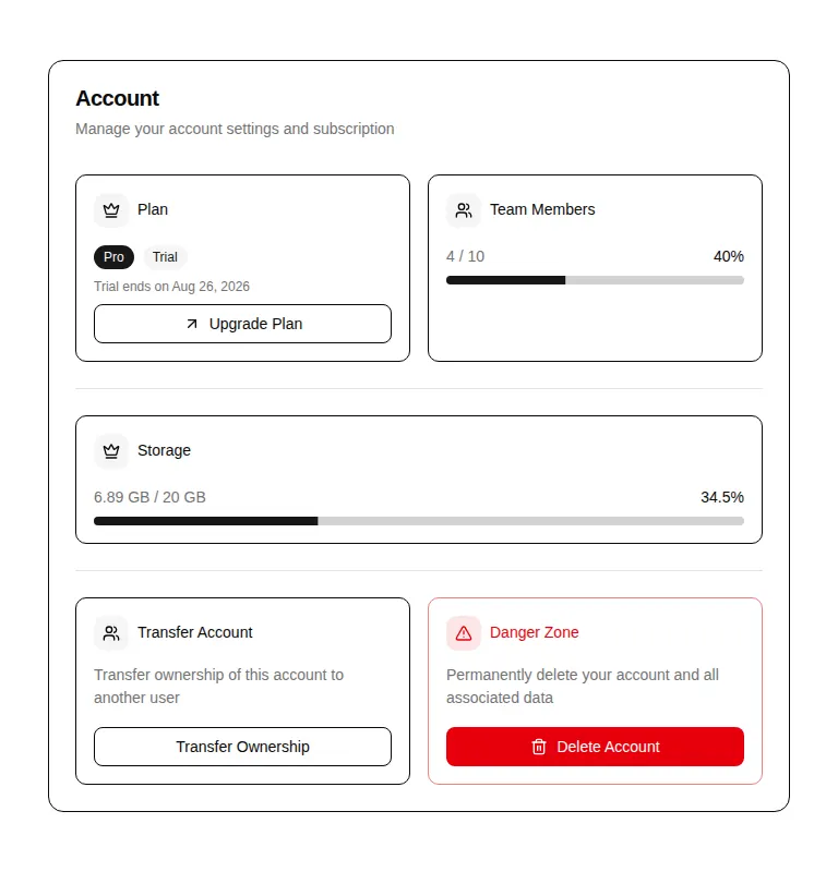
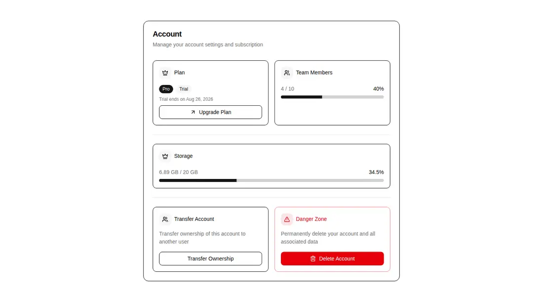
Measured
Every value below was written by the harness on the run that produced the frames above. None of it is derived from the prose.
| Build | OK |
|---|---|
| Mount | OK |
| Console errors | 0 |
| Uncaught page errors | 0 |
| Horizontal overflow | flagged at 375 |
| Axe critical | 1 |
| Axe serious | 1 |
| Axe moderate | 0 |
| Axe minor | 0 |
| Gzip marginal | 50.6 KB (116.1 KB build, 65.5 KB baseline) |
| Bare mode | FAIL |
| Provider required | NO |
| Demo used | written from the component source API |
What the harness recorded
BARE BUILD
✗ Build failed in 1.29s
error during build:
[vite]: Rollup failed to resolve import "lucide-react" from "<sandbox>re-c181d787948e/src/cut/blocks/settings/settings-account.tsx".
Verdict
A useful settings scaffold with sensible states and guarded async deletion, but it is not release-ready unchanged. It needs a shadcn-style setup, mobile overflow fixes, accessible progress labels, and a corrected confirmation flow. The undeclared Lucide import also makes bare installation fail.
Use it if
- You need a ready-made account and subscription settings panel inside an existing shadcn-style application.
- Your product model already exposes plan status, usage limits, and async handlers for upgrade, transfer, and deletion.
- You are prepared to repair the progress semantics and tighten the destructive-action flow before release.
Skip it if
- You need a drop-in component for a plain React project without Tailwind tokens, import aliases, and local UI primitives.
- Your settings page must fit narrow mobile screens without layout work, since the verified view overflows there.
- You require an accessibility-clean component before customization because its progress indicators have invalid or missing ARIA semantics.
- You require typed confirmation for deletion as shipped: the dialog asks for it but provides no input.
Install
| Declared dependencies | @radix-ui/react-alert-dialog, @radix-ui/react-slot, @radix-ui/react-label, @radix-ui/react-separator, @radix-ui/react-progress, clsx, tailwind-merge |
|---|---|
| Missing on install | none |
| Bare install | fails once the shadcn-style helpers are removed, so it needs that setup |
| Provider | no provider required in the harness |
For a non-shadcn project, add Tailwind theme tokens, a class-merging utility, compatible card, button, badge, field, progress, separator, and alert-dialog primitives, the required Radix packages, and Lucide React. Then replace the aliased imports with local paths and add accessible names to both progress indicators.
Source and credit
This page is a review, not a copy. The component source lives with its author and this site does not republish it. Read the license before you use anything.
Author repository
github.com/preetsuthar17/HextaUIAlternatives
Other published entries for the pricing pattern, ordered by what they measured: mounts first, then clean axe scans, then bare-mode passes, then the smaller bundle.
- hyperui-pricing-1unclassified
- Renders
- YES
- A11y
- 0
- Gzip
- 3.8KB
- Bare
- pass
- Prov
- NO
- hyperui-pricing-2editorial
- Renders
- YES
- A11y
- 0
- Gzip
- 18.2KB
- Bare
- pass
- Prov
- NO
- meraki-pricing-side-by-sideminimal-flat
- Renders
- YES
- A11y
- 0
- Gzip
- 18.8KB
- Bare
- pass
- Prov
- NO
- efferd-pricing-2glassmorphism
- Renders
- YES
- A11y
- 0
- Gzip
- 29.8KB
- Bare
- pass
- Prov
- NO
- ruixen-pricing-plansunclassified
- Renders
- YES
- A11y
- 0
- Gzip
- 60.6KB
- Bare
- pass
- Prov
- NO
- tripled-glassmorphism-pricing-block-shadcnuiglassmorphism
- Renders
- YES
- A11y
- 0
- Gzip
- 30.4KB
- Bare
- fail
- Prov
- NO