Measured entry
hextaui-settings-api-keys
A client-side React card for listing and creating API keys, choosing scopes and expiry, revealing or copying secrets, and confirming regeneration or revocation. It ships as a shadcn registry component and depends on Lucide icons, Radix-backed UI pieces, Tailwind theme classes, path aliases, and a cn utility.
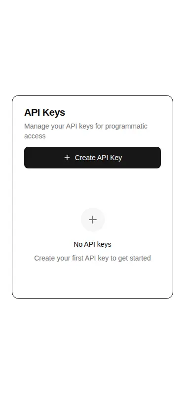
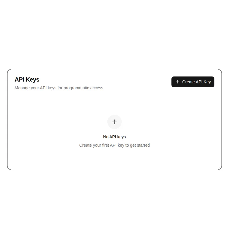
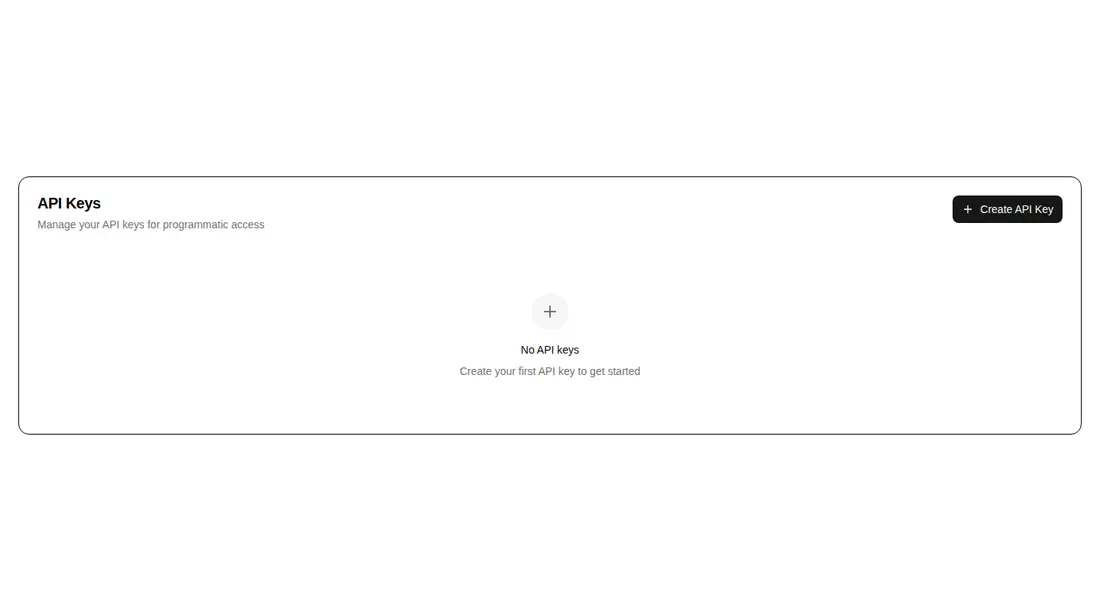
Measured
Every value below was written by the harness on the run that produced the frames above. None of it is derived from the prose.
| Build | OK |
|---|---|
| Mount | OK |
| Console errors | 0 |
| Uncaught page errors | 0 |
| Horizontal overflow | clean at 375, 768, 1440 |
| Axe critical | 0 |
| Axe serious | 0 |
| Axe moderate | 0 |
| Axe minor | 0 |
| Gzip marginal | 73.8 KB (139.2 KB build, 65.4 KB baseline) |
| Bare mode | FAIL |
| Provider required | NO |
| Demo used | written from the component source API |
What the harness recorded
BARE BUILD
✗ Build failed in 1m 26s
error during build:
[vite:load-fallback] Could not load <sandbox>/src/lib/utils (imported by src/cut/blocks/settings/settings-api-keys.tsx): ENOENT: no such file or directory, open '<sandbox>/src/lib/utils'
Verdict
A solid starting point for a conventional API-key settings screen, with useful lifecycle callbacks and careful destructive confirmation. It needs a shadcn-style setup, and teams should revise secret visibility and mutation error handling before production use.
Use it if
- You need a settings panel that covers the common API-key lifecycle behind application-owned callbacks.
- Your product already uses shadcn conventions and can supply key records, permissions, expiry data, and async mutations.
- You want a responsive empty state plus dialogs and confirmation flows without introducing a form library.
Skip it if
- Your security model reveals a secret only at creation and never keeps retrievable key values.
- You need permissions loaded from the server rather than the fixed read, write, and admin scope choices.
- You need mutation failures for revoke or regenerate surfaced to users; those callbacks currently clear loading state without showing an error.
- You want a portable standalone component with no shadcn registry or Tailwind theme setup.
Install
| Declared dependencies | @radix-ui/react-alert-dialog, @radix-ui/react-slot, @radix-ui/react-checkbox, @radix-ui/react-dialog, @radix-ui/react-label, @radix-ui/react-separator, @radix-ui/react-select |
|---|---|
| Missing on install | none |
| Bare install | fails once the shadcn-style helpers are removed, so it needs that setup |
| Provider | no provider required in the harness |
In a non-shadcn project, add the referenced Radix primitives and Lucide icons, install or recreate the registry UI components, provide Tailwind theme tokens and utility classes, add the cn helper, and replace the registry path aliases with local imports. Wire the create, revoke, and regenerate callbacks to your backend.
Source and credit
This page is a review, not a copy. The component source lives with its author and this site does not republish it. Read the license before you use anything.
Author repository
github.com/preetsuthar17/HextaUIAlternatives
Other published entries for the form pattern, ordered by what they measured: mounts first, then clean axe scans, then bare-mode passes, then the smaller bundle.
- hextaui-kbdminimal-flat
- Renders
- YES
- A11y
- 0
- Gzip
- 29.8KB
- Bare
- pass
- Prov
- NO
- shadcn-labelunclassified
- Renders
- YES
- A11y
- 0
- Gzip
- 31.1KB
- Bare
- pass
- Prov
- NO
- neobrutalism-labelbrutalism
- Renders
- YES
- A11y
- 0
- Gzip
- 31.5KB
- Bare
- pass
- Prov
- NO
- neobrutalism-nlabelbrutalism
- Renders
- YES
- A11y
- 0
- Gzip
- 31.5KB
- Bare
- pass
- Prov
- NO
- shadcn-formunclassified
- Renders
- YES
- A11y
- 0
- Gzip
- 43.9KB
- Bare
- pass
- Prov
- NO
- neobrutalism-formbrutalism
- Renders
- YES
- A11y
- 0
- Gzip
- 44.4KB
- Bare
- pass
- Prov
- NO