Measured entry
hextaui-settings-import-data
A client-side React settings card for importing JSON or CSV data, previewing conflicts, choosing a resolution policy, running a dry run, and showing import history. It ships as a shadcn registry component and expects local card, field, progress, radio, badge, button, and separator primitives, plus Lucide icons, Tailwind theme classes, and a cn utility.
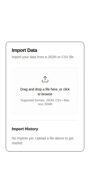
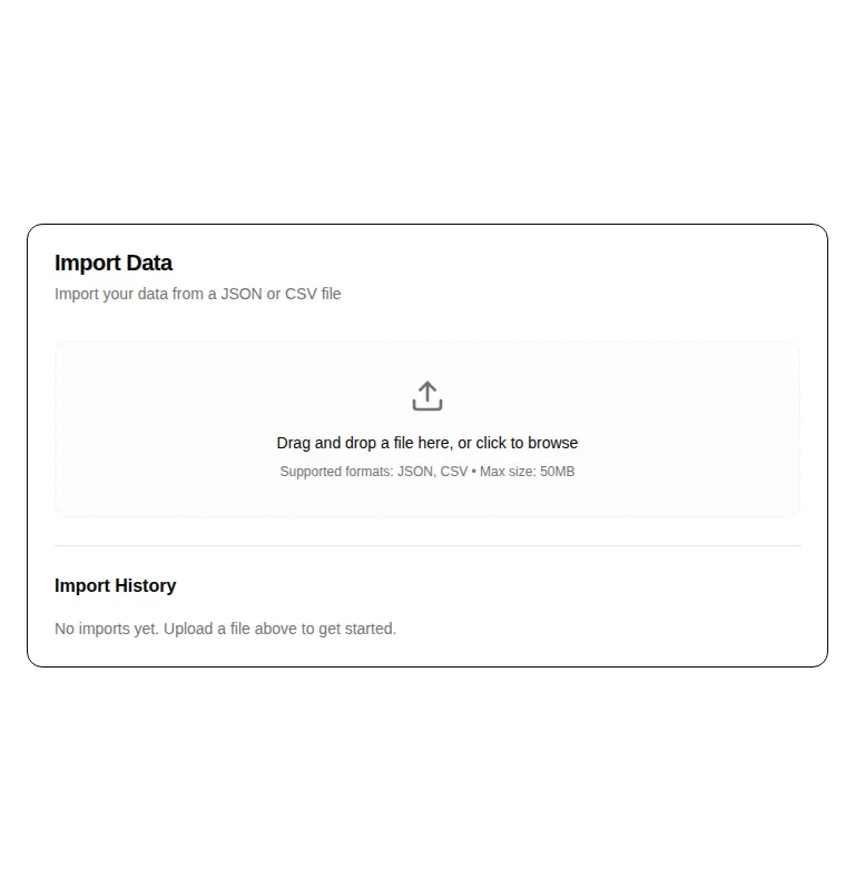
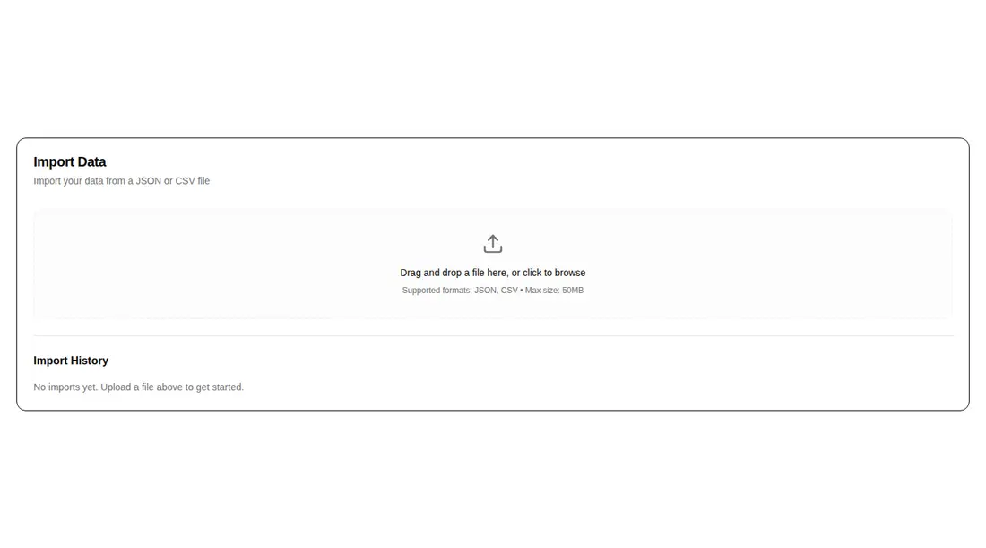
Measured
Every value below was written by the harness on the run that produced the frames above. None of it is derived from the prose.
| Build | OK |
|---|---|
| Mount | OK |
| Console errors | 0 |
| Uncaught page errors | 0 |
| Horizontal overflow | clean at 375, 768, 1440 |
| Axe critical | 1 |
| Axe serious | 0 |
| Axe moderate | 0 |
| Axe minor | 0 |
| Gzip marginal | 47.6 KB (113.0 KB build, 65.4 KB baseline) |
| Bare mode | FAIL |
| Provider required | NO |
| Demo used | written from the component source API |
What the harness recorded
BARE BUILD
✗ Build failed in 1m 38s
error during build:
[vite:load-fallback] Could not load <sandbox>/src/lib/utils (imported by src/cut/blocks/settings/settings-import-data.tsx): ENOENT: no such file or directory, open '<sandbox>/src/lib/utils'
Verdict
A useful, fairly complete import workflow shell for shadcn-based settings screens, but not a drop-in import feature. It needs a shadcn-style setup to mount, and the invalid ARIA usage should be fixed before production. Choose it when you already own the backend workflow and want the UI states wired together.
Use it if
- You need a settings-page shell for file import with preview and conflict handling already laid out.
- Your app can supply the upload, validation, dry-run, import, and history data through the component callbacks and props.
- Your project already follows shadcn conventions and can reuse its local UI primitives and theme tokens.
Skip it if
- You need a complete import engine, because this component delegates parsing, persistence, and job updates to the host app.
- Your design system does not use shadcn-style source components, aliases, or Tailwind theme tokens and you do not want to adapt them.
- You require an accessibility-clean component without remediation, because the audit found a critical unsupported ARIA attribute.
- You need arbitrary formats, multi-file selection, or resumable uploads rather than a single JSON or CSV workflow.
Install
| Declared dependencies | @radix-ui/react-slot, @radix-ui/react-label, @radix-ui/react-separator, @radix-ui/react-progress, @radix-ui/react-radio-group |
|---|---|
| Missing on install | none |
| Bare install | fails once the shadcn-style helpers are removed, so it needs that setup |
| Provider | no provider required in the harness |
In a non-shadcn project, add React and Lucide, provide compatible card, field, progress, radio-group, badge, button, and separator components, configure the source alias and cn helper, and map the Tailwind theme classes to your styling system. You must also implement the upload and import callbacks and supply history state.
Source and credit
This page is a review, not a copy. The component source lives with its author and this site does not republish it. Read the license before you use anything.
Author repository
github.com/preetsuthar17/HextaUIAlternatives
Other published entries for the form pattern, ordered by what they measured: mounts first, then clean axe scans, then bare-mode passes, then the smaller bundle.
- hextaui-kbdminimal-flat
- Renders
- YES
- A11y
- 0
- Gzip
- 29.8KB
- Bare
- pass
- Prov
- NO
- shadcn-labelunclassified
- Renders
- YES
- A11y
- 0
- Gzip
- 31.1KB
- Bare
- pass
- Prov
- NO
- neobrutalism-labelbrutalism
- Renders
- YES
- A11y
- 0
- Gzip
- 31.5KB
- Bare
- pass
- Prov
- NO
- neobrutalism-nlabelbrutalism
- Renders
- YES
- A11y
- 0
- Gzip
- 31.5KB
- Bare
- pass
- Prov
- NO
- shadcn-formunclassified
- Renders
- YES
- A11y
- 0
- Gzip
- 43.9KB
- Bare
- pass
- Prov
- NO
- neobrutalism-formbrutalism
- Renders
- YES
- A11y
- 0
- Gzip
- 44.4KB
- Bare
- pass
- Prov
- NO