Measured entry
hextaui-team-settings
A client-side React card for editing a team's avatar, name, description, slug, color, default model, and plan display. It ships as a shadcn registry item, uses local state and callback props for persistence and uploads, and depends on lucide icons, shadcn UI primitives, and the usual cn utility.
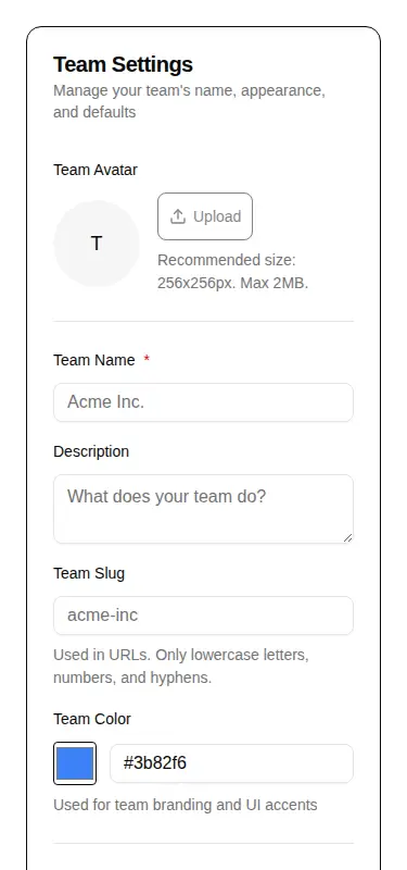
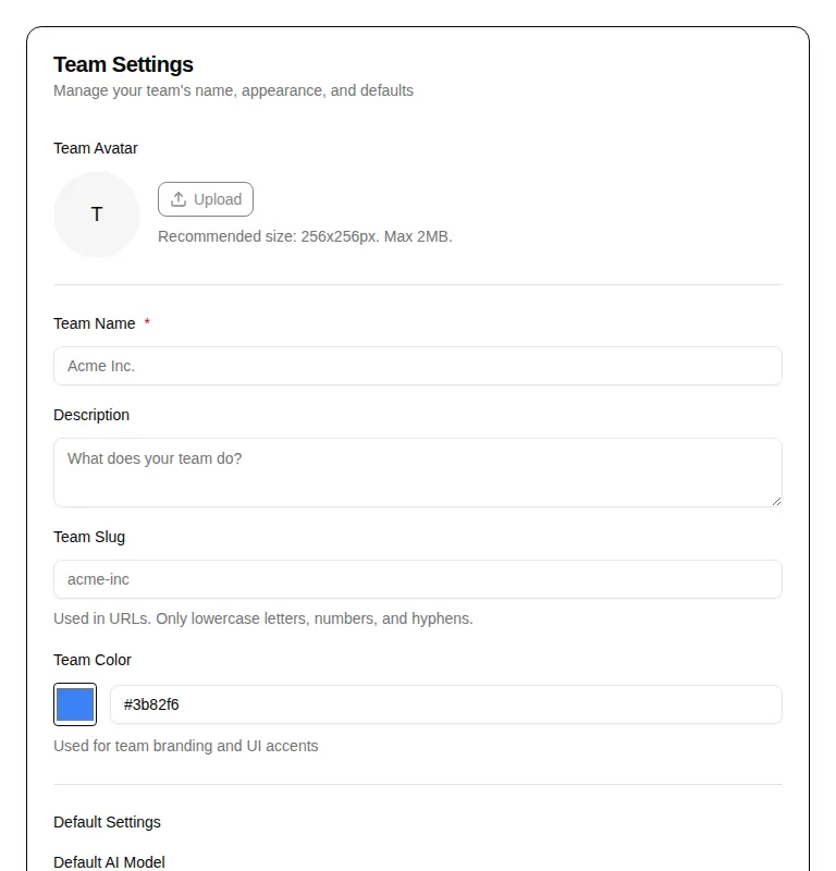
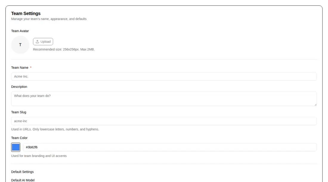
Measured
Every value below was written by the harness on the run that produced the frames above. None of it is derived from the prose.
| Build | OK |
|---|---|
| Mount | OK |
| Console errors | 0 |
| Uncaught page errors | 0 |
| Horizontal overflow | clean at 375, 768, 1440 |
| Axe critical | 1 |
| Axe serious | 0 |
| Axe moderate | 0 |
| Axe minor | 0 |
| Gzip marginal | 40.2 KB (105.6 KB build, 65.4 KB baseline) |
| Bare mode | FAIL |
| Provider required | NO |
| Demo used | written from the component source API |
What the harness recorded
BARE BUILD
✗ Build failed in 1m 37s
error during build:
[vite:load-fallback] Could not load <sandbox>/src/lib/utils (imported by src/cut/blocks/team/team-settings.tsx): ENOENT: no such file or directory, open '<sandbox>/src/lib/utils'
Verdict
A practical, coherent settings form for teams already using shadcn, with useful async hooks and sensible field coverage. It needs a shadcn-style setup to build and mount, and the ARIA defect should be fixed before production use.
Use it if
- You need a ready-made team profile and defaults form inside an existing shadcn application.
- Your product can supply save, avatar upload, and avatar removal callbacks.
- You want editable branding fields and an optional default model selector in one card.
Skip it if
- You need an accessibility-clean component without first correcting its unsupported ARIA attribute usage.
- Your settings can change externally after mount and the form must automatically resync with new props.
- You want a small framework-neutral form without shadcn registry components and path aliases.
Install
| Declared dependencies | @radix-ui/react-avatar, @radix-ui/react-slot, @radix-ui/react-label, @radix-ui/react-separator |
|---|---|
| Missing on install | none |
| Bare install | fails once the shadcn-style helpers are removed, so it needs that setup |
| Provider | no provider required in the harness |
In a non-shadcn project, add the avatar, badge, button, card, field, input group, separator, and textarea primitives; install their Radix dependencies and lucide-react; provide the cn helper, matching import aliases, Tailwind utilities and theme tokens; then connect persistence and avatar callbacks.
Source and credit
This page is a review, not a copy. The component source lives with its author and this site does not republish it. Read the license before you use anything.
Author repository
github.com/preetsuthar17/HextaUIAlternatives
Other published entries for the team pattern, ordered by what they measured: mounts first, then clean axe scans, then bare-mode passes, then the smaller bundle.
- hyperui-team-3editorial
- Renders
- YES
- A11y
- 0
- Gzip
- 17.4KB
- Bare
- pass
- Prov
- NO
- meraki-team-side-by-sideminimal-flat
- Renders
- YES
- A11y
- 0
- Gzip
- 17.9KB
- Bare
- pass
- Prov
- NO
- meraki-team-simpleminimal-flat
- Renders
- YES
- A11y
- 0
- Gzip
- 17.9KB
- Bare
- pass
- Prov
- NO
- hyperui-team-1editorial
- Renders
- YES
- A11y
- 0
- Gzip
- 18.1KB
- Bare
- pass
- Prov
- NO
- hyperui-team-2editorial
- Renders
- YES
- A11y
- 0
- Gzip
- 18.2KB
- Bare
- pass
- Prov
- NO
- meraki-team-backgroundminimal-flat
- Renders
- YES
- A11y
- 0
- Gzip
- 20.5KB
- Bare
- pass
- Prov
- NO