Measured entry
hyperui-app-stats-5
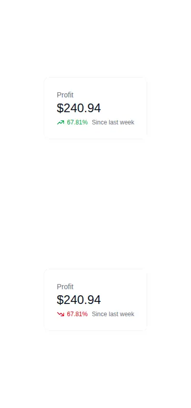
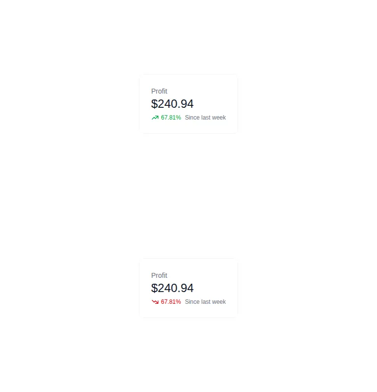
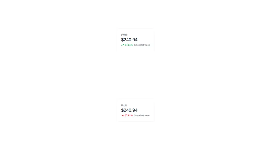
A compact pair of profit summary cards showing positive and negative trends. It ships as a standalone HTML example styled with Tailwind utility classes, with inline SVG arrows and screen-reader trend labels. It has no package or provider dependency, though the document references the harness stylesheet and script.
Measured
Every value below was written by the harness on the run that produced the frames above. None of it is derived from the prose.
| Build | OK |
|---|---|
| Mount | OK |
| Console errors | 0 |
| Uncaught page errors | 0 |
| Horizontal overflow | clean at 375, 768, 1440 |
| Axe critical | 0 |
| Axe serious | 1 |
| Axe moderate | 0 |
| Axe minor | 0 |
| Gzip marginal | 17.4 KB (82.8 KB build, 65.4 KB baseline) |
| Bare mode | OK |
| Provider required | NO |
| Demo used | none |
Verdict
A clean, low-dependency starting point for simple metric cards, and it mounts in a bare project. Use it as markup rather than a finished component: wire in real values and fix the muted text contrast before production.
Use it if
- You need a small dashboard metric treatment with an amount, direction, and comparison period.
- Your project already uses Tailwind utilities or can translate a short utility-class template.
- You want static markup that can be wired to your own data layer without adopting a component library.
Skip it if
- Your accessibility gate requires the supplied colors to pass contrast checks without modification.
- You need a reusable component API, data formatting, loading states, or interactive drill-down behavior.
- Your design system does not use Tailwind and duplicating these utility styles would add maintenance overhead.
Install
| Declared dependencies | none declared |
|---|---|
| Missing on install | none |
| Bare install | builds and mounts without the shadcn-style helpers |
| Provider | no provider required in the harness |
A non-shadcn project needs Tailwind CSS configured for the utility classes, or equivalent local CSS for the layout, spacing, borders, colors, typography, and screen-reader-only label. No React package, icon package, provider, or shadcn setup is required.
Source and credit
This page is a review, not a copy. The component source lives with its author and this site does not republish it. Read the license before you use anything.
Author repository
github.com/markmead/hyperuiAlternatives
Other published entries for the stats pattern, ordered by what they measured: mounts first, then clean axe scans, then bare-mode passes, then the smaller bundle.
- hyperui-stats-1unclassified
- Renders
- YES
- A11y
- 0
- Gzip
- 3.4KB
- Bare
- pass
- Prov
- NO
- hyperui-app-stats-4editorial
- Renders
- YES
- A11y
- 0
- Gzip
- 17.5KB
- Bare
- pass
- Prov
- NO
- tailark-mist-stats-2minimal-flat
- Renders
- YES
- A11y
- 0
- Gzip
- 17.6KB
- Bare
- pass
- Prov
- NO
- tailark-mist-stats-4minimal-flat
- Renders
- YES
- A11y
- 0
- Gzip
- 17.6KB
- Bare
- pass
- Prov
- NO
- tailark-veil-stats-1minimal-flat
- Renders
- YES
- A11y
- 0
- Gzip
- 17.6KB
- Bare
- pass
- Prov
- NO
- hyperui-stats-2editorial
- Renders
- YES
- A11y
- 0
- Gzip
- 17.8KB
- Bare
- pass
- Prov
- NO