Measured entry
hyperui-feature-grids-3
A compact, centered feature grid for short product claims, with an icon, heading, and supporting line in each cell. It ships as static HyperUI HTML styled entirely with Tailwind utility classes. The icons are inline SVG, and the component needs no JavaScript behavior or third-party runtime package.
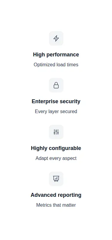
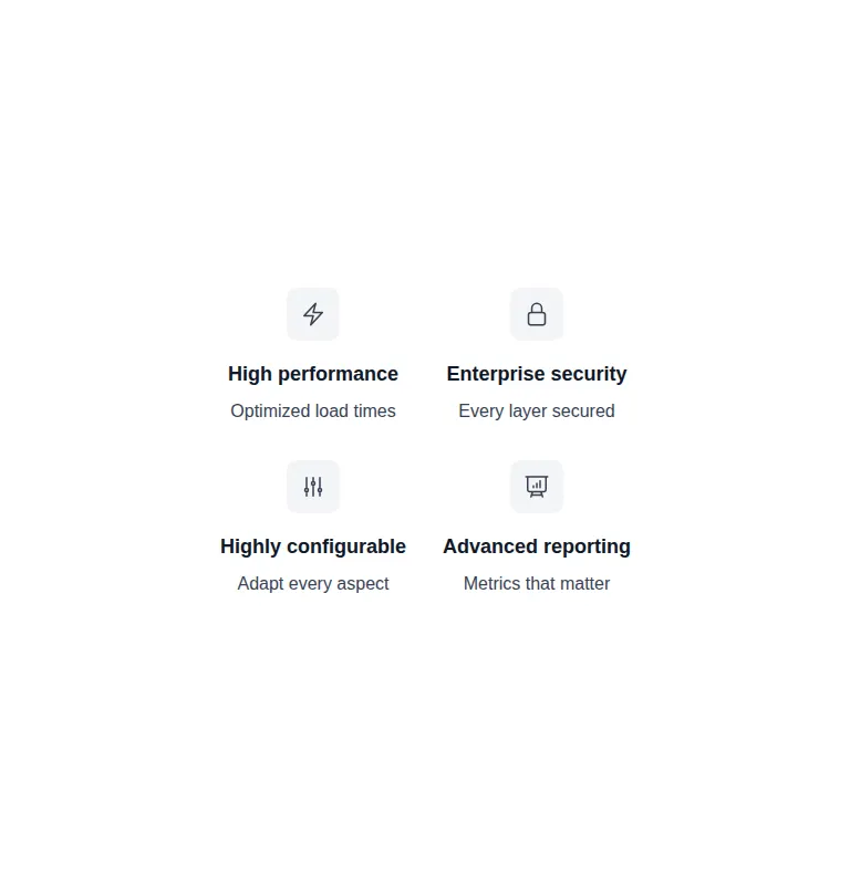

Measured
Every value below was written by the harness on the run that produced the frames above. None of it is derived from the prose.
| Build | OK |
|---|---|
| Mount | OK |
| Console errors | 0 |
| Uncaught page errors | 0 |
| Horizontal overflow | clean at 375, 768, 1440 |
| Axe critical | 0 |
| Axe serious | 0 |
| Axe moderate | 0 |
| Axe minor | 0 |
| Gzip marginal | 17.7 KB (83.1 KB build, 65.4 KB baseline) |
| Bare mode | OK |
| Provider required | NO |
| Demo used | written from the component source API |
Verdict
A dependable, deliberately simple feature grid that is easy to copy and restyle. It is a good fit for brief product claims, but teams expecting a configurable framework component will need to extract the repeated markup into their own abstraction.
Use it if
- You need a concise feature summary that can sit between longer landing-page sections.
- Your content fits a repeated icon, heading, and single-line description structure.
- Your project already uses Tailwind and can adopt a plain HTML snippet without a component API.
Skip it if
- Your feature copy needs paragraphs, links, screenshots, or other richer content.
- You need data-driven rendering, reusable props, or built-in interaction rather than static markup.
- Your design system avoids centered feature claims or uses a different icon language.
Install
| Declared dependencies | none declared |
|---|---|
| Missing on install | none |
| Bare install | builds and mounts without the shadcn-style helpers |
| Provider | no provider required in the harness |
In a non-shadcn project, add Tailwind CSS and ensure its content scan includes this markup so the utility classes are generated. No shadcn components, icon package, or client-side script is required; keep the inline SVG icons or replace them with your existing icon set.
Source and credit
This page is a review, not a copy. The component source lives with its author and this site does not republish it. Read the license before you use anything.
Author repository
github.com/markmead/hyperuiAlternatives
Other published entries for the feature-grid pattern, ordered by what they measured: mounts first, then clean axe scans, then bare-mode passes, then the smaller bundle.
- hyperui-feature-grids-1editorial
- Renders
- YES
- A11y
- 0
- Gzip
- 17.9KB
- Bare
- pass
- Prov
- NO
- hyperui-feature-grids-4editorial
- Renders
- YES
- A11y
- 0
- Gzip
- 17.9KB
- Bare
- pass
- Prov
- NO
- hyperui-feature-grids-2editorial
- Renders
- YES
- A11y
- 0
- Gzip
- 18.3KB
- Bare
- pass
- Prov
- NO
- meraki-feature-grid-list-with-imageminimal-flat
- Renders
- YES
- A11y
- 0
- Gzip
- 18.5KB
- Bare
- pass
- Prov
- NO
- meraki-feature-simpleminimal-flat
- Renders
- YES
- A11y
- 0
- Gzip
- 20.2KB
- Bare
- pass
- Prov
- NO
- tailark-mist-integrations-1minimal-flat
- Renders
- YES
- A11y
- 0
- Gzip
- 26.2KB
- Bare
- pass
- Prov
- NO