Measured entry
kokonut-background-paths
background-effectdark-futuristicmotion on file
A client-side React hero that fills the viewport with layered, gently moving SVG wave paths and a centered title. It ships as a TypeScript registry component, uses Tailwind utility classes for layout and light or dark styling, and imports the React entry point from Motion for animation.
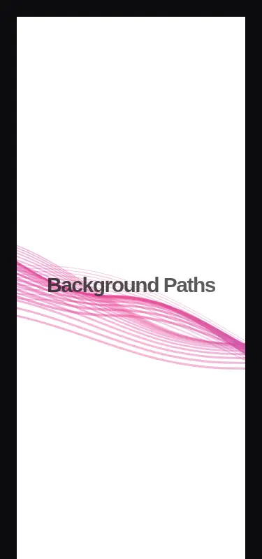
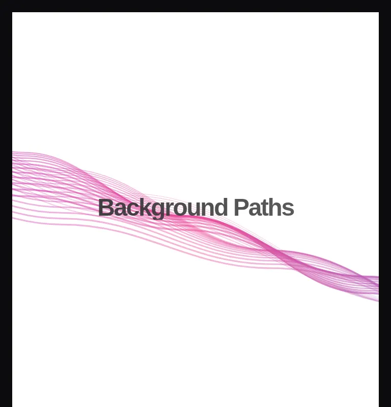
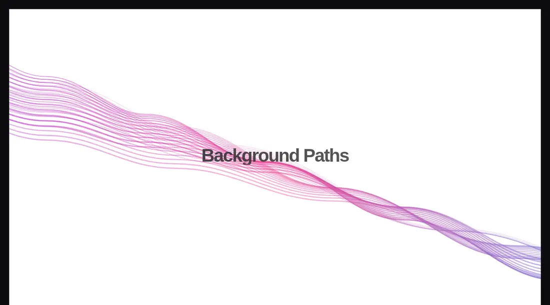
Measured
Every value below was written by the harness on the run that produced the frames above. None of it is derived from the prose.
| Build | OK |
|---|---|
| Mount | OK |
| Console errors | 0 |
| Uncaught page errors | 0 |
| Horizontal overflow | clean at 375, 768, 1440 |
| Axe critical | 0 |
| Axe serious | 0 |
| Axe moderate | 0 |
| Axe minor | 0 |
| Gzip marginal | 59.6 KB (125.0 KB build, 65.4 KB baseline) |
| Bare mode | OK |
| Provider required | NO |
| Demo used | written from the component source API |
Verdict
A dependable drop-in hero for Tailwind projects that want ambient motion without provider wiring. It built and mounted cleanly across the tested layouts, but the Motion dependency and missing reduced-motion handling make it a deliberate visual choice rather than a neutral background primitive.
Use it if
- You need a ready-made animated backdrop for a landing-page hero or campaign intro.
- Your project already uses Tailwind and Motion, and a full-viewport section fits the page structure.
- You want a self-contained visual with editable title text and no provider setup.
Skip it if
- You need a lightweight static background and do not otherwise depend on Motion.
- Your design requires reduced-motion behavior out of the box; this component does not implement it.
- You need a background layer only, since the component also owns the full-viewport wrapper and title layout.
- Your project does not use Tailwind and you do not want to translate its utility classes.
Install
| Declared dependencies | motion |
|---|---|
| Missing on install | none |
| Bare install | builds and mounts without the shadcn-style helpers |
| Provider | no provider required in the harness |
In a non-shadcn project, copy the TSX component, install Motion, and provide React with client-component support. Add Tailwind with the utilities and dark-mode variant used by the markup, or replace those classes with equivalent local styles.
Source and credit
This page is a review, not a copy. The component source lives with its author and this site does not republish it. Read the license before you use anything.
Author repository
github.com/kokonut-labs/kokonutuiAlternatives
Other published entries for the background-effect pattern, ordered by what they measured: mounts first, then clean axe scans, then bare-mode passes, then the smaller bundle.
- ruixen-loading-circlegradient-glow
- Renders
- YES
- A11y
- 0
- Gzip
- 17.7KB
- Bare
- pass
- Prov
- NO
- eldora-hacker-backgrounddark-futuristic
- Renders
- YES
- A11y
- 0
- Gzip
- 17.8KB
- Bare
- pass
- Prov
- NO
- ruixen-ripple-circlesgradient-glow
- Renders
- YES
- A11y
- 0
- Gzip
- 17.9KB
- Bare
- pass
- Prov
- NO
- ruixen-dual-tone-rain-backgroundunclassified
- Renders
- YES
- A11y
- 0
- Gzip
- 18.4KB
- Bare
- pass
- Prov
- NO
- cultui-lightboardliquid-glass
- Renders
- YES
- A11y
- 0
- Gzip
- 19.6KB
- Bare
- pass
- Prov
- NO
- ruixen-mouse-sparkunclassified
- Renders
- YES
- A11y
- 0
- Gzip
- 20.6KB
- Bare
- pass
- Prov
- NO