Measured entry
magicui-icon-cloud
logo-wallspatialmotion on file
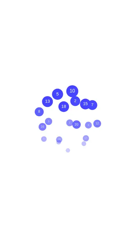
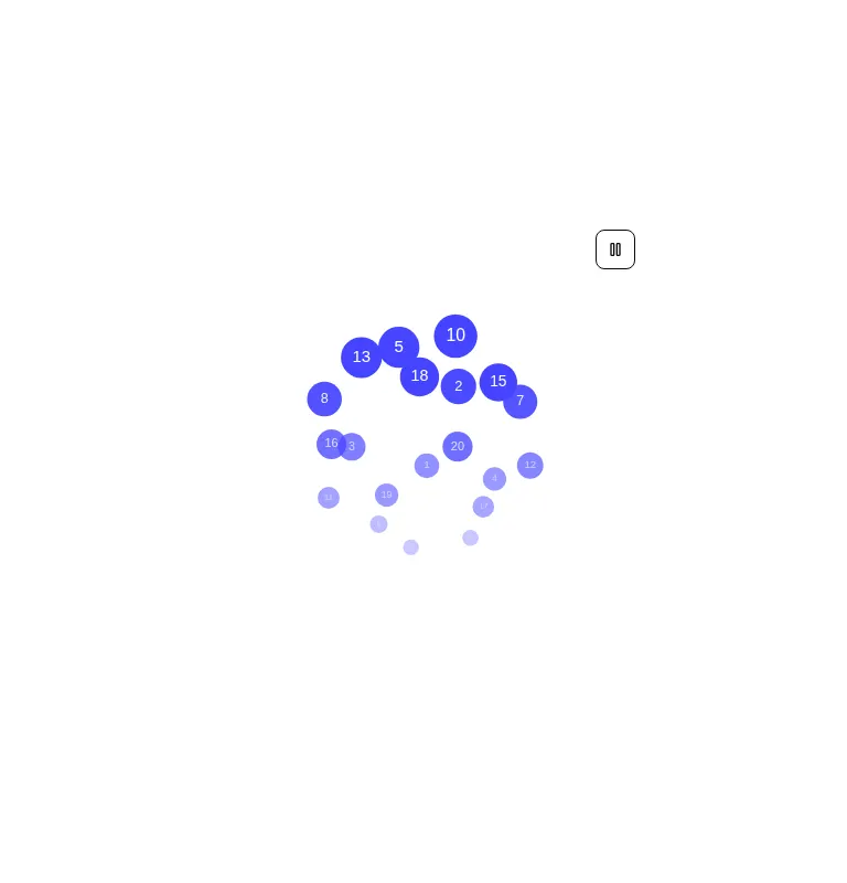
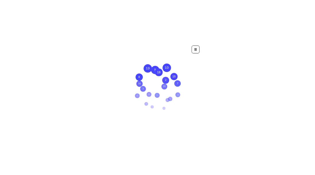
A client-side React component that draws an interactive spherical cloud on a canvas from supplied image URLs or React icons. It ships as a registry TSX file and uses React DOM rendering for icons, Lucide for the play and pause glyphs, and a shadcn Button dependency.
Measured
Every value below was written by the harness on the run that produced the frames above. None of it is derived from the prose.
| Build | OK |
|---|---|
| Mount | OK |
| Console errors | 0 |
| Uncaught page errors | 0 |
| Horizontal overflow | flagged at 375 |
| Axe critical | 0 |
| Axe serious | 0 |
| Axe moderate | 0 |
| Axe minor | 0 |
| Gzip marginal | 87.9 KB (153.3 KB build, 65.4 KB baseline) |
| Bare mode | FAIL |
| Provider required | NO |
| Demo used | written from the component source API |
What the harness recorded
BARE BUILD
✗ Build failed in 9.55s
error during build:
[vite:load-fallback] Could not load <sandbox>/src/lib/utils (imported by src/components/ui/button.tsx): ENOENT: no such file or directory, open '<sandbox>/src/lib/utils'
Verdict
A convincing decorative effect for an existing shadcn app, with useful motion controls and clean runtime behavior. It needs a shadcn-style setup to mount, requires responsive work for narrow layouts, and carries a substantial bundle cost for a single visual flourish.
Use it if
- You need a decorative, draggable logo or technology cloud for a roomy hero or showcase section.
- Your app already uses shadcn conventions and can supply image URLs or React icon nodes.
- You want motion that pauses automatically for visitors who prefer reduced motion.
Skip it if
- The cloud must fit narrow screens without adding responsive sizing or overflow containment.
- Each icon needs to be a keyboard-focusable link, button, or separately announced item.
- You need a lightweight static logo grid rather than a continuously rendered canvas effect.
- Your interface must render without browser canvas APIs or client-side React.
Install
| Declared dependencies | lucide-react, radix-ui |
|---|---|
| Missing on install | none |
| Bare install | fails once the shadcn-style helpers are removed, so it needs that setup |
| Provider | no provider required in the harness |
In a non-shadcn project, add the source alias and utility module expected by shadcn components, install React, React DOM, Lucide React, and the dependencies used by the shadcn Button, then add or replace that Button implementation. Also make the canvas responsive or contain its overflow for narrow layouts.
Source and credit
This page is a review, not a copy. The component source lives with its author and this site does not republish it. Read the license before you use anything.
Author repository
github.com/magicuidesign/magicuiAlternatives
Other published entries for the logo-wall pattern, ordered by what they measured: mounts first, then clean axe scans, then bare-mode passes, then the smaller bundle.
- hyperui-logo-wall-1editorial
- Renders
- YES
- A11y
- 0
- Gzip
- 22.4KB
- Bare
- pass
- Prov
- NO
- hyperui-logo-wall-2editorial
- Renders
- YES
- A11y
- 0
- Gzip
- 22.7KB
- Bare
- pass
- Prov
- NO
- hyperui-logo-wall-3editorial
- Renders
- YES
- A11y
- 0
- Gzip
- 22.8KB
- Bare
- pass
- Prov
- NO
- meraki-logo-wall-trusted-byminimal-flat
- Renders
- YES
- A11y
- 0
- Gzip
- 25.1KB
- Bare
- pass
- Prov
- NO
- tailark-mist-logo-cloud-1minimal-flat
- Renders
- YES
- A11y
- 0
- Gzip
- 27.1KB
- Bare
- pass
- Prov
- NO
- tailark-mist-logo-cloud-2minimal-flat
- Renders
- YES
- A11y
- 0
- Gzip
- 27.1KB
- Bare
- pass
- Prov
- NO