Measured entry
meraki-team-cards2x2
A static team section delivered as standalone HTML: a responsive card grid with portraits, roles, short bios, social links, hover states, and dark-mode classes. It relies on Tailwind CSS, remote Unsplash images, and inline SVG icons, with no JavaScript component library or provider.
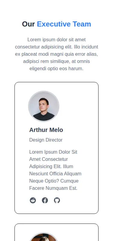
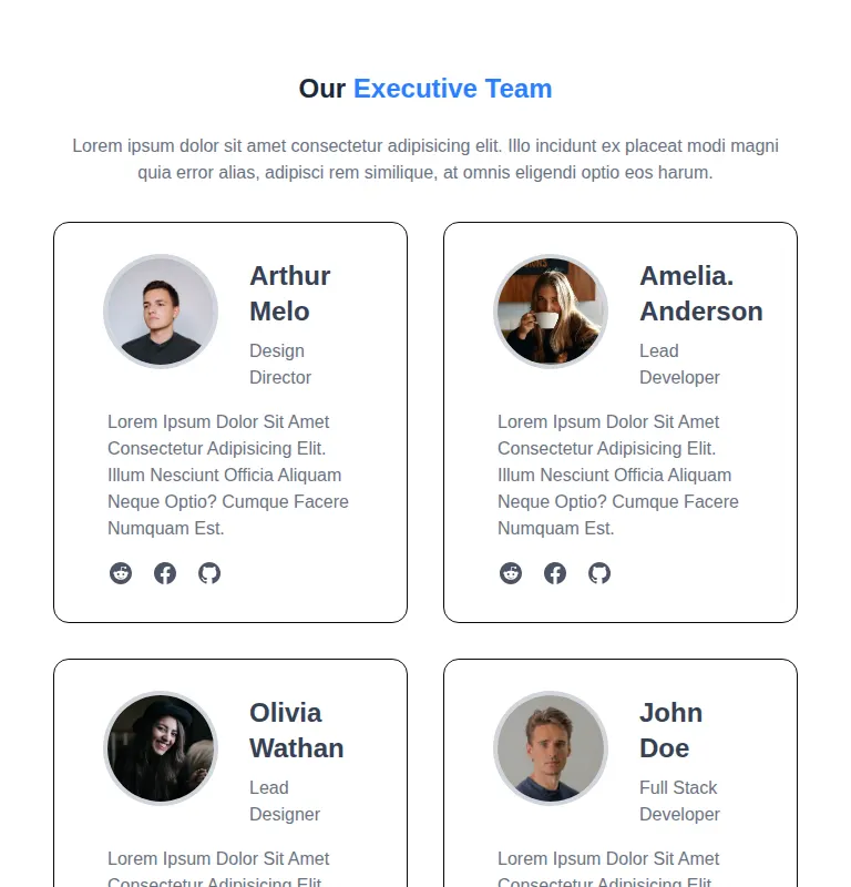
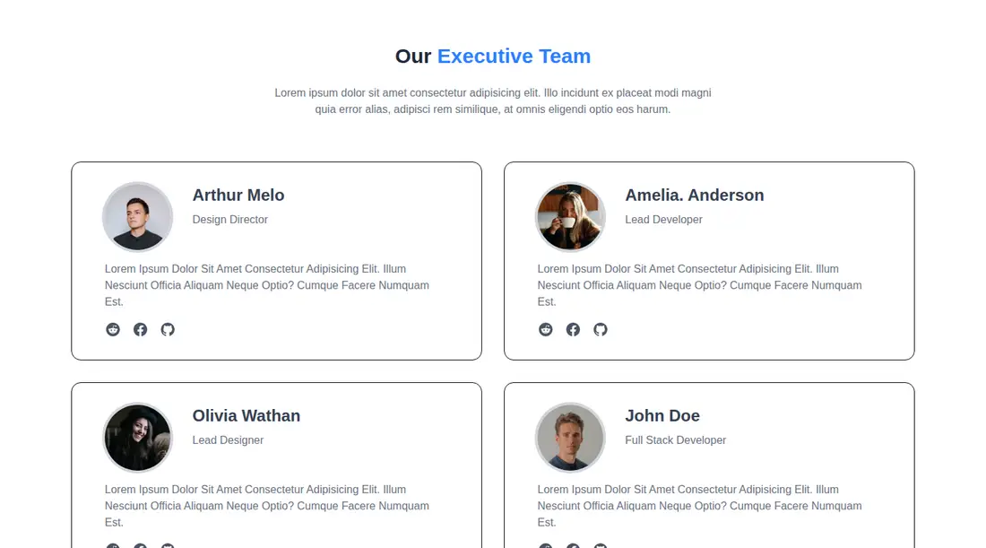
Measured
Every value below was written by the harness on the run that produced the frames above. None of it is derived from the prose.
| Build | OK |
|---|---|
| Mount | OK |
| Console errors | 0 |
| Uncaught page errors | 0 |
| Horizontal overflow | clean at 375, 768, 1440 |
| Axe critical | 0 |
| Axe serious | 0 |
| Axe moderate | 0 |
| Axe minor | 0 |
| Gzip marginal | 20.7 KB (86.1 KB build, 65.4 KB baseline) |
| Bare mode | OK |
| Provider required | NO |
| Demo used | none |
Verdict
A sound static starting point for a small team section. It builds and mounts cleanly, adapts across the tested layouts, and avoids runtime dependencies. Use it when Tailwind is already present, but replace the sample copy, remote portraits, placeholder links, and ambiguous clickable-card styling before release.
Use it if
- You need a compact leadership or staff showcase with a short bio and social links per person.
- Your site already uses Tailwind CSS and can reuse its responsive and dark-mode utility classes.
- A static markup block is preferable to adding a component runtime or UI package.
Skip it if
- Your roster is driven by a CMS or API and you want reusable data-backed cards without refactoring repeated markup.
- Your project does not use Tailwind CSS and translating the utility-heavy styling would outweigh the value of the layout.
- You need production-ready interactions immediately, since the social URLs are placeholders and the clickable card styling has no card-level action.
- You require meaningful portrait alternatives or richer staff-profile semantics without an accessibility content pass.
Install
| Declared dependencies | none declared |
|---|---|
| Missing on install | none |
| Bare install | builds and mounts without the shadcn-style helpers |
| Provider | no provider required in the harness |
Add Tailwind CSS and configure it to scan this markup. Copy the section into your page, retain or adapt the dark-mode strategy, replace the remote portrait URLs and placeholder links, and keep the inline SVG icons or swap them for your existing icon set. No shadcn setup, provider, or JavaScript package is required.
Source and credit
This page is a review, not a copy. The component source lives with its author and this site does not republish it. Read the license before you use anything.
Author repository
github.com/merakiui/merakiuiAlternatives
Other published entries for the team pattern, ordered by what they measured: mounts first, then clean axe scans, then bare-mode passes, then the smaller bundle.
- hyperui-team-3editorial
- Renders
- YES
- A11y
- 0
- Gzip
- 17.4KB
- Bare
- pass
- Prov
- NO
- meraki-team-side-by-sideminimal-flat
- Renders
- YES
- A11y
- 0
- Gzip
- 17.9KB
- Bare
- pass
- Prov
- NO
- meraki-team-simpleminimal-flat
- Renders
- YES
- A11y
- 0
- Gzip
- 17.9KB
- Bare
- pass
- Prov
- NO
- hyperui-team-1editorial
- Renders
- YES
- A11y
- 0
- Gzip
- 18.1KB
- Bare
- pass
- Prov
- NO
- hyperui-team-2editorial
- Renders
- YES
- A11y
- 0
- Gzip
- 18.2KB
- Bare
- pass
- Prov
- NO
- meraki-team-backgroundminimal-flat
- Renders
- YES
- A11y
- 0
- Gzip
- 20.5KB
- Bare
- pass
- Prov
- NO