Measured entry
meraki-testimonials-full-page-cards
A full-screen testimonial composition with a split-color backdrop, heading, card grid, avatar imagery, dark-mode classes, and arrow controls. It ships as a complete HTML document styled with Tailwind utilities loaded from the CDN, uses remote Unsplash images, and includes no JavaScript behavior or package dependencies.
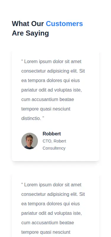
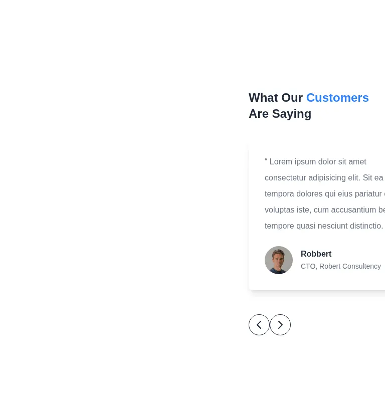
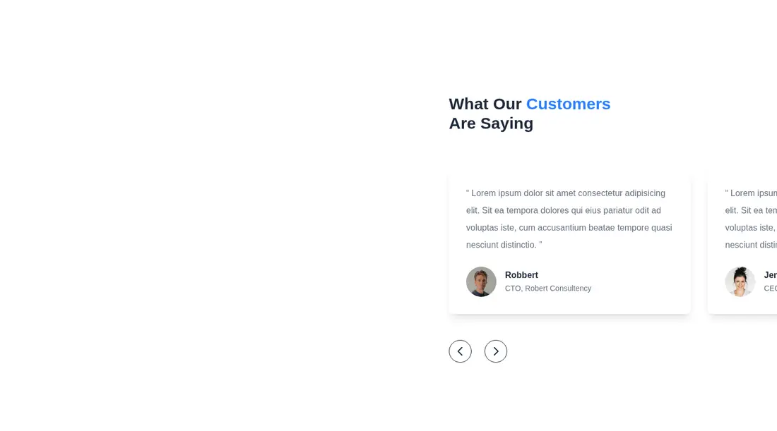
Measured
Every value below was written by the harness on the run that produced the frames above. None of it is derived from the prose.
| Build | OK |
|---|---|
| Mount | OK |
| Console errors | 0 |
| Uncaught page errors | 0 |
| Horizontal overflow | clean at 375, 768, 1440 |
| Axe critical | 0 |
| Axe serious | 0 |
| Axe moderate | 0 |
| Axe minor | 0 |
| Gzip marginal | 18.7 KB (84.1 KB build, 65.4 KB baseline) |
| Bare mode | OK |
| Provider required | NO |
| Demo used | none |
Verdict
A dependable static starting point with clean mounting, responsive containment, and no detected accessibility violations. The oversized composition is visually distinctive, but the arrows are only controls in appearance and the breakpoint-driven card hiding makes it a poor fit for teams expecting a complete testimonial carousel.
Use it if
- You need a spacious testimonial section that can take over a landing-page viewport.
- Your project already uses Tailwind and you are comfortable replacing sample copy and remote avatars.
- You want a static layout and plan to connect the arrow controls to your own carousel logic.
Skip it if
- You need working carousel navigation out of the box, since the arrow buttons do not change cards.
- Every testimonial must remain visible at each breakpoint, since the template hides selected cards responsively.
- You need a compact section that fits naturally between other page content rather than occupying the viewport.
- Your content policy forbids externally hosted profile images.
Install
| Declared dependencies | none declared |
|---|---|
| Missing on install | none |
| Bare install | builds and mounts without the shadcn-style helpers |
| Provider | no provider required in the harness |
Add Tailwind CSS or translate the utility classes into your styling system. Extract the section from the document shell, replace the placeholder copy, host approved avatar assets locally if needed, and add state plus event handling if the arrow controls should navigate testimonials.
Source and credit
This page is a review, not a copy. The component source lives with its author and this site does not republish it. Read the license before you use anything.
Author repository
github.com/merakiui/merakiuiAlternatives
Other published entries for the testimonials pattern, ordered by what they measured: mounts first, then clean axe scans, then bare-mode passes, then the smaller bundle.
- tailark-mist-testimonials-1minimal-flat
- Renders
- YES
- A11y
- 0
- Gzip
- 17.6KB
- Bare
- pass
- Prov
- NO
- meraki-testimonials-sliderminimal-flat
- Renders
- YES
- A11y
- 0
- Gzip
- 18.2KB
- Bare
- pass
- Prov
- NO
- meraki-testimonials-centeredminimal-flat
- Renders
- YES
- A11y
- 0
- Gzip
- 18.4KB
- Bare
- pass
- Prov
- NO
- tailark-veil-testimonials-4minimal-flat
- Renders
- YES
- A11y
- 0
- Gzip
- 23.7KB
- Bare
- pass
- Prov
- NO
- tailark-veil-testimonials-3minimal-flat
- Renders
- YES
- A11y
- 0
- Gzip
- 23.8KB
- Bare
- pass
- Prov
- NO
- tailark-mist-testimonials-4minimal-flat
- Renders
- YES
- A11y
- 0
- Gzip
- 23.9KB
- Bare
- pass
- Prov
- NO