Measured entry
originui-comp-157
A compact review-rating radio filter with an all-reviews option, star rows, visible result counts, and screen-reader labels. It ships as a shadcn registry component built from React, registry-provided Label and RadioGroup primitives, utility classes and theme tokens, plus Remix Icon stars.
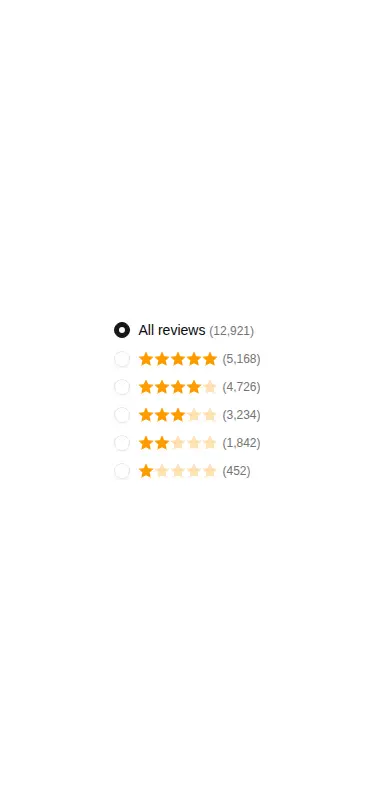

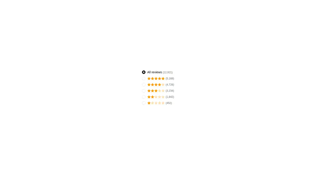
Measured
Every value below was written by the harness on the run that produced the frames above. None of it is derived from the prose.
| Build | OK |
|---|---|
| Mount | OK |
| Console errors | 0 |
| Uncaught page errors | 0 |
| Horizontal overflow | clean at 375, 768, 1440 |
| Axe critical | 0 |
| Axe serious | 0 |
| Axe moderate | 0 |
| Axe minor | 0 |
| Gzip marginal | 37.1 KB (102.5 KB build, 65.4 KB baseline) |
| Bare mode | FAIL |
| Provider required | NO |
| Demo used | written from the component source API |
What the harness recorded
BARE BUILD
✗ Build failed in 3.95s
error during build:
[vite:load-fallback] Could not load <sandbox>/src/lib/utils (imported by src/components/ui/label.tsx): ENOENT: no such file or directory, open '<sandbox>/src/lib/utils'
Verdict
A solid, focused starting point for review filtering, with clean responsive behavior and sensible accessible labels. It needs a shadcn-style setup to build, and real use still requires wiring selection state and replacing the sample counts.
Use it if
- You need a familiar review filter for a product, marketplace or feedback list.
- Your app already uses shadcn-style registry primitives, Tailwind utilities and theme tokens.
- You want native radio-group behavior with labels that expose star values to assistive technology.
Skip it if
- You need a reusable data-driven filter without replacing the embedded labels, counts and choices.
- You need selection to update application state immediately, since the example only supplies an initial value.
- Your design system avoids Remix Icon or shadcn-style utility dependencies for a small filter.
Install
| Declared dependencies | @remixicon/react, radix-ui |
|---|---|
| Missing on install | @remixicon/react |
| Bare install | fails once the shadcn-style helpers are removed, so it needs that setup |
| Provider | no provider required in the harness |
In a non-shadcn project, add React, Remix Icon, the Radix-based Label and RadioGroup primitives, the class-name utility expected at the aliased lib path, matching path aliases, and the Tailwind utilities and theme tokens used by the markup. Then connect the selected value and replace the embedded review data.
Source and credit
This page is a review, not a copy. The component source lives with its author and this site does not republish it. Read the license before you use anything.
Author repository
github.com/origin-space/originuiAlternatives
Other published entries for the radio-group pattern, ordered by what they measured: mounts first, then clean axe scans, then bare-mode passes, then the smaller bundle.
- originui-comp-152minimal-flat
- Renders
- YES
- A11y
- 0
- Gzip
- 36.5KB
- Bare
- fail
- Prov
- NO
- originui-comp-154minimal-flat
- Renders
- YES
- A11y
- 0
- Gzip
- 36.5KB
- Bare
- fail
- Prov
- NO
- originui-comp-153minimal-flat
- Renders
- YES
- A11y
- 0
- Gzip
- 36.7KB
- Bare
- fail
- Prov
- NO
- originui-comp-155minimal-flat
- Renders
- YES
- A11y
- 0
- Gzip
- 36.7KB
- Bare
- fail
- Prov
- NO
- originui-comp-159minimal-flat
- Renders
- YES
- A11y
- 0
- Gzip
- 36.7KB
- Bare
- fail
- Prov
- NO
- originui-comp-158minimal-flat
- Renders
- YES
- A11y
- 0
- Gzip
- 36.9KB
- Bare
- fail
- Prov
- NO