Measured entry
ruixen-card-carousel-hero
hero-effectunclassifiedmotion on file
A client-side Next.js hero that presents a centered headline above a fanned stack of image cards animated with GSAP. It ships as a shadcn registry item and imports the project Card and Button primitives, Tailwind utility classes, the Next Image component, and an alias-based utility used by the Card primitive. The registry also declares Motion, although this component does not import it.
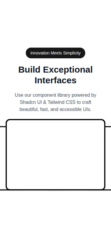
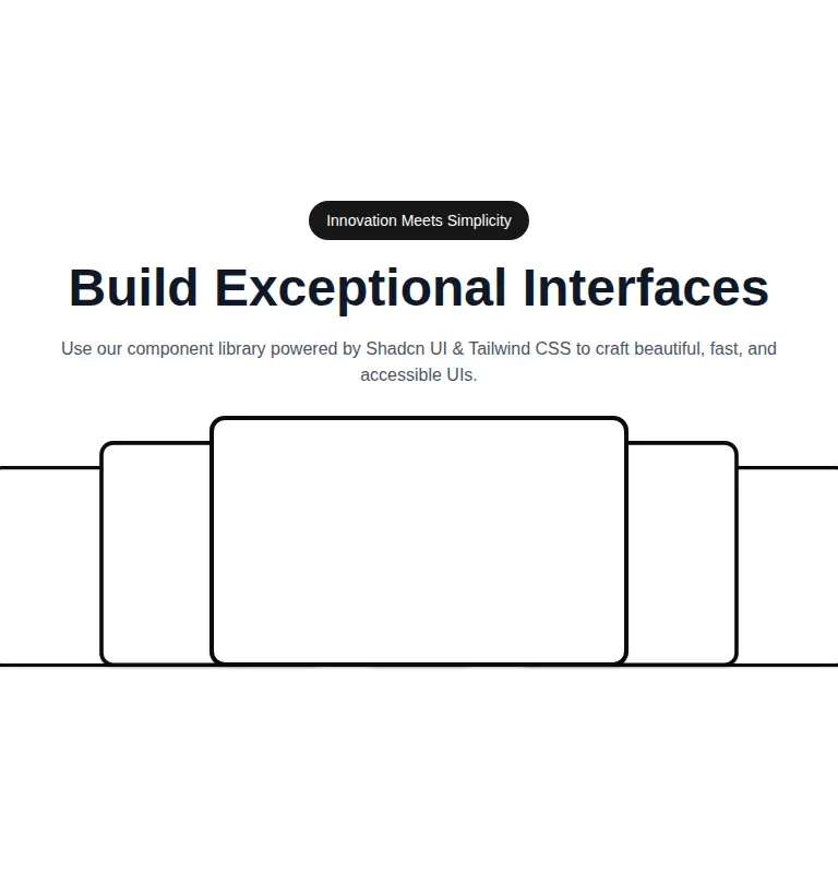
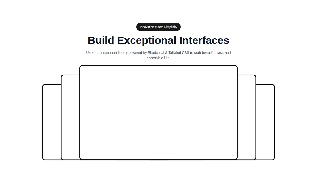
Measured
Every value below was written by the harness on the run that produced the frames above. None of it is derived from the prose.
| Build | OK |
|---|---|
| Mount | OK |
| Console errors | 0 |
| Uncaught page errors | 0 |
| Horizontal overflow | flagged at 375, 768 |
| Axe critical | 0 |
| Axe serious | 0 |
| Axe moderate | 0 |
| Axe minor | 0 |
| Gzip marginal | 63.3 KB (128.7 KB build, 65.4 KB baseline) |
| Bare mode | FAIL |
| Provider required | NO |
| Demo used | written from the component source API |
What the harness recorded
BARE BUILD
✗ Build failed in 32.22s
error during build:
[vite:load-fallback] Could not load <sandbox>/src/lib/utils (imported by src/components/ui/card.tsx): ENOENT: no such file or directory, open '<sandbox>/src/lib/utils'
Verdict
A polished entrance effect, but the source behaves more like a static fanned card display than an interactive carousel. It builds and mounts in the prepared harness, yet it overflows on narrower layouts and needs a shadcn-style setup. Choose it when the visual composition matters more than carousel behavior.
Use it if
- You want a cinematic entrance for a fixed set of promotional image cards beneath hero copy.
- Your Next.js app already uses Tailwind, shadcn primitives, path aliases, and GSAP.
- You are prepared to tune the card spread for narrower layouts.
Skip it if
- You need an actual carousel with navigation, autoplay, gestures, or changing active cards.
- Horizontal overflow on phone and tablet layouts is unacceptable without modification.
- You want a lightweight hero without GSAP and extra registry dependencies.
- Your app is not based on Next.js or cannot use the Next Image component.
Install
| Declared dependencies | motion, gsap, radix-ui |
|---|---|
| Missing on install | gsap |
| Bare install | fails once the shadcn-style helpers are removed, so it needs that setup |
| Provider | no provider required in the harness |
For a non-shadcn project, add Tailwind, GSAP, the Next Image equivalent or an adapted image element, Button and Card primitives, the configured component and library path aliases, and the class-merging utility required by the Card primitive. Remove the unused Motion dependency if your integration does not use it, and revise the layout rules to prevent narrow-screen overflow.
Source and credit
This page is a review, not a copy. The component source lives with its author and this site does not republish it. Read the license before you use anything.
Author repository
github.com/ruixenui/ruixen.comAlternatives
Other published entries for the hero-effect pattern, ordered by what they measured: mounts first, then clean axe scans, then bare-mode passes, then the smaller bundle.
- ruixen-hero-title-animationunclassified
- Renders
- YES
- A11y
- 0
- Gzip
- 18.7KB
- Bare
- pass
- Prov
- NO
- tripled-glassmorphism-hero-block-shadcnuiglassmorphism
- Renders
- YES
- A11y
- 0
- Gzip
- 30.4KB
- Bare
- fail
- Prov
- NO
- cultui-three-d-carousel3d
- Renders
- YES
- A11y
- 0
- Gzip
- 61.2KB
- Bare
- fail
- Prov
- NO
- fancy-circling-elements3d
- Renders
- YES
- A11y
- 0
- Gzip
- 66.5KB
- Bare
- fail
- Prov
- NO
- motion-primitives-spotlightgradient-glow
- Renders
- YES
- A11y
- 0
- Gzip
- 67.8KB
- Bare
- fail
- Prov
- NO
- magicui-hero-video-dialog3d
- Renders
- YES
- A11y
- 0
- Gzip
- 69.6KB
- Bare
- fail
- Prov
- NO