Measured entry
ruixen-drawer-inner-content
badgeunclassifiedmotion on file
A controlled React bottom sheet for grouped action rows, shipped as a client-side registry component. It uses Motion for spring entry, staggered content, and drag-to-dismiss behavior, while relying on inline styles rather than shadcn primitives or utility classes. Icons and open-state handling come from the consuming app.
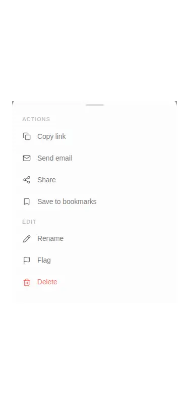
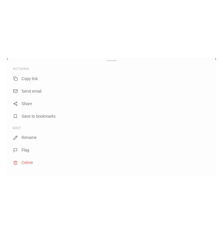
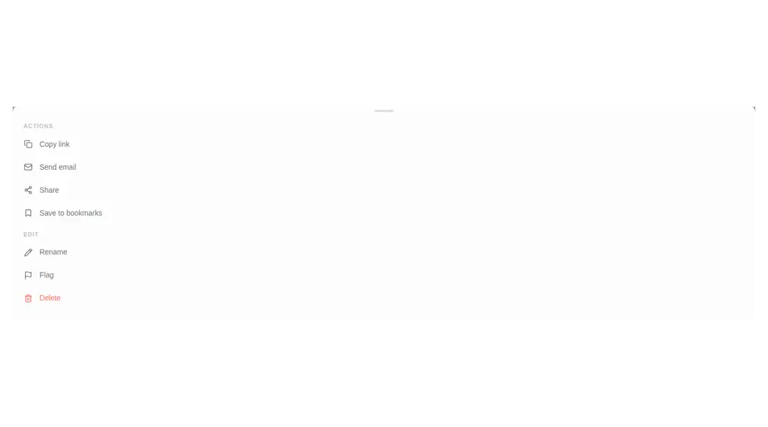
Measured
Every value below was written by the harness on the run that produced the frames above. None of it is derived from the prose.
| Build | OK |
|---|---|
| Mount | OK |
| Console errors | 0 |
| Uncaught page errors | 0 |
| Horizontal overflow | clean at 375, 768, 1440 |
| Axe critical | 0 |
| Axe serious | 1 |
| Axe moderate | 0 |
| Axe minor | 0 |
| Gzip marginal | 65.0 KB (130.5 KB build, 65.5 KB baseline) |
| Bare mode | FAIL |
| Provider required | NO |
| Demo used | written from the component source API |
What the harness recorded
BARE BUILD
✗ Build failed in 169ms
error during build:
[vite]: Rollup failed to resolve import "lucide-react" from "<sandbox>re-a62bec672b96/src/cut/demo.jsx".
Verdict
A polished interaction shell with a small API, successful standalone mounting, and no viewport overflow in the harness. Use it as a visual starting point, but address contrast and replace clickable divs with accessible controls before production.
Use it if
- You need a compact action sheet inside a bounded container.
- You want drag dismissal and animated row entry without adopting a drawer primitive library.
- Your app can supply icons, action callbacks, and controlled open state.
Skip it if
- You need dialog semantics, focus trapping, keyboard dismissal, or screen-reader labeling out of the box.
- You need a portal-backed overlay that reliably escapes clipped or stacked parent containers.
- Your dependency budget cannot justify Motion for a single action sheet.
- You cannot revise the muted text colors that triggered the verified contrast finding.
Install
| Declared dependencies | motion |
|---|---|
| Missing on install | none |
| Bare install | fails once the shadcn-style helpers are removed, so it needs that setup |
| Provider | no provider required in the harness |
Add Motion, copy the client component, and provide React state plus icon nodes and callbacks. No shadcn setup or utility CSS is required. A production integration should also add dialog semantics, focus management, keyboard closing, accessible action controls, and compliant theme colors.
Source and credit
This page is a review, not a copy. The component source lives with its author and this site does not republish it. Read the license before you use anything.
Author repository
github.com/ruixenui/ruixen.comAlternatives
Other published entries for the badge pattern, ordered by what they measured: mounts first, then clean axe scans, then bare-mode passes, then the smaller bundle.
- neu-badgeneumorphism
- Renders
- YES
- A11y
- 0
- Gzip
- 17.5KB
- Bare
- pass
- Prov
- NO
- clay-badgeclaymorphism
- Renders
- YES
- A11y
- 0
- Gzip
- 17.9KB
- Bare
- pass
- Prov
- NO
- ruixen-load-rippleunclassified
- Renders
- YES
- A11y
- 0
- Gzip
- 17.9KB
- Bare
- pass
- Prov
- NO
- kibo-listminimal-flat
- Renders
- YES
- A11y
- 0
- Gzip
- 42.4KB
- Bare
- pass
- Prov
- NO
- ruixen-blurred-stagger-textunclassified
- Renders
- YES
- A11y
- 0
- Gzip
- 58.1KB
- Bare
- pass
- Prov
- NO
- tripled-auto-revealing-heading-shadcnuiminimal-flat
- Renders
- YES
- A11y
- 0
- Gzip
- 58.3KB
- Bare
- pass
- Prov
- NO