Measured entry
ruixen-drum-picker
A client-side React drum picker for choosing one value from a string list by dragging or scrolling a cylindrical wheel. It ships as a shadcn registry component, uses Motion for spring animation, relies on Tailwind utility classes for layout and typography, and can optionally create Web Audio detent clicks.
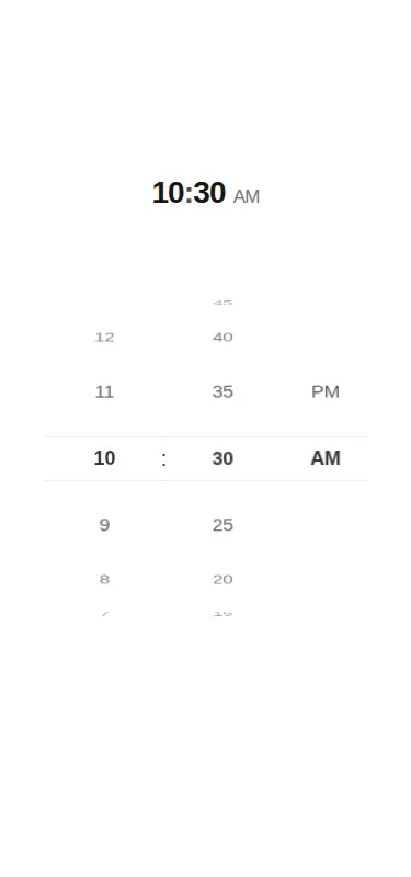
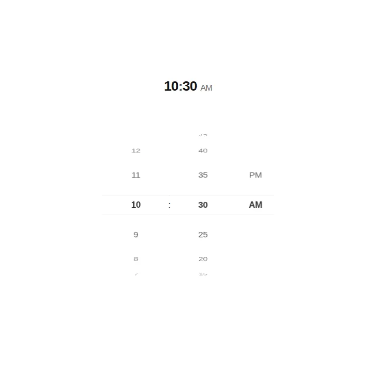
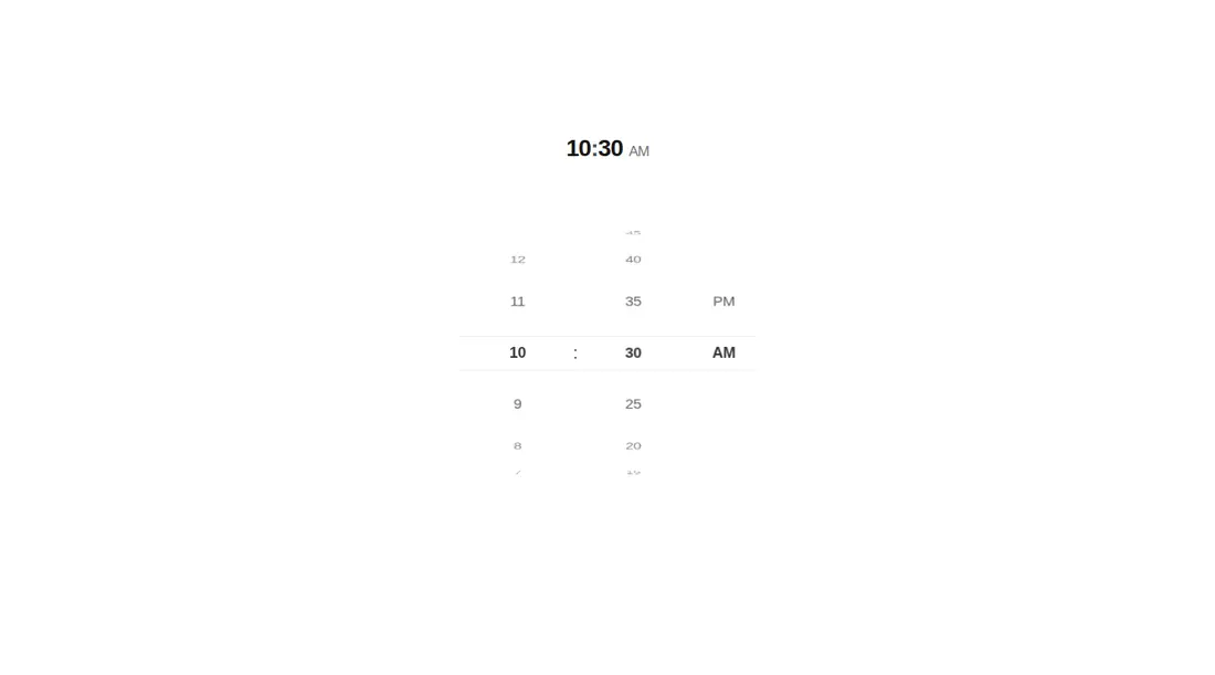
Measured
Every value below was written by the harness on the run that produced the frames above. None of it is derived from the prose.
| Build | OK |
|---|---|
| Mount | OK |
| Console errors | 0 |
| Uncaught page errors | 0 |
| Horizontal overflow | clean at 375, 768, 1440 |
| Axe critical | 0 |
| Axe serious | 1 |
| Axe moderate | 0 |
| Axe minor | 0 |
| Gzip marginal | 62.8 KB (128.3 KB build, 65.5 KB baseline) |
| Bare mode | OK |
| Provider required | NO |
| Demo used | written from the component source API |
Verdict
A polished fit for touch-oriented time and short-list pickers, and it builds and mounts without framework scaffolding. Treat it as a visual interaction primitive, not a finished accessible form control: revise contrast and add focus, keyboard, and selection semantics before production use.
Use it if
- You need a compact wheel selector for bounded choices such as hours, minutes, periods, or short option lists.
- Your interface already uses React, Tailwind, and Motion, and pointer-first interaction fits the surrounding form.
- You want controlled and uncontrolled value handling with optional audible feedback.
Skip it if
- You need a keyboard-complete or screen-reader-native form control without adding semantics and key handling.
- Your accessibility bar cannot accept the current text contrast issue until its fading colors are revised.
- You want a lightweight static select and do not need cylindrical animation, drag behavior, or audio.
- Your option labels are long or numerous enough that a searchable select would be easier to scan.
Install
| Declared dependencies | motion |
|---|---|
| Missing on install | none |
| Bare install | builds and mounts without the shadcn-style helpers |
| Provider | no provider required in the harness |
In a non-shadcn React project, copy the component into a client-rendered module, install Motion, and ensure its Tailwind utility classes are included in your stylesheet build. If Tailwind is absent, replace those utilities with equivalent CSS. Keep the injected theme selectors or adapt them to your dark-mode convention, and disable sound if Web Audio clicks are unsuitable.
Source and credit
This page is a review, not a copy. The component source lives with its author and this site does not republish it. Read the license before you use anything.
Author repository
github.com/ruixenui/ruixen.comAlternatives
Other published entries for the form pattern, ordered by what they measured: mounts first, then clean axe scans, then bare-mode passes, then the smaller bundle.
- hextaui-kbdminimal-flat
- Renders
- YES
- A11y
- 0
- Gzip
- 29.8KB
- Bare
- pass
- Prov
- NO
- shadcn-labelunclassified
- Renders
- YES
- A11y
- 0
- Gzip
- 31.1KB
- Bare
- pass
- Prov
- NO
- neobrutalism-labelbrutalism
- Renders
- YES
- A11y
- 0
- Gzip
- 31.5KB
- Bare
- pass
- Prov
- NO
- neobrutalism-nlabelbrutalism
- Renders
- YES
- A11y
- 0
- Gzip
- 31.5KB
- Bare
- pass
- Prov
- NO
- shadcn-formunclassified
- Renders
- YES
- A11y
- 0
- Gzip
- 43.9KB
- Bare
- pass
- Prov
- NO
- neobrutalism-formbrutalism
- Renders
- YES
- A11y
- 0
- Gzip
- 44.4KB
- Bare
- pass
- Prov
- NO