Measured entry
ruixen-phone-mockup-card
statsunclassifiedmotion on file
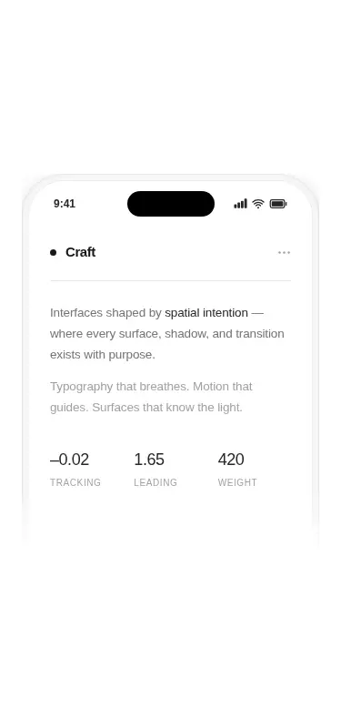
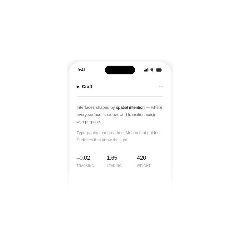
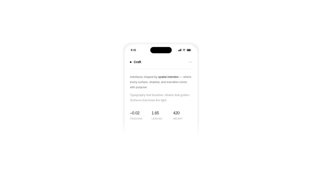
A client-side React card that presents copy and typography metrics inside a cropped phone frame. It ships as a shadcn registry component styled with Tailwind utility classes, animates its entrance with Motion, and uses React Icons for the status bar symbols.
Measured
Every value below was written by the harness on the run that produced the frames above. None of it is derived from the prose.
| Build | OK |
|---|---|
| Mount | OK |
| Console errors | 0 |
| Uncaught page errors | 0 |
| Horizontal overflow | clean at 375, 768, 1440 |
| Axe critical | 0 |
| Axe serious | 0 |
| Axe moderate | 0 |
| Axe minor | 0 |
| Gzip marginal | 60.7 KB (126.1 KB build, 65.4 KB baseline) |
| Bare mode | OK |
| Provider required | NO |
| Demo used | written from the component source API |
Verdict
A polished, focused presentation card that mounts cleanly and adapts without overflow. It is a sensible pick when the phone metaphor fits the page, but its animation and icon dependencies are a meaningful cost for content that is otherwise static.
Use it if
- You need a decorative phone preview for a product, portfolio, or design-system section.
- Your page already uses Tailwind and can accommodate an animated client component.
- You want configurable title, body copy, highlighted text, and metric labels without rebuilding the device frame.
Skip it if
- You need an interactive phone simulator with controls, scrolling, or real application content.
- Your design cannot justify adding Motion and React Icons for a single decorative card.
- You need a complete device outline rather than a frame that deliberately fades and crops near the bottom.
- Your project renders only server components and cannot include a client-side animation boundary.
Install
| Declared dependencies | motion, react-icons |
|---|---|
| Missing on install | none |
| Bare install | builds and mounts without the shadcn-style helpers |
| Provider | no provider required in the harness |
In a non-shadcn project, copy the component into your source tree, install Motion and React Icons, and ensure Tailwind scans the file and provides its neutral palette, dark-mode variant, arbitrary values, mask support, and standard utility classes. The host must support React client components.
Source and credit
This page is a review, not a copy. The component source lives with its author and this site does not republish it. Read the license before you use anything.
Author repository
github.com/ruixenui/ruixen.comAlternatives
Other published entries for the stats pattern, ordered by what they measured: mounts first, then clean axe scans, then bare-mode passes, then the smaller bundle.
- hyperui-stats-1unclassified
- Renders
- YES
- A11y
- 0
- Gzip
- 3.4KB
- Bare
- pass
- Prov
- NO
- hyperui-app-stats-4editorial
- Renders
- YES
- A11y
- 0
- Gzip
- 17.5KB
- Bare
- pass
- Prov
- NO
- tailark-mist-stats-2minimal-flat
- Renders
- YES
- A11y
- 0
- Gzip
- 17.6KB
- Bare
- pass
- Prov
- NO
- tailark-mist-stats-4minimal-flat
- Renders
- YES
- A11y
- 0
- Gzip
- 17.6KB
- Bare
- pass
- Prov
- NO
- tailark-veil-stats-1minimal-flat
- Renders
- YES
- A11y
- 0
- Gzip
- 17.6KB
- Bare
- pass
- Prov
- NO
- hyperui-stats-2editorial
- Renders
- YES
- A11y
- 0
- Gzip
- 17.8KB
- Bare
- pass
- Prov
- NO