Measured entry
ruixen-rotating-gradient-right
background-effectgradient-glowmotion on file
A client-side React marketing section with a rotating conic-gradient glow around a hardcoded progress card beside promotional copy and buttons. It ships as a shadcn registry item with a spin keyframe, uses Tailwind utility classes, imports local shadcn Card and Button primitives, and relies on lucide-react plus the Radix stack used by those primitives.
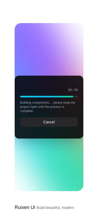
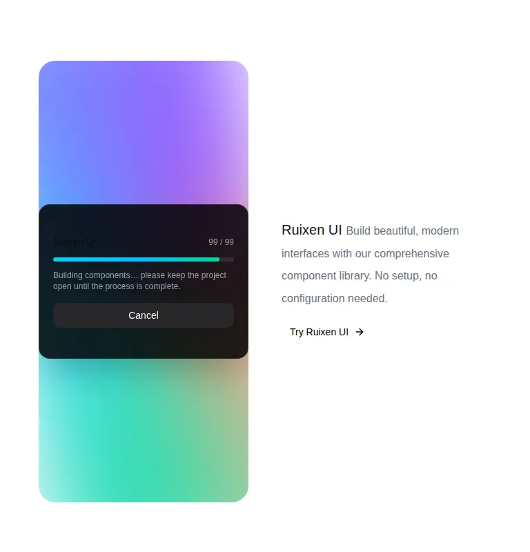
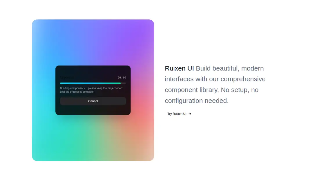
Measured
Every value below was written by the harness on the run that produced the frames above. None of it is derived from the prose.
| Build | OK |
|---|---|
| Mount | OK |
| Console errors | 0 |
| Uncaught page errors | 0 |
| Horizontal overflow | clean at 375, 768, 1440 |
| Axe critical | 0 |
| Axe serious | 0 |
| Axe moderate | 0 |
| Axe minor | 0 |
| Gzip marginal | 30.5 KB (95.9 KB build, 65.4 KB baseline) |
| Bare mode | FAIL |
| Provider required | NO |
| Demo used | written from the component source API |
What the harness recorded
BARE BUILD
✗ Build failed in 37.47s
error during build:
[vite:load-fallback] Could not load <sandbox>/src/lib/utils (imported by src/components/ui/card.tsx): ENOENT: no such file or directory, open '<sandbox>/src/lib/utils'
Verdict
A credible drop-in for a shadcn and Tailwind marketing demo, with responsive behavior and no observed accessibility flags. It is not portable as-is: the bare mount fails because it needs a shadcn-style setup, and teams should wire the actions and reduced-motion behavior before production.
Use it if
- You need a ready-made hero or product-demo section that pairs an animated glow card with supporting copy and calls to action.
- Your app already uses Tailwind, shadcn Card and Button primitives, and the usual source alias.
- You are comfortable replacing the bundled copy and wiring the visual buttons to real behavior.
Skip it if
- You need a reusable background effect that can sit behind arbitrary children, since this component owns the entire section and its content.
- Your motion policy requires reduced-motion handling without source changes, since the gradient spins continuously.
- You want a dependency-light CSS effect for a non-Tailwind codebase.
- You need production-ready actions out of the box, since the bundled buttons have no handlers.
Install
| Declared dependencies | lucide-react, radix-ui |
|---|---|
| Missing on install | none |
| Bare install | fails once the shadcn-style helpers are removed, so it needs that setup |
| Provider | no provider required in the harness |
In a non-shadcn project, add Tailwind and the source alias, provide compatible Card, CardContent, and Button components with their shared class-name utility, install lucide-react and the Radix dependencies those primitives use, and copy the registry spin keyframe into the global styles. Keep the file client-rendered where the framework distinguishes client components.
Source and credit
This page is a review, not a copy. The component source lives with its author and this site does not republish it. Read the license before you use anything.
Author repository
github.com/ruixenui/ruixen.comAlternatives
Other published entries for the background-effect pattern, ordered by what they measured: mounts first, then clean axe scans, then bare-mode passes, then the smaller bundle.
- ruixen-loading-circlegradient-glow
- Renders
- YES
- A11y
- 0
- Gzip
- 17.7KB
- Bare
- pass
- Prov
- NO
- eldora-hacker-backgrounddark-futuristic
- Renders
- YES
- A11y
- 0
- Gzip
- 17.8KB
- Bare
- pass
- Prov
- NO
- ruixen-ripple-circlesgradient-glow
- Renders
- YES
- A11y
- 0
- Gzip
- 17.9KB
- Bare
- pass
- Prov
- NO
- ruixen-dual-tone-rain-backgroundunclassified
- Renders
- YES
- A11y
- 0
- Gzip
- 18.4KB
- Bare
- pass
- Prov
- NO
- cultui-lightboardliquid-glass
- Renders
- YES
- A11y
- 0
- Gzip
- 19.6KB
- Bare
- pass
- Prov
- NO
- ruixen-mouse-sparkunclassified
- Renders
- YES
- A11y
- 0
- Gzip
- 20.6KB
- Bare
- pass
- Prov
- NO