Measured entry
tailark-dusk-stats-1
A dark CRM stats section that pairs a split headline and sales copy with a compact row of key metrics. It ships as a shadcn registry block containing one React component, styled entirely with Tailwind utilities and theme color tokens. It declares no package dependencies and needs no provider.

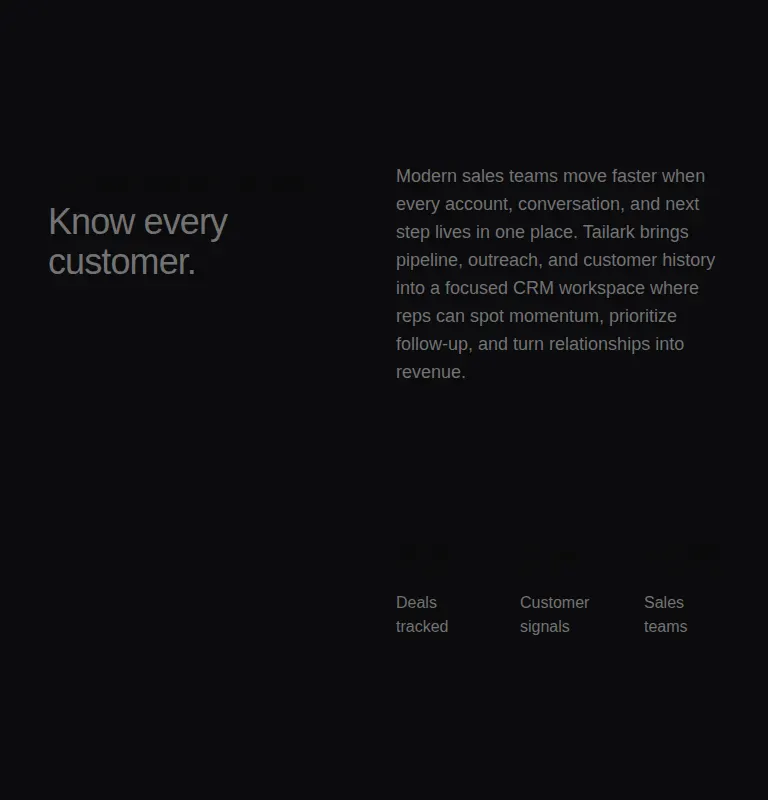
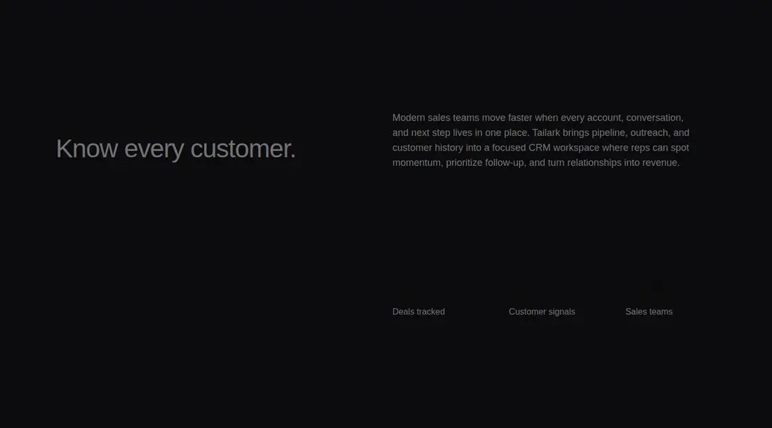
Measured
Every value below was written by the harness on the run that produced the frames above. None of it is derived from the prose.
| Build | OK |
|---|---|
| Mount | OK |
| Console errors | 0 |
| Uncaught page errors | 0 |
| Horizontal overflow | clean at 375, 768, 1440 |
| Axe critical | 0 |
| Axe serious | 1 |
| Axe moderate | 0 |
| Axe minor | 0 |
| Gzip marginal | 17.9 KB (83.3 KB build, 65.4 KB baseline) |
| Bare mode | OK |
| Provider required | NO |
| Demo used | written from the component source API |
Verdict
A clean, low-dependency starting point with sensible responsive stacking and no overflow. The current palette fails an important text contrast check, so it is not ready to ship unchanged. Use it if you can tune the theme colors and replace the generic CRM copy and metrics.
Use it if
- You need a restrained stats section for a dark sales, CRM, or product landing page.
- Your design system already supplies Tailwind foreground, muted foreground, and border colors.
- You want a static content block that can be replaced with real metrics without adding runtime behavior.
Skip it if
- You need charts, animated counters, live data binding, or interactive drill-downs.
- You cannot adjust the supplied dark theme colors to fix the detected text contrast issue.
- Your page needs a denser mobile summary, since the generous vertical spacing makes this block fairly long on a narrow screen.
Install
| Declared dependencies | none declared |
|---|---|
| Missing on install | none |
| Bare install | builds and mounts without the shadcn-style helpers |
| Provider | no provider required in the harness |
In a non-shadcn project, add Tailwind CSS and define equivalents for the foreground and muted foreground theme tokens, plus a suitable default border color. Copy the component into your React codebase; no provider or extra package is required. Verify the final dark palette for readable contrast.
Source and credit
This page is a review, not a copy. The component source lives with its author and this site does not republish it. Read the license before you use anything.
Author repository
github.com/tailark/blocksAlternatives
Other published entries for the stats pattern, ordered by what they measured: mounts first, then clean axe scans, then bare-mode passes, then the smaller bundle.
- hyperui-stats-1unclassified
- Renders
- YES
- A11y
- 0
- Gzip
- 3.4KB
- Bare
- pass
- Prov
- NO
- hyperui-app-stats-4editorial
- Renders
- YES
- A11y
- 0
- Gzip
- 17.5KB
- Bare
- pass
- Prov
- NO
- tailark-mist-stats-2minimal-flat
- Renders
- YES
- A11y
- 0
- Gzip
- 17.6KB
- Bare
- pass
- Prov
- NO
- tailark-mist-stats-4minimal-flat
- Renders
- YES
- A11y
- 0
- Gzip
- 17.6KB
- Bare
- pass
- Prov
- NO
- tailark-veil-stats-1minimal-flat
- Renders
- YES
- A11y
- 0
- Gzip
- 17.6KB
- Bare
- pass
- Prov
- NO
- hyperui-stats-2editorial
- Renders
- YES
- A11y
- 0
- Gzip
- 17.8KB
- Bare
- pass
- Prov
- NO