Measured entry
tripled-ai-response-typing-shadcnui
text-effectminimal-flatmotion on file
A client-side AI response card that reveals text character by character, pauses at punctuation, shows thinking and typing states, and exposes completion and cursor controls. It ships as a shadcn registry component with a button registry dependency, and uses React, Framer Motion, Tailwind utilities, and shadcn color tokens.
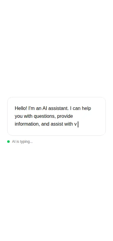
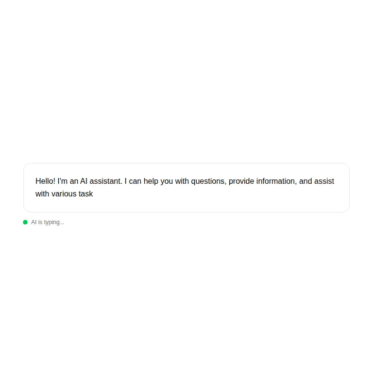
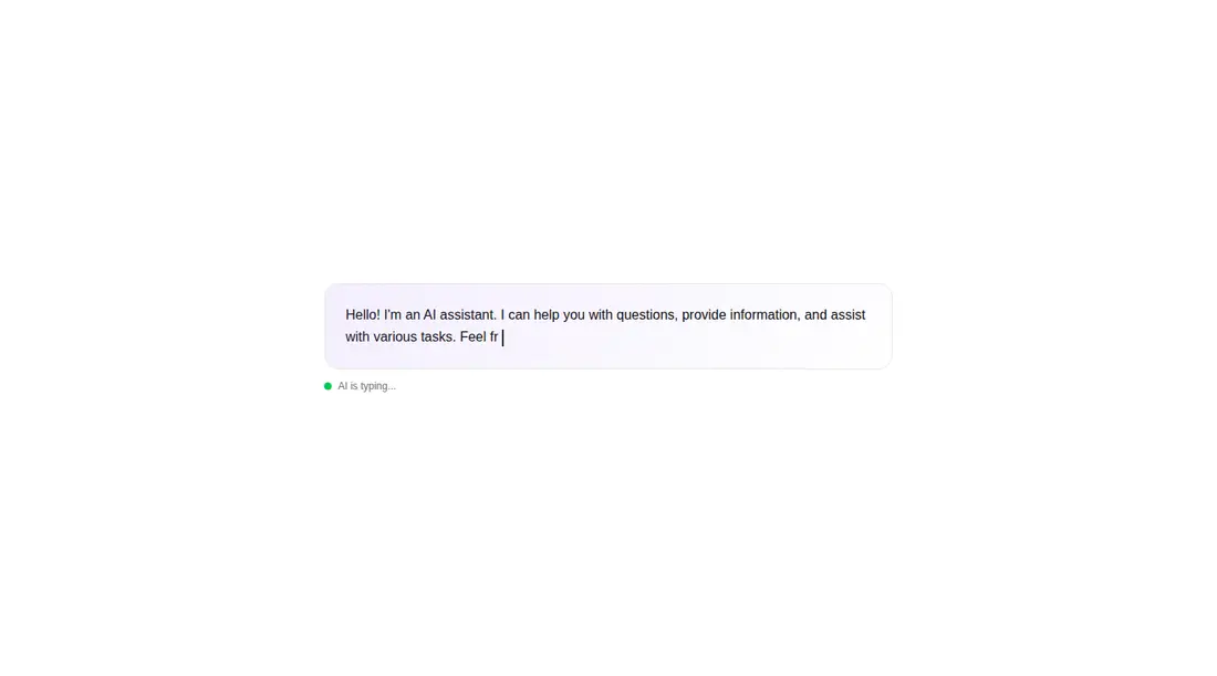
Measured
Every value below was written by the harness on the run that produced the frames above. None of it is derived from the prose.
| Build | OK |
|---|---|
| Mount | OK |
| Console errors | 0 |
| Uncaught page errors | 0 |
| Horizontal overflow | flagged at 375, 768 |
| Axe critical | 0 |
| Axe serious | 0 |
| Axe moderate | 0 |
| Axe minor | 0 |
| Gzip marginal | 59.0 KB (124.4 KB build, 65.4 KB baseline) |
| Bare mode | OK |
| Provider required | NO |
| Demo used | written from the component source API |
Verdict
A credible drop-in for staged AI demos and buffered replies, with clean runtime and accessibility checks. The narrow-layout overflow and relatively costly animation dependency keep it from being an automatic choice for production chat streaming.
Use it if
- You need a self-contained typing treatment for a simulated or buffered assistant reply.
- Your interface already uses Tailwind theme tokens and Framer Motion.
- You want built-in thinking, typing, ready, cursor, and completion states in one component.
Skip it if
- Your chat renders true streamed tokens and should not replay the accumulated response character by character.
- You cannot accept horizontal overflow at phone and tablet widths without adjusting the surrounding layout.
- You need new response text announced to screen readers without adding live-region behavior.
- You want a lightweight text effect without bringing in Framer Motion.
Install
| Declared dependencies | framer-motion, react, radix-ui |
|---|---|
| Missing on install | none |
| Bare install | builds and mounts without the shadcn-style helpers |
| Provider | no provider required in the harness |
In a non-shadcn project, add React and Framer Motion, configure Tailwind, and define equivalents for the card, border, foreground, muted foreground, and primary color tokens. Copy the client component directly; no provider is required. The declared button registry item is not referenced by this source.
Source and credit
This page is a review, not a copy. The component source lives with its author and this site does not republish it. Read the license before you use anything.
Author repository
github.com/moumen-soliman/uitripledAlternatives
Other published entries for the text-effect pattern, ordered by what they measured: mounts first, then clean axe scans, then bare-mode passes, then the smaller bundle.
- uilayouts-randomized-text-effectdark-futuristic
- Renders
- YES
- A11y
- 0
- Gzip
- 17.5KB
- Bare
- pass
- Prov
- NO
- uilayouts-randomized-text-unveildark-futuristic
- Renders
- YES
- A11y
- 0
- Gzip
- 17.7KB
- Bare
- pass
- Prov
- NO
- fancy-scramble-indark-futuristic
- Renders
- YES
- A11y
- 0
- Gzip
- 17.8KB
- Bare
- pass
- Prov
- NO
- magicui-aurora-textaurora-mesh
- Renders
- YES
- A11y
- 0
- Gzip
- 20.7KB
- Bare
- pass
- Prov
- NO
- magicui-highlighterskeuomorphism
- Renders
- YES
- A11y
- 0
- Gzip
- 24.8KB
- Bare
- pass
- Prov
- NO
- fancy-text-along-pathspatial
- Renders
- YES
- A11y
- 0
- Gzip
- 25.7KB
- Bare
- pass
- Prov
- NO