Measured entry
tripled-ai-unlock-animation-shadcnui
background-effectminimal-flatmotion on file
A client-side React unlock confirmation card that animates an activation state into a completed state with ripples, particles, a progress line, and replay control. It ships as a shadcn registry TSX component, uses Framer Motion and React state, and expects Tailwind-style utilities plus shadcn color tokens.
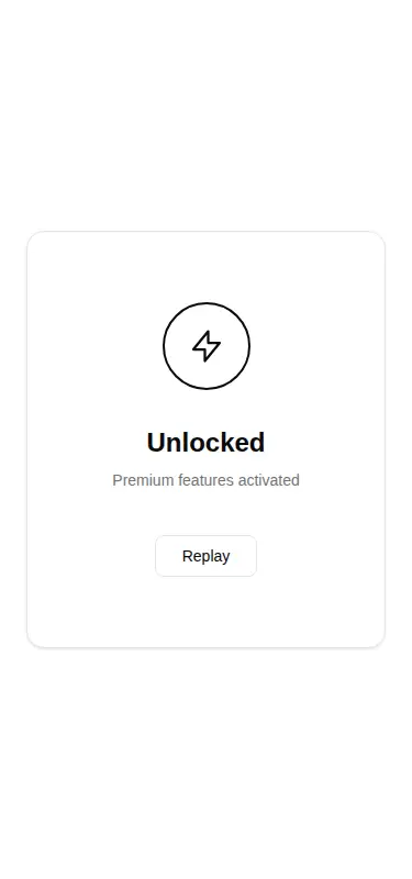
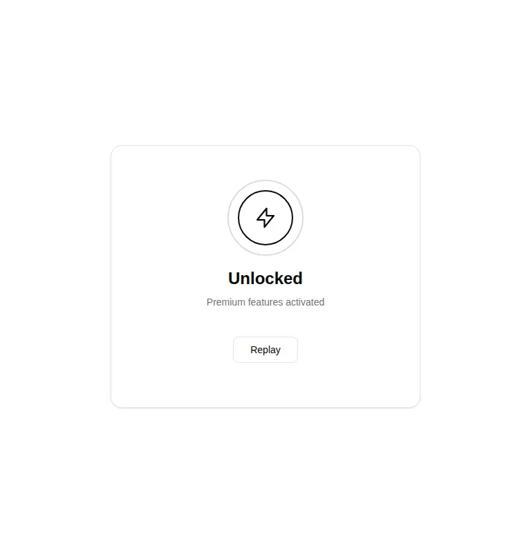
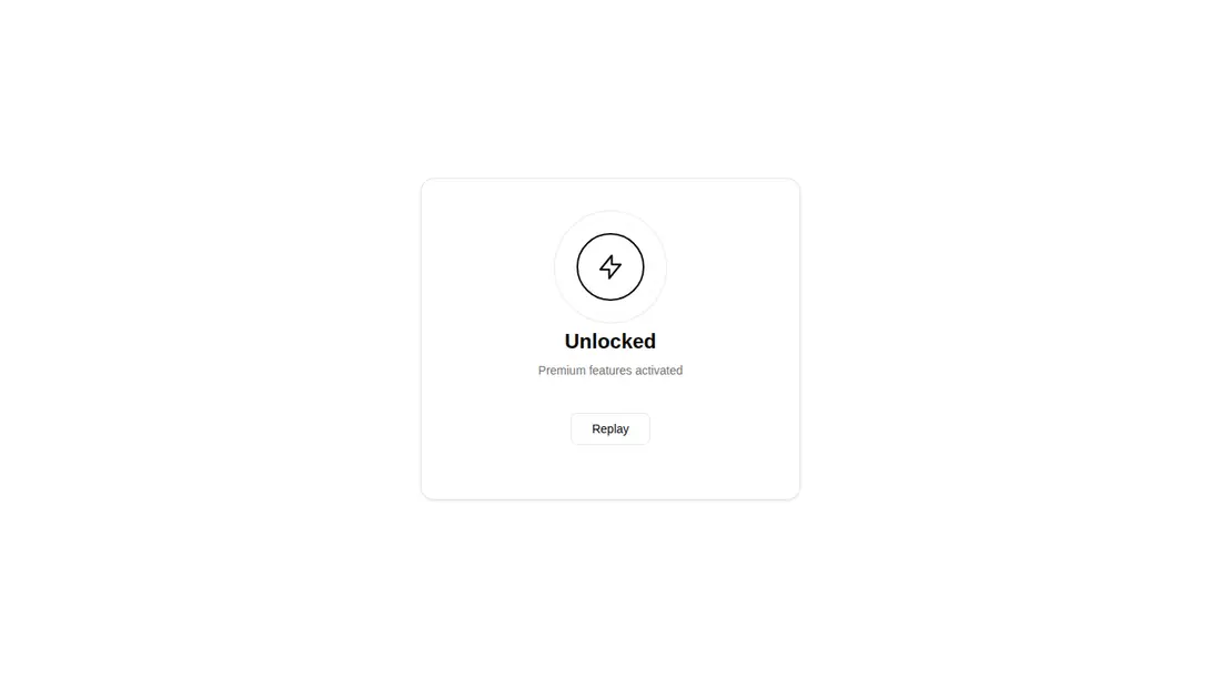
Measured
Every value below was written by the harness on the run that produced the frames above. None of it is derived from the prose.
| Build | OK |
|---|---|
| Mount | OK |
| Console errors | 0 |
| Uncaught page errors | 0 |
| Horizontal overflow | flagged at 375, 768 |
| Axe critical | 0 |
| Axe serious | 0 |
| Axe moderate | 0 |
| Axe minor | 0 |
| Gzip marginal | 60.8 KB (126.2 KB build, 65.4 KB baseline) |
| Bare mode | OK |
| Provider required | NO |
| Demo used | written from the component source API |
Verdict
A convincing desktop confirmation effect that builds and mounts cleanly on its own, but it is not production-ready as-is. Fix its responsive overflow, add reduced-motion handling, and drive completion from the real unlock lifecycle before shipping it.
Use it if
- You need a polished confirmation moment after a user activates access or completes an upgrade.
- Your React app already uses Framer Motion and can map the component's semantic theme classes.
- You are prepared to connect the visual sequence to real activation state instead of relying on its internal timer.
Skip it if
- The card must fit narrow or mid-sized layouts without responsive adjustments, since the captured component overflows there.
- You need reduced-motion behavior out of the box for motion-sensitive users.
- Your completion flow requires a built-in callback or direct integration with an asynchronous unlock operation.
- Adding Framer Motion for one decorative confirmation would be disproportionate to your bundle budget.
Install
| Declared dependencies | framer-motion, react |
|---|---|
| Missing on install | none |
| Bare install | builds and mounts without the shadcn-style helpers |
| Provider | no provider required in the harness |
In a non-shadcn project, add React and Framer Motion, provide Tailwind-compatible utility styling, and define equivalents for the card, border, foreground, background, muted, and accent theme tokens. Ensure the file runs as a client component. No provider is required.
Source and credit
This page is a review, not a copy. The component source lives with its author and this site does not republish it. Read the license before you use anything.
Author repository
github.com/moumen-soliman/uitripledAlternatives
Other published entries for the background-effect pattern, ordered by what they measured: mounts first, then clean axe scans, then bare-mode passes, then the smaller bundle.
- ruixen-loading-circlegradient-glow
- Renders
- YES
- A11y
- 0
- Gzip
- 17.7KB
- Bare
- pass
- Prov
- NO
- eldora-hacker-backgrounddark-futuristic
- Renders
- YES
- A11y
- 0
- Gzip
- 17.8KB
- Bare
- pass
- Prov
- NO
- ruixen-ripple-circlesgradient-glow
- Renders
- YES
- A11y
- 0
- Gzip
- 17.9KB
- Bare
- pass
- Prov
- NO
- ruixen-dual-tone-rain-backgroundunclassified
- Renders
- YES
- A11y
- 0
- Gzip
- 18.4KB
- Bare
- pass
- Prov
- NO
- cultui-lightboardliquid-glass
- Renders
- YES
- A11y
- 0
- Gzip
- 19.6KB
- Bare
- pass
- Prov
- NO
- ruixen-mouse-sparkunclassified
- Renders
- YES
- A11y
- 0
- Gzip
- 20.6KB
- Bare
- pass
- Prov
- NO