Measured entry
tripled-animated-select-shadcnui
selectminimal-flatmotion on file
A client-side React select-like menu shipped as a shadcn registry component. It renders its own button and option panel, using Framer Motion for transitions, Lucide icons, React state, and Tailwind utility classes with theme variables. The registry also requests the shadcn button dependency, though the source does not import it.

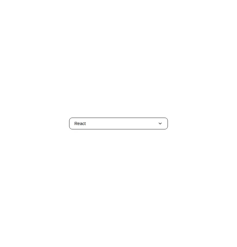
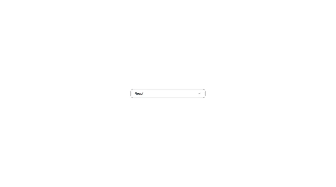
Measured
Every value below was written by the harness on the run that produced the frames above. None of it is derived from the prose.
| Build | OK |
|---|---|
| Mount | OK |
| Console errors | 0 |
| Uncaught page errors | 0 |
| Horizontal overflow | clean at 375, 768, 1440 |
| Axe critical | 0 |
| Axe serious | 0 |
| Axe moderate | 0 |
| Axe minor | 0 |
| Gzip marginal | 60.4 KB (125.8 KB build, 65.4 KB baseline) |
| Bare mode | FAIL |
| Provider required | NO |
| Demo used | written from the component source API |
What the harness recorded
BARE BUILD
✗ Build failed in 995ms
error during build:
[vite]: Rollup failed to resolve import "lucide-react" from "<sandbox>re-073a5368c9e3/src/cut/components/uitripled/animated-select-shadcnui.tsx".
Verdict
It builds and mounts cleanly, stays within its viewport, and passes the automated accessibility scan. It is a tidy animated picker for simple demos or controlled choices, but its button-based menu lacks the interaction depth expected from a production select and brings notable animation overhead.
Use it if
- You need a compact picker for a small, fixed set of choices.
- Your app already ships Framer Motion and Lucide icons.
- You want an animated menu that can be restyled directly with Tailwind classes.
Skip it if
- You need native select behavior, form submission, or mobile platform pickers.
- You require complete keyboard navigation and explicit listbox semantics without extending the component.
- You want to avoid adding an animation dependency for one dropdown.
- Your options are dynamic, searchable, grouped, or loaded remotely.
Install
| Declared dependencies | framer-motion, react, radix-ui |
|---|---|
| Missing on install | none |
| Bare install | fails once the shadcn-style helpers are removed, so it needs that setup |
| Provider | no provider required in the harness |
In a non-shadcn project, add React, Framer Motion, and Lucide React, configure Tailwind for the utility classes, and provide the card background and accent theme tokens. The declared shadcn button dependency is not referenced by this source, so it can be omitted unless your registry workflow requires it.
Source and credit
This page is a review, not a copy. The component source lives with its author and this site does not republish it. Read the license before you use anything.
Author repository
github.com/moumen-soliman/uitripledAlternatives
Other published entries for the select pattern, ordered by what they measured: mounts first, then clean axe scans, then bare-mode passes, then the smaller bundle.
- hextaui-native-selectminimal-flat
- Renders
- YES
- A11y
- 0
- Gzip
- 30.6KB
- Bare
- fail
- Prov
- NO
- 8bitcn-difficulty-selectskeuomorphism
- Renders
- YES
- A11y
- 0
- Gzip
- 32.7KB
- Bare
- fail
- Prov
- NO
- hextaui-checkboxminimal-flat
- Renders
- YES
- A11y
- 0
- Gzip
- 35.8KB
- Bare
- fail
- Prov
- NO
- hextaui-radio-groupminimal-flat
- Renders
- YES
- A11y
- 0
- Gzip
- 40.3KB
- Bare
- fail
- Prov
- NO
- ruixen-tag-cloud-selectunclassified
- Renders
- YES
- A11y
- 0
- Gzip
- 58.8KB
- Bare
- fail
- Prov
- NO
- 8bitcn-theme-selectorskeuomorphism
- Renders
- YES
- A11y
- 0
- Gzip
- 62.1KB
- Bare
- fail
- Prov
- NO