Measured entry
tripled-dynamic-spotlight-cta-shadcnui
ctagradient-glowmotion on file
An animated client-side React hero panel presented as a CTA, with a cursor-following spotlight, ambient particles, gradient lighting, and reduced-motion handling. It ships as a single shadcn registry component and depends on React, Framer Motion, Tailwind utilities, and shadcn-style theme variables.
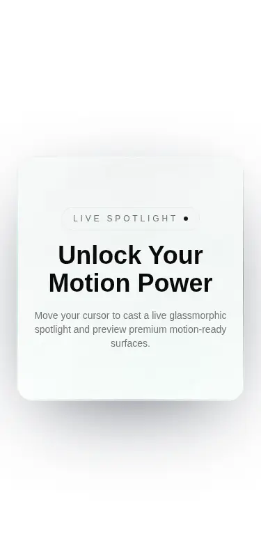
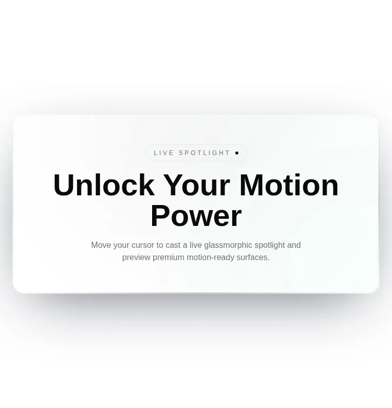
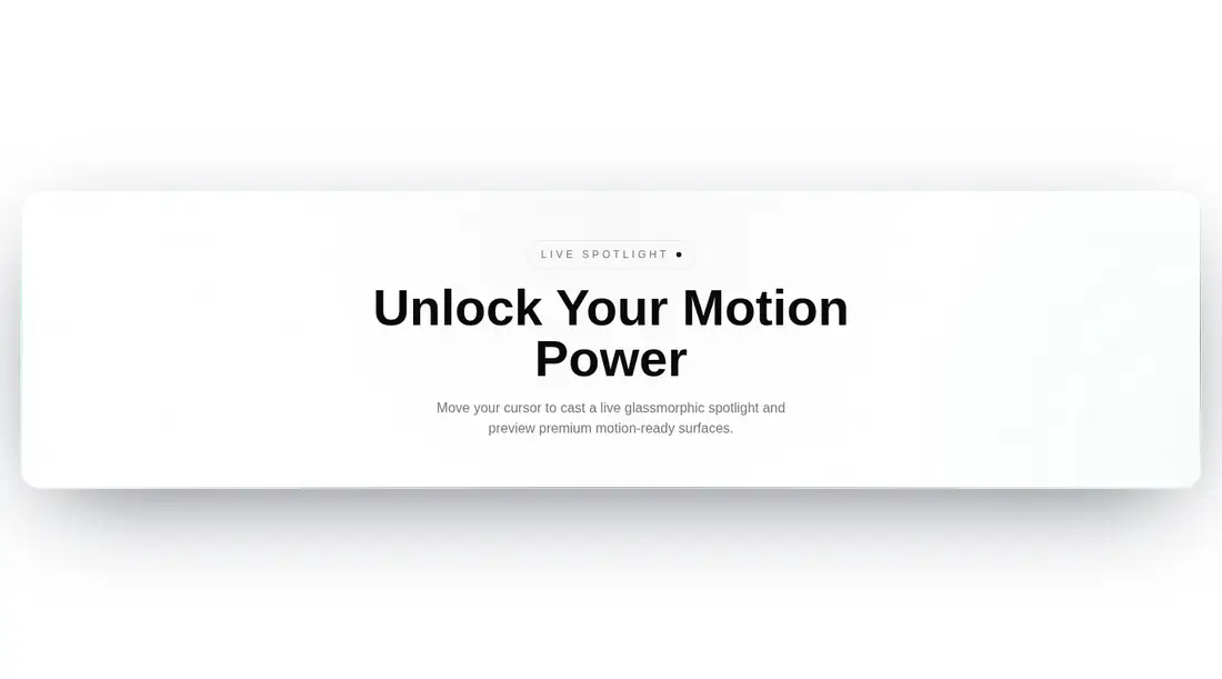
Measured
Every value below was written by the harness on the run that produced the frames above. None of it is derived from the prose.
| Build | OK |
|---|---|
| Mount | OK |
| Console errors | 0 |
| Uncaught page errors | 0 |
| Horizontal overflow | clean at 375, 768, 1440 |
| Axe critical | 0 |
| Axe serious | 0 |
| Axe moderate | 0 |
| Axe minor | 0 |
| Gzip marginal | 64.3 KB (129.7 KB build, 65.4 KB baseline) |
| Bare mode | OK |
| Provider required | NO |
| Demo used | written from the component source API |
Verdict
A polished decorative hero with sensible reduced-motion behavior, but calling it a complete CTA overstates what ships because there is no action control. Use it as an atmospheric headline surface and add a real link or button for conversion.
Use it if
- You need a decorative product or campaign hero that responds to pointer movement.
- Your project already uses Tailwind theme tokens and Framer Motion.
- You can add a separate link or button to turn the display panel into a complete CTA.
Skip it if
- You need a ready-made CTA with an actionable link or button; this component only supplies display copy.
- You do not want to add Framer Motion for one decorative section.
- Your experience is primarily touch-driven, where the cursor spotlight provides little value.
- You require deterministic particle placement during server rendering without modifying the source.
Install
| Declared dependencies | framer-motion, react |
|---|---|
| Missing on install | none |
| Bare install | builds and mounts without the shadcn-style helpers |
| Provider | no provider required in the harness |
A non-shadcn project must add Framer Motion, support Tailwind utility classes, define the referenced card, border, foreground, muted foreground, and primary theme variables, and render the component on the client. Add your own action element if it must function as a CTA.
Source and credit
This page is a review, not a copy. The component source lives with its author and this site does not republish it. Read the license before you use anything.
Author repository
github.com/moumen-soliman/uitripledAlternatives
Other published entries for the cta pattern, ordered by what they measured: mounts first, then clean axe scans, then bare-mode passes, then the smaller bundle.
- meraki-cta-simpleminimal-flat
- Renders
- YES
- A11y
- 0
- Gzip
- 17.7KB
- Bare
- pass
- Prov
- NO
- hyperui-ctas-4editorial
- Renders
- YES
- A11y
- 0
- Gzip
- 17.8KB
- Bare
- pass
- Prov
- NO
- meraki-cta-gridminimal-flat
- Renders
- YES
- A11y
- 0
- Gzip
- 17.8KB
- Bare
- pass
- Prov
- NO
- meraki-cta-formminimal-flat
- Renders
- YES
- A11y
- 0
- Gzip
- 17.9KB
- Bare
- pass
- Prov
- NO
- hyperui-ctas-2editorial
- Renders
- YES
- A11y
- 0
- Gzip
- 18.0KB
- Bare
- pass
- Prov
- NO
- meraki-cta-cardminimal-flat
- Renders
- YES
- A11y
- 0
- Gzip
- 18.0KB
- Bare
- pass
- Prov
- NO