Measured entry
tripled-dynamic-tag-cloud-shadcnui
badgeminimal-flatmotion on file
A client-side React tag cloud shipped as a shadcn registry component. It renders supplied labels as animated pill buttons, uses local hover state and randomized offsets, and depends on Framer Motion plus Tailwind utility classes and shadcn-style color tokens.
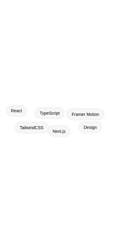
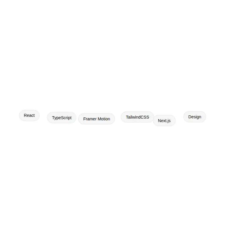
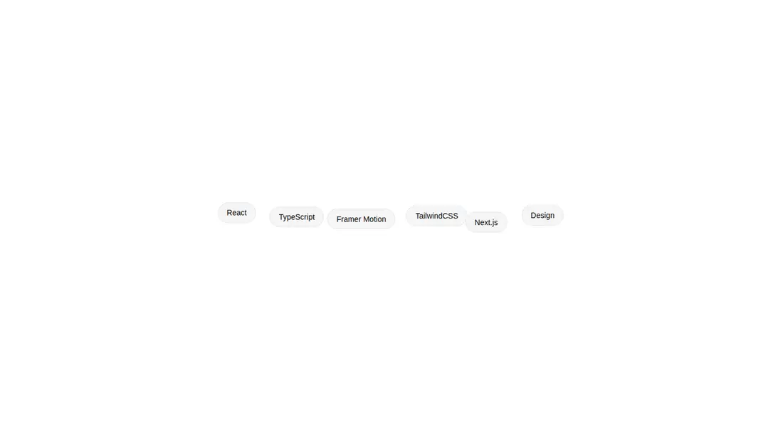
Measured
Every value below was written by the harness on the run that produced the frames above. None of it is derived from the prose.
| Build | OK |
|---|---|
| Mount | OK |
| Console errors | 0 |
| Uncaught page errors | 0 |
| Horizontal overflow | clean at 375, 768, 1440 |
| Axe critical | 0 |
| Axe serious | 0 |
| Axe moderate | 0 |
| Axe minor | 0 |
| Gzip marginal | 61.0 KB (126.4 KB build, 65.4 KB baseline) |
| Bare mode | OK |
| Provider required | NO |
| Demo used | written from the component source API |
Verdict
A tidy, drop-in accent for an existing motion-enabled interface, with clean verified rendering and sensible wrapping. Use it as presentation scaffolding, but add interaction semantics and stabilize the randomized positioning before treating the pills as functional controls.
Use it if
- You want a compact, animated cluster for technologies, topics, or decorative metadata.
- Your interface already uses Framer Motion and Tailwind theme tokens.
- You can provide stable tag identifiers and labels through the component prop.
Skip it if
- You need tags to navigate, filter, or toggle selection without adding behavior yourself.
- You want to avoid a motion library for a small decorative element.
- You require deterministic placement because offsets are regenerated during renders.
- You plan to place it inside a form without first setting explicit button behavior.
Install
| Declared dependencies | framer-motion, react |
|---|---|
| Missing on install | none |
| Bare install | builds and mounts without the shadcn-style helpers |
| Provider | no provider required in the harness |
In a non-shadcn project, add Framer Motion and Tailwind CSS, define equivalents for the border, muted, primary, and primary foreground theme tokens, and copy the client component into your source tree. React must already be available.
Source and credit
This page is a review, not a copy. The component source lives with its author and this site does not republish it. Read the license before you use anything.
Author repository
github.com/moumen-soliman/uitripledAlternatives
Other published entries for the badge pattern, ordered by what they measured: mounts first, then clean axe scans, then bare-mode passes, then the smaller bundle.
- neu-badgeneumorphism
- Renders
- YES
- A11y
- 0
- Gzip
- 17.5KB
- Bare
- pass
- Prov
- NO
- clay-badgeclaymorphism
- Renders
- YES
- A11y
- 0
- Gzip
- 17.9KB
- Bare
- pass
- Prov
- NO
- ruixen-load-rippleunclassified
- Renders
- YES
- A11y
- 0
- Gzip
- 17.9KB
- Bare
- pass
- Prov
- NO
- kibo-listminimal-flat
- Renders
- YES
- A11y
- 0
- Gzip
- 42.4KB
- Bare
- pass
- Prov
- NO
- ruixen-blurred-stagger-textunclassified
- Renders
- YES
- A11y
- 0
- Gzip
- 58.1KB
- Bare
- pass
- Prov
- NO
- tripled-auto-revealing-heading-shadcnuiminimal-flat
- Renders
- YES
- A11y
- 0
- Gzip
- 58.3KB
- Bare
- pass
- Prov
- NO