Measured entry
tripled-gradient-animation-shadcnui
background-effectgradient-glowmotion on file
A client-side React decorative card that cycles through hard-coded linear gradients inside a fixed, rounded rectangle. It ships as a shadcn registry UI file, uses Tailwind utility classes for layout and shape, and relies on Framer Motion for the repeating background transition.
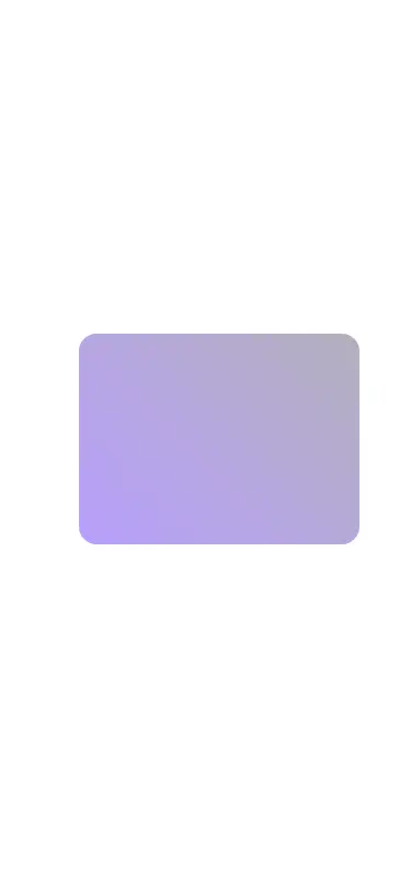
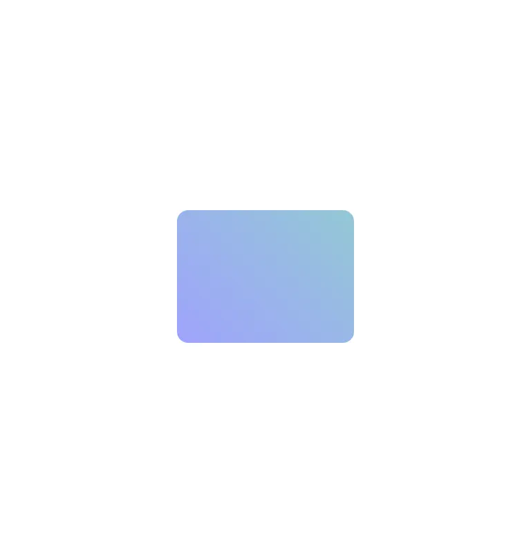
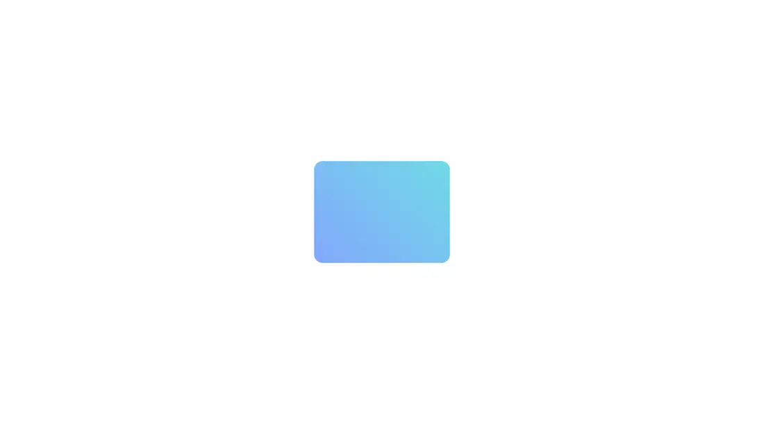
Measured
Every value below was written by the harness on the run that produced the frames above. None of it is derived from the prose.
| Build | OK |
|---|---|
| Mount | OK |
| Console errors | 0 |
| Uncaught page errors | 0 |
| Horizontal overflow | flagged at 375 |
| Axe critical | 0 |
| Axe serious | 0 |
| Axe moderate | 0 |
| Axe minor | 0 |
| Gzip marginal | 58.1 KB (123.5 KB build, 65.4 KB baseline) |
| Bare mode | OK |
| Provider required | NO |
| Demo used | written from the component source API |
Verdict
Use it as a small decorative accent, not a production-ready page background. It mounts without shadcn scaffolding and has clean automated accessibility results, but its narrow-screen overflow, fixed sizing, perpetual motion, and sizable dependency cost warrant adaptation.
Use it if
- You need a compact animated gradient accent inside a hero, empty state, or promotional section.
- Your app already uses Framer Motion and Tailwind, so this component adds little integration work.
- You are prepared to adapt the fixed dimensions and motion behavior to your design system.
Skip it if
- You need a full-bleed background effect rather than a fixed decorative card.
- Your mobile layout cannot tolerate horizontal overflow without additional styling.
- You want to avoid adding Framer Motion for a purely decorative effect.
- You require built-in reduced-motion handling or user controls for perpetual animation.
Install
| Declared dependencies | framer-motion, react |
|---|---|
| Missing on install | none |
| Bare install | builds and mounts without the shadcn-style helpers |
| Provider | no provider required in the harness |
In a non-shadcn app, copy the component into your source tree, ensure React client components are supported, install Framer Motion, and provide Tailwind CSS with the utility classes used by the file. No context provider is required.
Source and credit
This page is a review, not a copy. The component source lives with its author and this site does not republish it. Read the license before you use anything.
Author repository
github.com/moumen-soliman/uitripledAlternatives
Other published entries for the background-effect pattern, ordered by what they measured: mounts first, then clean axe scans, then bare-mode passes, then the smaller bundle.
- ruixen-loading-circlegradient-glow
- Renders
- YES
- A11y
- 0
- Gzip
- 17.7KB
- Bare
- pass
- Prov
- NO
- eldora-hacker-backgrounddark-futuristic
- Renders
- YES
- A11y
- 0
- Gzip
- 17.8KB
- Bare
- pass
- Prov
- NO
- ruixen-ripple-circlesgradient-glow
- Renders
- YES
- A11y
- 0
- Gzip
- 17.9KB
- Bare
- pass
- Prov
- NO
- ruixen-dual-tone-rain-backgroundunclassified
- Renders
- YES
- A11y
- 0
- Gzip
- 18.4KB
- Bare
- pass
- Prov
- NO
- cultui-lightboardliquid-glass
- Renders
- YES
- A11y
- 0
- Gzip
- 19.6KB
- Bare
- pass
- Prov
- NO
- ruixen-mouse-sparkunclassified
- Renders
- YES
- A11y
- 0
- Gzip
- 20.6KB
- Bare
- pass
- Prov
- NO