Measured entry
tripled-native-likes-counter-shadcnui
statsminimal-flatmotion on file
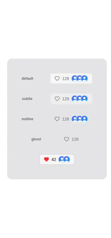
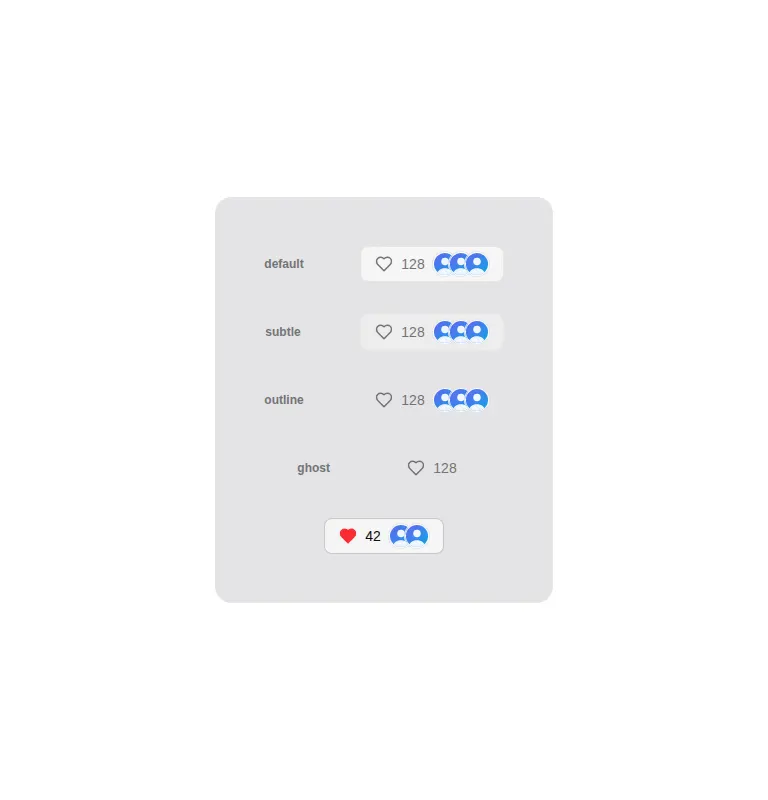
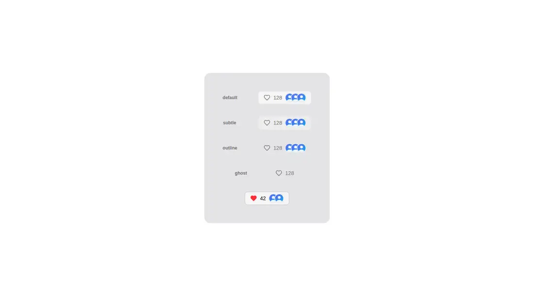
A client-side React likes control that combines an animated heart and count, an avatar stack, and a hover or focus popup listing users. It ships as copy-in TSX from a shadcn registry and relies on Tailwind theme classes, shadcn Avatar and cn helpers, Framer Motion, Lucide icons, and React.
Measured
Every value below was written by the harness on the run that produced the frames above. None of it is derived from the prose.
| Build | OK |
|---|---|
| Mount | OK |
| Console errors | 0 |
| Uncaught page errors | 0 |
| Horizontal overflow | clean at 375, 768, 1440 |
| Axe critical | 0 |
| Axe serious | 1 |
| Axe moderate | 0 |
| Axe minor | 0 |
| Gzip marginal | 77.9 KB (143.4 KB build, 65.5 KB baseline) |
| Bare mode | FAIL |
| Provider required | NO |
| Demo used | written from the component source API |
What the harness recorded
BARE BUILD
✗ Build failed in 845ms
error during build:
[vite]: Rollup failed to resolve import "lucide-react" from "<sandbox>re-55d57359c802/src/cut/components/uitripled/native-likes-counter-shadcnui.tsx".
Verdict
It builds, mounts, and stays contained across the tested layouts, with useful interaction states and reduced-motion handling. Still, the contrast failure needs correction, and the copy-in source omits a direct icon dependency. It needs a shadcn-style setup before it will work in a bare app.
Use it if
- You need one compact control for liking, showing social proof, and previewing who liked an item.
- Your app can persist each interaction through the callback while accepting the component's immediate local count update.
- You already use shadcn theme conventions and can supply user records plus an optional load-more callback.
Skip it if
- You need liked and count values to remain fully controlled or to resync whenever their props change.
- You want a lean static counter without an animation library and avatar primitives.
- You cannot budget time to correct the detected text contrast problem and retest the popup.
- You require a registry item whose declared dependencies cover every direct import.
Install
| Declared dependencies | framer-motion, react, radix-ui, clsx, tailwind-merge |
|---|---|
| Missing on install | none |
| Bare install | fails once the shadcn-style helpers are removed, so it needs that setup |
| Provider | no provider required in the harness |
For a non-shadcn project, add React, Framer Motion, Lucide React, the Radix-backed Avatar primitive, clsx, and tailwind-merge. Provide the cn helper, configure Tailwind, and define the shadcn color, border, ring, background, accent, muted, and popover theme tokens used by the classes.
Source and credit
This page is a review, not a copy. The component source lives with its author and this site does not republish it. Read the license before you use anything.
Author repository
github.com/moumen-soliman/uitripledAlternatives
Other published entries for the stats pattern, ordered by what they measured: mounts first, then clean axe scans, then bare-mode passes, then the smaller bundle.
- hyperui-stats-1unclassified
- Renders
- YES
- A11y
- 0
- Gzip
- 3.4KB
- Bare
- pass
- Prov
- NO
- hyperui-app-stats-4editorial
- Renders
- YES
- A11y
- 0
- Gzip
- 17.5KB
- Bare
- pass
- Prov
- NO
- tailark-mist-stats-2minimal-flat
- Renders
- YES
- A11y
- 0
- Gzip
- 17.6KB
- Bare
- pass
- Prov
- NO
- tailark-mist-stats-4minimal-flat
- Renders
- YES
- A11y
- 0
- Gzip
- 17.6KB
- Bare
- pass
- Prov
- NO
- tailark-veil-stats-1minimal-flat
- Renders
- YES
- A11y
- 0
- Gzip
- 17.6KB
- Bare
- pass
- Prov
- NO
- hyperui-stats-2editorial
- Renders
- YES
- A11y
- 0
- Gzip
- 17.8KB
- Bare
- pass
- Prov
- NO