Measured entry
tripled-notion-blog-page-shadcnui
blog-cardsminimal-flatmotion on file
A client-side React block for a Notion-inspired long-form article, with animated entry, expandable writing tips, supporting cards, and remote editorial images. It ships as a shadcn registry block styled with Tailwind theme tokens and uses Framer Motion, React state, Lucide icons, and the registry's UI dependency.
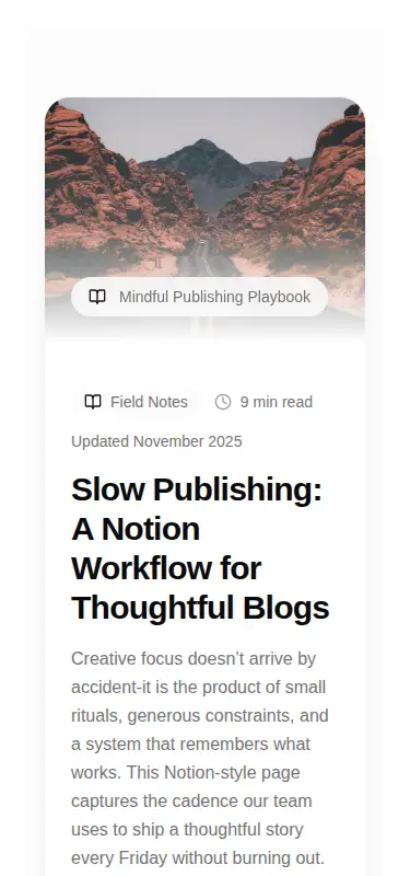
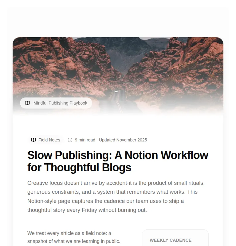
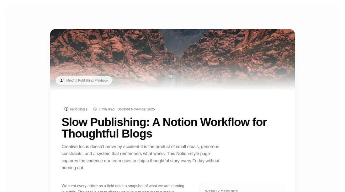
Measured
Every value below was written by the harness on the run that produced the frames above. None of it is derived from the prose.
| Build | OK |
|---|---|
| Mount | OK |
| Console errors | 0 |
| Uncaught page errors | 0 |
| Horizontal overflow | clean at 375, 768, 1440 |
| Axe critical | 0 |
| Axe serious | 1 |
| Axe moderate | 1 |
| Axe minor | 0 |
| Gzip marginal | 64.4 KB (129.8 KB build, 65.4 KB baseline) |
| Bare mode | FAIL |
| Provider required | NO |
| Demo used | written from the component source API |
What the harness recorded
BARE BUILD
✗ Build failed in 1.05s
error during build:
[vite]: Rollup failed to resolve import "lucide-react" from "<sandbox>re-9fcce54053cf/src/cut/components/uitripled/notion-blog-page-shadcnui.tsx".
Verdict
A polished, responsive article-page starter that builds and mounts cleanly, but it is not ready to ship unchanged. Fix the widespread contrast failures and heading-order issue, then replace the embedded copy and remote imagery. The animation dependency is a meaningful cost for mostly decorative motion.
Use it if
- You need a complete editorial landing page rather than a reusable article card.
- Your design system already exposes shadcn-style color tokens and Tailwind utilities.
- Animated disclosure sections and a magazine-like article layout fit the content model.
Skip it if
- You need content sourced from a CMS without first extracting the hard-coded copy and arrays into props.
- Your accessibility bar requires compliant contrast and heading structure before adoption.
- You want a lightweight static article without an animation runtime or client-side state.
- Your image policy forbids third-party Unsplash URLs.
Install
| Declared dependencies | framer-motion, react, radix-ui |
|---|---|
| Missing on install | none |
| Bare install | fails once the shadcn-style helpers are removed, so it needs that setup |
| Provider | no provider required in the harness |
In a non-shadcn project, add Tailwind CSS and define the background, foreground, muted, border, and primary theme tokens used by the classes. Install React, Framer Motion, and Lucide React, preserve the client-component boundary, and allow or self-host the Unsplash images. The declared registry UI dependency can be omitted because this source does not import it.
Source and credit
This page is a review, not a copy. The component source lives with its author and this site does not republish it. Read the license before you use anything.
Author repository
github.com/moumen-soliman/uitripledAlternatives
Other published entries for the blog-cards pattern, ordered by what they measured: mounts first, then clean axe scans, then bare-mode passes, then the smaller bundle.
- hyperui-blog-cards-4editorial
- Renders
- YES
- A11y
- 0
- Gzip
- 17.3KB
- Bare
- pass
- Prov
- NO
- hyperui-blog-cards-2editorial
- Renders
- YES
- A11y
- 0
- Gzip
- 17.5KB
- Bare
- pass
- Prov
- NO
- hyperui-blog-cards-1editorial
- Renders
- YES
- A11y
- 0
- Gzip
- 17.6KB
- Bare
- pass
- Prov
- NO
- hyperui-blog-cards-3editorial
- Renders
- YES
- A11y
- 0
- Gzip
- 17.7KB
- Bare
- pass
- Prov
- NO
- hyperui-blog-cards-7editorial
- Renders
- YES
- A11y
- 0
- Gzip
- 17.8KB
- Bare
- pass
- Prov
- NO
- hyperui-blog-cards-5editorial
- Renders
- YES
- A11y
- 0
- Gzip
- 17.9KB
- Bare
- pass
- Prov
- NO