Measured entry
tripled-spotlight-section-shadcnui
cursor-effectminimal-flatmotion on file
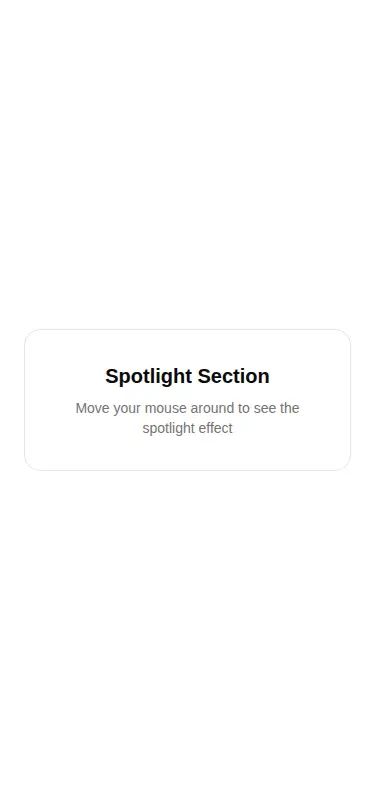
A client-side React container that places arbitrary children over a cursor-following radial glow. It ships as a single shadcn registry TypeScript component, uses Framer Motion values and springs for pointer tracking, and expects Tailwind-style utility classes plus shadcn color tokens for its card, border, and text styling.
Measured
Every value below was written by the harness on the run that produced the frames above. None of it is derived from the prose.
| Build | OK |
|---|---|
| Mount | OK |
| Console errors | 0 |
| Uncaught page errors | 0 |
| Horizontal overflow | clean at 375, 768, 1440 |
| Axe critical | 0 |
| Axe serious | 0 |
| Axe moderate | 0 |
| Axe minor | 0 |
| Gzip marginal | 61.8 KB (127.2 KB build, 65.4 KB baseline) |
| Bare mode | OK |
| Provider required | NO |
| Demo used | written from the component source API |
Verdict
A focused, reusable effect with a clean children-based API and no provider requirement. It is a sensible fit when Framer Motion is already present, but the dependency cost is hard to justify for this effect alone, and non-mouse users receive only the static container.
Use it if
- You want a contained pointer spotlight around hero copy, a callout, or an interactive card.
- Your app already uses Framer Motion and can absorb another client-rendered interaction.
- You need children, glow size, and glow intensity exposed as straightforward component props.
Skip it if
- Your interface must give touch and keyboard users an equivalent interactive effect, since this implementation only responds to mouse movement.
- You are minimizing client JavaScript or do not otherwise use Framer Motion.
- Your design system does not provide the referenced utility classes and theme color tokens, and you do not want to restyle the component.
Install
| Declared dependencies | framer-motion, react |
|---|---|
| Missing on install | none |
| Bare install | builds and mounts without the shadcn-style helpers |
| Provider | no provider required in the harness |
In a non-shadcn project, add React and Framer Motion, ensure the file is compiled as a client component, and replace or provide the Tailwind utility classes and shadcn theme tokens used for the card, border, spacing, radius, and muted text. No context provider is required.
Source and credit
This page is a review, not a copy. The component source lives with its author and this site does not republish it. Read the license before you use anything.
Author repository
github.com/moumen-soliman/uitripledAlternatives
Other published entries for the cursor-effect pattern, ordered by what they measured: mounts first, then clean axe scans, then bare-mode passes, then the smaller bundle.
- tripled-liquid-cursor-shadcnuiliquid-glass
- Renders
- YES
- A11y
- 0
- Gzip
- 21.1KB
- Bare
- pass
- Prov
- NO
- kibo-cursorminimal-flat
- Renders
- YES
- A11y
- 0
- Gzip
- 29.9KB
- Bare
- pass
- Prov
- NO
- tripled-native-typewriterminimal-flat
- Renders
- YES
- A11y
- 0
- Gzip
- 69.9KB
- Bare
- pass
- Prov
- NO
- tripled-native-typewriter-shadcnuiminimal-flat
- Renders
- YES
- A11y
- 0
- Gzip
- 69.9KB
- Bare
- pass
- Prov
- NO
- tripled-native-magneticminimal-flat
- Renders
- YES
- A11y
- 0
- Gzip
- 70.5KB
- Bare
- pass
- Prov
- NO
- tripled-native-magnetic-carbonminimal-flat
- Renders
- YES
- A11y
- 0
- Gzip
- 70.5KB
- Bare
- pass
- Prov
- NO