8bitcn-pricing1
pricing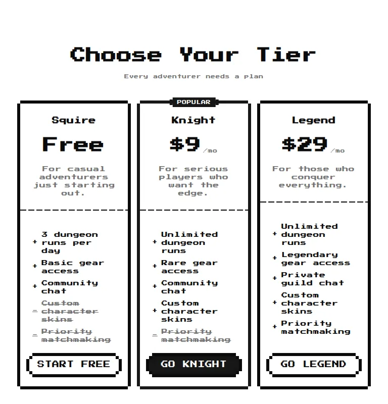
- Renders
- YES
- A11y
- 0
- Gzip
- 34.4KB
- Bare
- fail
skeuomorphismMIT
vibecodng is a measured index of React components for coding agents. Every entry is built, mounted, screenshotted and scanned in the same harness before it gets a verdict, so an agent picking a component reads test results instead of a README. When something fails, the failure is the entry. There are 11 components in here whose only job is to tell you not to use them.
Numbers read from the live index at build time. Snapshot 2026-08-22.
Spec 01
Nine checks, one harness, same treatment for a first-party component and a component from a registry with forty thousand stars.
01
The component is installed into a clean Vite app, built, and mounted against a demo written from its own source API. No mount, no entry.
02
Console errors and uncaught page errors are recorded while the demo runs. A component that mounts and then shouts still gets the shout written down.
03
Screenshots at 375, 768 and 1440 with a horizontal overflow check on each. The screenshots are the specimen photos you see below.
04
Any viewport where the document scrolls sideways is flagged on the record. It is the single most common thing that breaks a component on a phone.
05
An axe scan runs on the mounted demo. Critical, serious, moderate and minor findings are summed. A zero means the recorded demo was clean, not that the component is certified.
06
Gzipped kilobytes over the harness baseline, so the number is what the component itself costs rather than what the app around it costs.
07
A second build and mount with the prepared shadcn-style helpers removed. It answers one question: can you paste this into an app that is not a shadcn app.
08
A missing-provider mount error is recorded separately, because a component that needs a theme or query provider is not broken, it is conditional.
09
Animated entries get a webm capture of the demo running, so a still frame is not the only evidence that something moves.
Harness results are controlled measurements, not production QA. They do not replace testing a component inside your own app. The point is that the numbers exist at all, and that they are the same numbers for every entry.
Spec 02
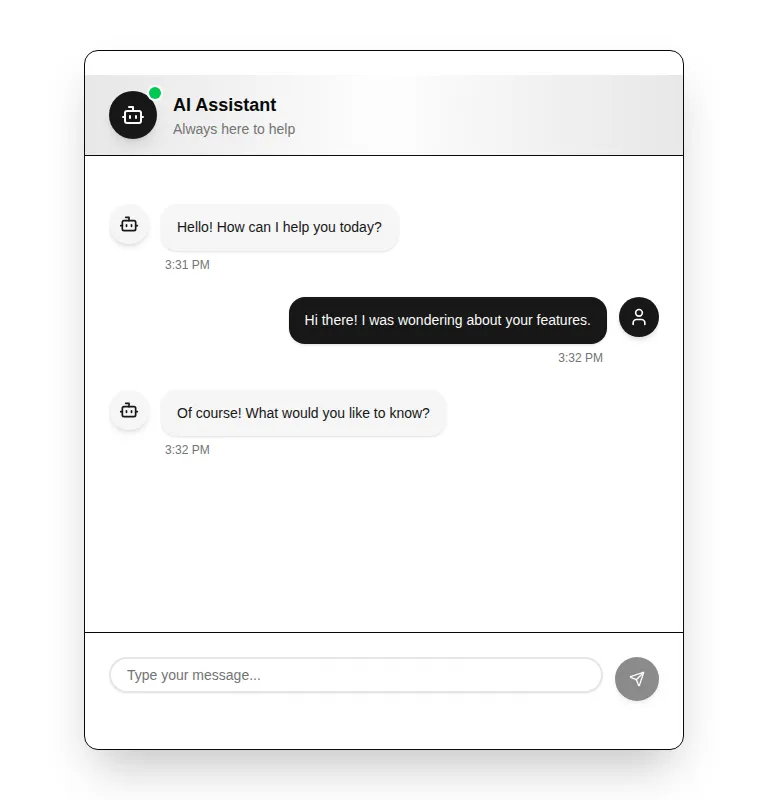
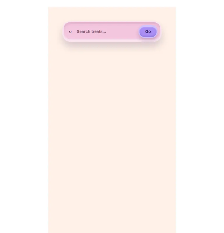
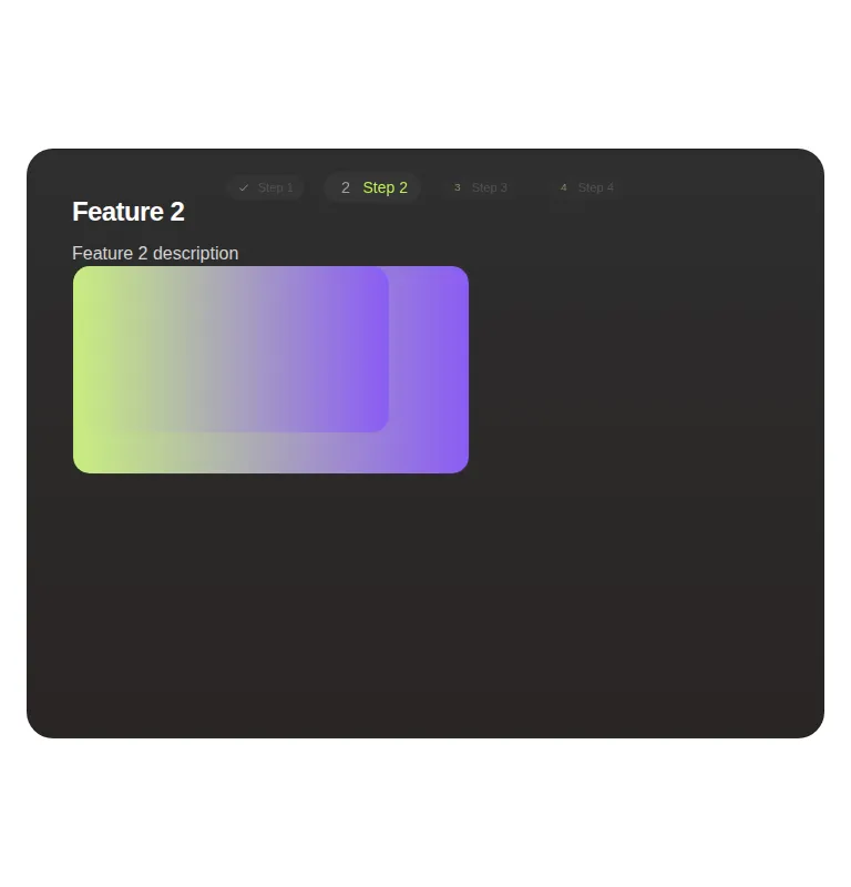
Six entries pulled from the index. The picture is the harness screenshot at 768. The strip under it is the record.
skeuomorphismMIT

dark-futuristicMIT
minimal-flatMIT

spatialMIT
claymorphismMITfirst partyoverflow flagged
liquid-glassMIT
A bare cross means the component did not build once the shadcn-style helpers were taken away. That is not a verdict against it. It is the setup cost, written down before you pay it.
Spec 03
Full pages built out of index entries, one per style and one per common site shape.
The component index answers one question at a time. The public template library answers the bigger one: what a whole page looks like when it is assembled only from entries that passed. Each template is a working Vite build, not a screenshot, and each one ships with a provenance table listing which index entry every block came from and what that entry measured.
Styles in the index, with published counts
246 published entries carry no style label yet. They are counted here because leaving them out would make the taxonomy look tidier than it is.
Browse public template librarySource + downloadSpec 04
We ship our own audit. If we will not publish the receipts for our own homepage, the index is worth nothing.
This page is first party. The CSS is written for it, the React is written for it, and the only runtime dependencies are react and react-dom. There is no component library under it and no UI package to credit. What we did take from the index is structure: six patterns whose behaviour we copied by hand rather than installed. Below is each source entry with what the harness measured on it, and then this page with the same measurement applied to itself.
| Source entry | Pattern | What we took | Mount | Axe | Gzip | Bare | License |
|---|---|---|---|---|---|---|---|
| neobrutalism-card | card | Hard border plus offset shadow, used by the specimen cards | OK | 0 | 29.6 KB | OK | MIT |
| neobrutalism-table | table | Two pixel rule table with an inverting row hover, used by this table | OK | 0 | 29.8 KB | OK | MIT |
| neobrutalism-badge | badge | Bordered uppercase chip, used by the style list and status tags | OK | 0 | 31.3 KB | FAIL | MIT |
| neobrutalism-navigation-menu | navbar | Divided header bar, used by the masthead | OK | 1 | 43.9 KB | FAIL | MIT |
| neobrutalism-button | button | Offset action block, used by the two links on this page | OK | 0 | 31.7 KB | FAIL | MIT |
| motion-primitives-in-view | scroll-effect | Once-only intersection reveal, used by every section | OK | 0 | 58.1 KB | OK | MIT |
| vibecodng.com homepage | first party | Everything else on this page | OK | 0 | 76.3 KB | OK | not published |
Read the gzip column carefully. The six source entries are measured as marginal cost over the harness baseline, which is how every entry in the index is measured. The last row is different: it is every JavaScript and CSS file this site ships, gzipped together, measured by a script that runs after the build and stamps the number into the row you are reading. Images, videos and the prerendered HTML are not counted in it, because those are paid per route rather than by everyone. The axe column on that row is a real scan: the same axe-core build the index uses runs against this page and five gallery routes after every build, with the scroll reveals forced open so the whole document is in view. A serious or critical finding fails the build. Bare mode fails for three of the six source patterns where they live. We adapted them instead of installing them, so this page carries none of that setup cost, which is exactly the trade the bare column exists to expose.
Viewport check, 375 / 768 / 1440clean at 375, 768, 1440
Spec 05
should-i-render is a read-only MCP server that answers component-fit questions with verdicts and harness facts instead of trusting source marketing.
The free beta is open. Use the hosted endpoint for the live index, or run the npm snapshot locally with no account, database or network access. Both expose nine read-only tools and clamp text responses to roughly 500 tokens so the agent spends its context on your code.
Hosted keys include 100 measured tool calls per UTC day. No card or email required.
Offline snapshot — free forever
{
  "mcpServers": {
    "should-i-render": {
      "command": "npx",
      "args": ["-y", "should-i-render@latest"]
    }
  }
}find_component(task, pattern?, style?, palette?)Ranks up to three fits across the prose, pattern, style and measured results. Pass a palette slug and it appends that palette as CSS variables.
check_component(name)Returns the full verdict for one entry, its skip conditions, and the measured strip.
alternatives(name)Ranks other candidates that solve the same pattern.
install_plan(name)Dependencies, bare-harness gaps, provider requirements, setup notes, license and author credit.
skip_list(pattern, style?)Puts the explicit failure warnings and the worst measured offenders first, so an agent can rule things out before it picks.
palette_pick(mood?)One to three curated palettes with hex roles and a copyable CSS variable block. Every text-on-surface pair is checked at WCAG AA.
find_template(task, category?, style?)Ranks complete page starters for a product or business task and keeps failed accessibility audits out of recommendations.
check_template(name)Returns one template’s stack, license, audit status, preview, source, download and available palette builds.
template_plan(name, palette?)Gives the exact clone and setup steps, optionally selecting a ready-built palette preview.
The offline snapshot remains free. Future paid plans will cover live freshness, higher quotas and team policy workflows; the free beta does not silently enroll you in billing.