Measured entry
8bitcn-game-features1
feature-gridskeuomorphismmotion on file
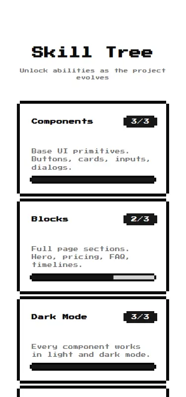
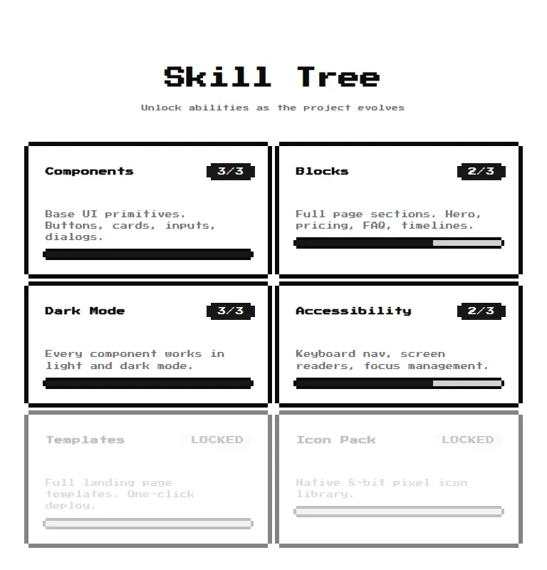
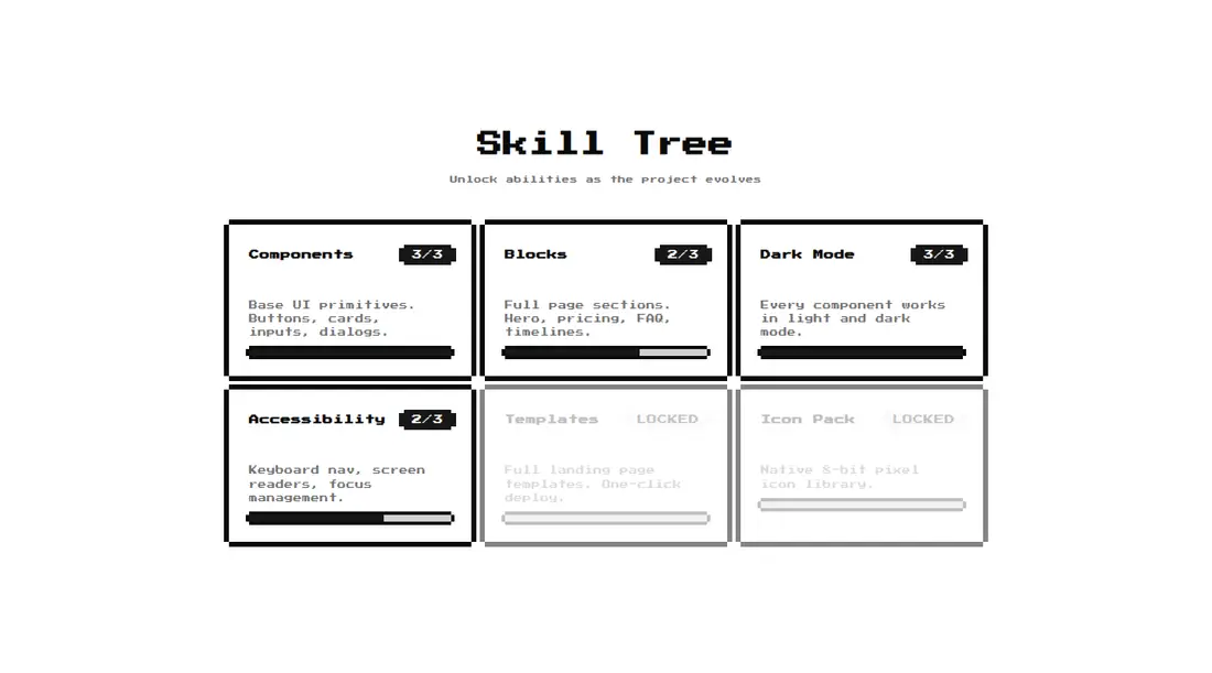
A pixel-art skill-tree feature grid shipped as a shadcn registry block. It renders configurable skills as cards with locked states, level badges, and progress bars. The source depends on React, Tailwind utilities and theme tokens, path aliases, a cn helper, shadcn card and badge primitives, Radix Progress, class-variance-authority, and a remotely loaded display font.
Measured
Every value below was written by the harness on the run that produced the frames above. None of it is derived from the prose.
| Build | OK |
|---|---|
| Mount | OK |
| Console errors | 0 |
| Uncaught page errors | 0 |
| Horizontal overflow | clean at 375, 768, 1440 |
| Axe critical | 0 |
| Axe serious | 1 |
| Axe moderate | 0 |
| Axe minor | 0 |
| Gzip marginal | 34.4 KB (99.8 KB build, 65.4 KB baseline) |
| Bare mode | FAIL |
| Provider required | NO |
| Demo used | written from the component source API |
What the harness recorded
BARE BUILD
✗ Build failed in 1.07s
error during build:
[vite]: Rollup failed to resolve import "class-variance-authority" from "<sandbox>re-4c96c8cb8533/src/components/ui/8bit/badge.tsx".
Verdict
A focused choice for game-like roadmaps, but the published registry item does not currently build because its pixel card wrapper cannot resolve the base shadcn card module. It needs a shadcn-style setup, including the expected aliases and primitives, before it can mount. Avoid it if you need a verified drop-in block.
Use it if
- You are building a game page or product roadmap where features naturally map to unlocked skills and levels.
- Your app already has a shadcn-style component setup with compatible card and badge primitives.
- Your content fits a simple title, description, level, maximum level, and unlocked-state model.
Skip it if
- You need a registry block that builds successfully without repairing its missing base card dependency.
- Your project does not use Tailwind aliases and shadcn conventions, and you do not want to add that scaffold.
- You need interactive progression controls rather than a read-only feature summary.
- Your deployment cannot load the imported Google font or requires all visual assets to be self-hosted.
Install
| Declared dependencies | radix-ui, @radix-ui/react-progress, clsx, tailwind-merge |
|---|---|
| Missing on install | none |
| Bare install | fails once the shadcn-style helpers are removed, so it needs that setup |
| Provider | no provider required in the harness |
In a non-shadcn project, add React and Tailwind theme tokens, configure the source path alias, provide the cn utility, and implement compatible base Card and Badge exports. Also install Radix Progress and class-variance-authority, copy the pixel wrapper components and retro stylesheet, and self-host or permit the imported display font. Verify that the base Card includes every export used by the wrapper.
Source and credit
This page is a review, not a copy. The component source lives with its author and this site does not republish it. Read the license before you use anything.
Author repository
github.com/TheOrcDev/8bitcn-uiAlternatives
Other published entries for the feature-grid pattern, ordered by what they measured: mounts first, then clean axe scans, then bare-mode passes, then the smaller bundle.
- hyperui-feature-grids-3editorial
- Renders
- YES
- A11y
- 0
- Gzip
- 17.7KB
- Bare
- pass
- Prov
- NO
- hyperui-feature-grids-1editorial
- Renders
- YES
- A11y
- 0
- Gzip
- 17.9KB
- Bare
- pass
- Prov
- NO
- hyperui-feature-grids-4editorial
- Renders
- YES
- A11y
- 0
- Gzip
- 17.9KB
- Bare
- pass
- Prov
- NO
- hyperui-feature-grids-2editorial
- Renders
- YES
- A11y
- 0
- Gzip
- 18.3KB
- Bare
- pass
- Prov
- NO
- meraki-feature-grid-list-with-imageminimal-flat
- Renders
- YES
- A11y
- 0
- Gzip
- 18.5KB
- Bare
- pass
- Prov
- NO
- meraki-feature-simpleminimal-flat
- Renders
- YES
- A11y
- 0
- Gzip
- 20.2KB
- Bare
- pass
- Prov
- NO