Measured entry
animata-scroll-reveal
scroll-effectspatialmotion on file
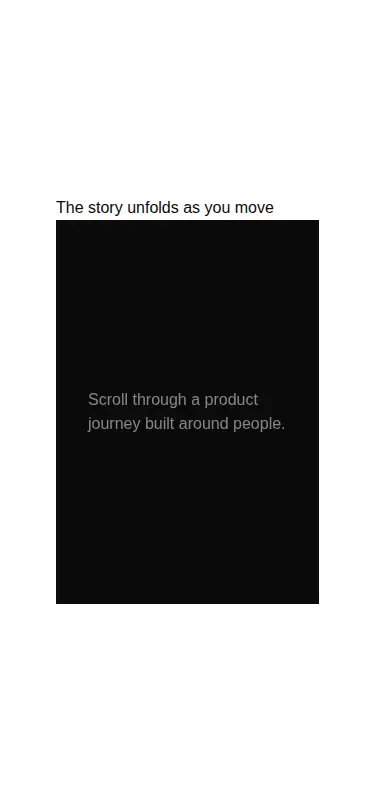
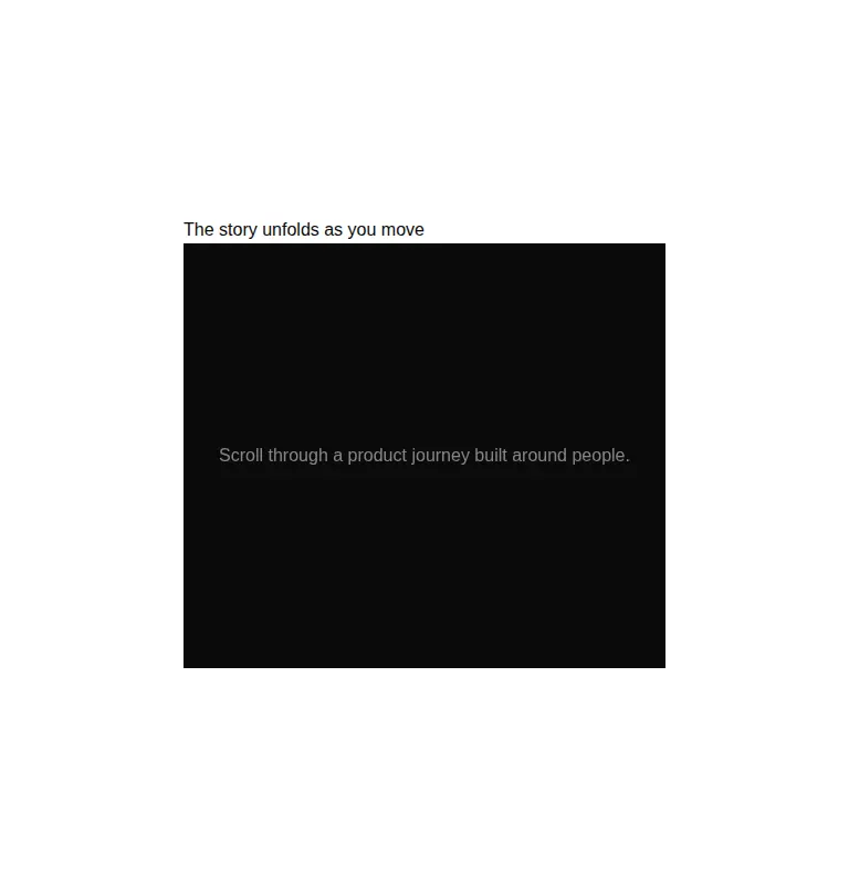
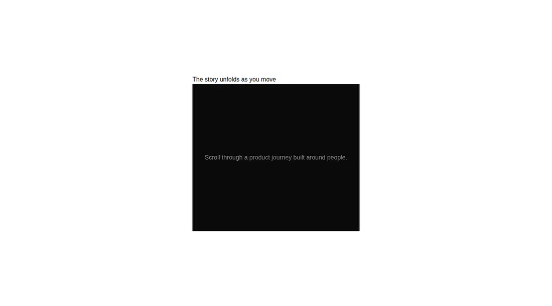
A React text treatment shipped as a shadcn registry TSX component. It creates its own scrollable panel, splits plain text into fragments, and maps panel scroll progress to per-fragment opacity with Motion. Its styling assumes Tailwind theme utilities plus the project cn helper and import alias.
Measured
Every value below was written by the harness on the run that produced the frames above. None of it is derived from the prose.
| Build | OK |
|---|---|
| Mount | OK |
| Console errors | 0 |
| Uncaught page errors | 0 |
| Horizontal overflow | clean at 375, 768, 1440 |
| Axe critical | 0 |
| Axe serious | 0 |
| Axe moderate | 0 |
| Axe minor | 0 |
| Gzip marginal | 67.3 KB (132.7 KB build, 65.4 KB baseline) |
| Bare mode | FAIL |
| Provider required | NO |
| Demo used | written from the component source API |
What the harness recorded
BARE BUILD
✗ Build failed in 30.27s
error during build:
[vite:load-fallback] Could not load <sandbox>/src/lib/utils (imported by src/cut/components/animata/text/scroll-reveal.tsx): ENOENT: no such file or directory, open '<sandbox>/src/lib/utils'
Verdict
A focused effect that builds, mounts, stays within its viewports, and shows no detected accessibility violations in the configured demo. It is best for short, deliberate story beats. It needs a shadcn-style setup and is less suitable as a drop-in for lean or page-scroll-driven sites.
Use it if
- You want copy to brighten progressively as the reader scrolls inside a bounded story panel.
- Your React app already uses Motion, Tailwind theme utilities, and the standard cn helper.
- The content is mostly plain text or simple inline elements that can be revealed as fragments.
Skip it if
- The reveal must follow the page scroll instead of a nested scrolling region.
- You need rich nested markup to reveal word by word, because nested elements are treated as single fragments.
- You are minimizing client-side bundle growth for a single decorative text effect.
- Your design cannot accommodate the component's generated vertical spacer content and fixed-height panel.
Install
| Declared dependencies | none declared |
|---|---|
| Missing on install | none |
| Bare install | fails once the shadcn-style helpers are removed, so it needs that setup |
| Provider | no provider required in the harness |
In a non-shadcn project, add React and Motion, configure Tailwind with the foreground and background theme utilities used here, provide a class-merging cn helper, and either configure the at-sign source alias or replace that import with a local path. Ensure the component runs on the client in frameworks that separate server and client modules.
Source and credit
This page is a review, not a copy. The component source lives with its author and this site does not republish it. Read the license before you use anything.
Author repository
github.com/codse/animataAlternatives
Other published entries for the scroll-effect pattern, ordered by what they measured: mounts first, then clean axe scans, then bare-mode passes, then the smaller bundle.
- reui-scrollspyminimal-flat
- Renders
- YES
- A11y
- 0
- Gzip
- 21.5KB
- Bare
- pass
- Prov
- NO
- kibo-marqueeminimal-flat
- Renders
- YES
- A11y
- 0
- Gzip
- 31.3KB
- Bare
- pass
- Prov
- NO
- motion-primitives-in-viewspatial
- Renders
- YES
- A11y
- 0
- Gzip
- 58.1KB
- Bare
- pass
- Prov
- NO
- tripled-interactive-timeline-shadcnuiminimal-flat
- Renders
- YES
- A11y
- 0
- Gzip
- 58.7KB
- Bare
- pass
- Prov
- NO
- ruixen-container-text-scrollspatial
- Renders
- YES
- A11y
- 0
- Gzip
- 61.5KB
- Bare
- pass
- Prov
- NO
- fancy-parallax-floating3d
- Renders
- YES
- A11y
- 0
- Gzip
- 27.5KB
- Bare
- fail
- Prov
- NO