Measured entry
tripled-interactive-timeline-shadcnui
scroll-effectminimal-flatmotion on file
A client-side vertical timeline whose connector, dots, and content cards reveal as they enter the viewport. It ships as a shadcn registry component, uses React and Framer Motion for refs and animation, and expects Tailwind utilities plus shadcn color tokens. The registry also declares the shadcn button dependency, although the component does not import it.
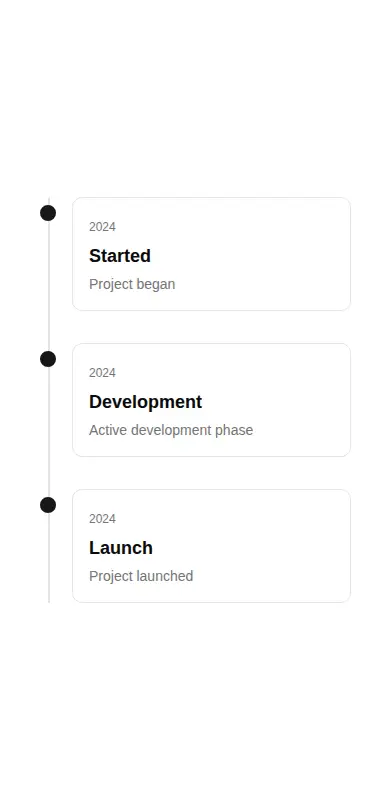
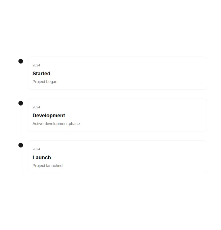
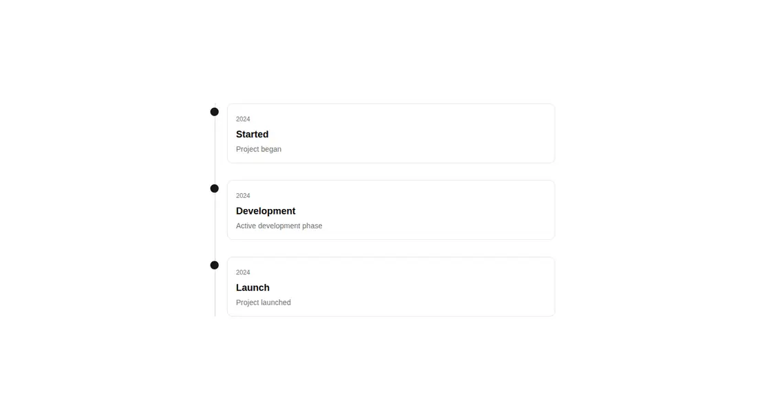
Measured
Every value below was written by the harness on the run that produced the frames above. None of it is derived from the prose.
| Build | OK |
|---|---|
| Mount | OK |
| Console errors | 0 |
| Uncaught page errors | 0 |
| Horizontal overflow | clean at 375, 768, 1440 |
| Axe critical | 0 |
| Axe serious | 0 |
| Axe moderate | 0 |
| Axe minor | 0 |
| Gzip marginal | 58.7 KB (124.1 KB build, 65.4 KB baseline) |
| Bare mode | OK |
| Provider required | NO |
| Demo used | written from the component source API |
Verdict
A focused, editable timeline that builds and mounts cleanly, works in a bare setup, avoids viewport overflow, and raises no automated accessibility violations. The tradeoff is a meaningful animation dependency for a simple layout, plus missing reduced-motion handling and richer timeline semantics.
Use it if
- You need a compact project, release, or company-history timeline with viewport-triggered reveals.
- Your app already uses Framer Motion and shadcn-style Tailwind theme tokens.
- You want to pass simple title, description, and optional date data without adopting a timeline framework.
Skip it if
- You need a semantic ordered history with list and time elements out of the box.
- You must honor reduced-motion preferences without modifying the animation logic.
- You want to avoid adding Framer Motion for a small presentation component.
- You expect very long timelines, since the index-based stagger makes later entries wait progressively longer.
Install
| Declared dependencies | framer-motion, react, radix-ui |
|---|---|
| Missing on install | none |
| Bare install | builds and mounts without the shadcn-style helpers |
| Provider | no provider required in the harness |
In a non-shadcn project, add React and Framer Motion, configure Tailwind for the utility classes, and define equivalents for the primary, border, card, and muted foreground theme tokens. The registry declares the shadcn button dependency even though this source does not use it, so satisfy that registry entry or remove the unused declaration.
Source and credit
This page is a review, not a copy. The component source lives with its author and this site does not republish it. Read the license before you use anything.
Author repository
github.com/moumen-soliman/uitripledAlternatives
Other published entries for the scroll-effect pattern, ordered by what they measured: mounts first, then clean axe scans, then bare-mode passes, then the smaller bundle.
- reui-scrollspyminimal-flat
- Renders
- YES
- A11y
- 0
- Gzip
- 21.5KB
- Bare
- pass
- Prov
- NO
- kibo-marqueeminimal-flat
- Renders
- YES
- A11y
- 0
- Gzip
- 31.3KB
- Bare
- pass
- Prov
- NO
- motion-primitives-in-viewspatial
- Renders
- YES
- A11y
- 0
- Gzip
- 58.1KB
- Bare
- pass
- Prov
- NO
- ruixen-container-text-scrollspatial
- Renders
- YES
- A11y
- 0
- Gzip
- 61.5KB
- Bare
- pass
- Prov
- NO
- fancy-parallax-floating3d
- Renders
- YES
- A11y
- 0
- Gzip
- 27.5KB
- Bare
- fail
- Prov
- NO
- ruixen-animated-linkunclassified
- Renders
- YES
- A11y
- 0
- Gzip
- 29.6KB
- Bare
- fail
- Prov
- NO