Measured entry
clay-checkbox
checkboxclaymorphismfirst party
A single-file React checkbox that ships as a default JSX export with controlled and uncontrolled state support. It uses a native checkbox hidden behind a clay-styled visual control, depends on React for state, and expects Tailwind CSS to supply its utility, peer-state, focus, and arbitrary-value styles.
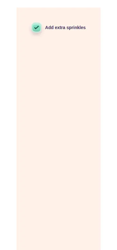
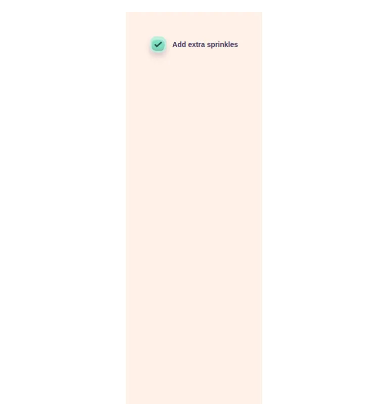
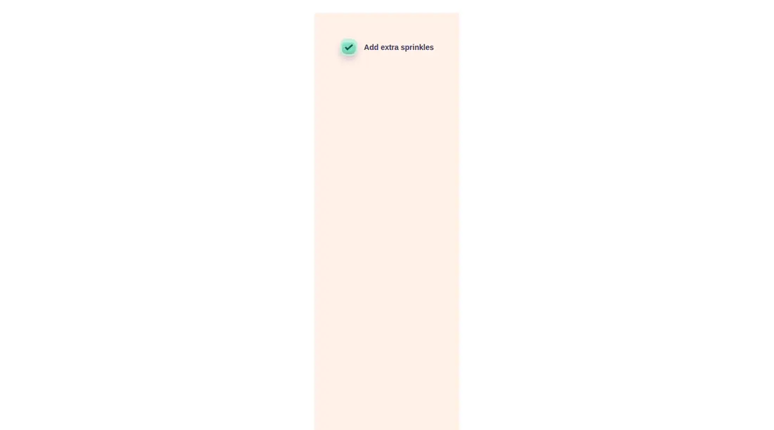
Measured
Every value below was written by the harness on the run that produced the frames above. None of it is derived from the prose.
| Build | OK |
|---|---|
| Mount | OK |
| Console errors | 0 |
| Uncaught page errors | 0 |
| Horizontal overflow | clean at 375, 768, 1440 |
| Axe critical | 0 |
| Axe serious | 0 |
| Axe moderate | 0 |
| Axe minor | 0 |
| Gzip marginal | 18.2 KB (83.6 KB build, 65.4 KB baseline) |
| Bare mode | OK |
| Provider required | NO |
| Demo used | written from the component source API |
Verdict
A dependable, accessible choice for playful Tailwind interfaces: it builds and mounts cleanly, adapts without overflow, and reports no automated accessibility violations. The main tradeoff is a narrow API and heavily hard-coded visual treatment.
Use it if
- You want a playful clay-style checkbox for a Tailwind-based React interface.
- You need the option to manage checked state internally or from a parent component.
- You want a native labeled input with visible keyboard focus and disabled-state styling.
Skip it if
- Your project does not use Tailwind and you do not want to recreate the utility-driven styling.
- Your design system forbids hard-coded colors, shadows, radii, or typography weights.
- You need an indeterminate state or direct support for input attributes such as name, value, or required.
- Your form abstractions expect the standard React change event instead of a boolean-first callback.
Install
| Declared dependencies | none declared |
|---|---|
| Missing on install | none |
| Bare install | builds and mounts without the shadcn-style helpers |
| Provider | no provider required in the harness |
First-party component from the sir-originals set. In a non-shadcn React project, add Tailwind CSS and ensure it scans this JSX file so the peer, focus-visible, screen-reader, transition, and arbitrary-value utilities are generated. Copy the component directly; no provider or shadcn scaffolding is required.
Source and credit
This page is a review, not a copy. The component source lives with its author and this site does not republish it. Read the license before you use anything.
Author repository
mrkeyoor/sir-originalsAlternatives
Other published entries for the checkbox pattern, ordered by what they measured: mounts first, then clean axe scans, then bare-mode passes, then the smaller bundle.
- neu-checkboxneumorphism
- Renders
- YES
- A11y
- 0
- Gzip
- 17.9KB
- Bare
- pass
- Prov
- NO
- shadcn-checkboxunclassified
- Renders
- YES
- A11y
- 0
- Gzip
- 18.4KB
- Bare
- fail
- Prov
- NO
- originui-comp-132minimal-flat
- Renders
- YES
- A11y
- 0
- Gzip
- 32.5KB
- Bare
- fail
- Prov
- NO
- originui-comp-135minimal-flat
- Renders
- YES
- A11y
- 0
- Gzip
- 32.5KB
- Bare
- fail
- Prov
- NO
- originui-comp-140minimal-flat
- Renders
- YES
- A11y
- 0
- Gzip
- 32.5KB
- Bare
- fail
- Prov
- NO
- originui-comp-133minimal-flat
- Renders
- YES
- A11y
- 0
- Gzip
- 32.6KB
- Bare
- fail
- Prov
- NO