Measured entry
clay-toggle
switchclaymorphismfirst party
A self-contained React checkbox styled as a claymorphic toggle, delivered as one JSX component. It supports controlled and uncontrolled state, a label, disabled styling, and change callbacks. It imports only React state, but its appearance depends on Tailwind CSS utilities, including arbitrary values and peer variants.
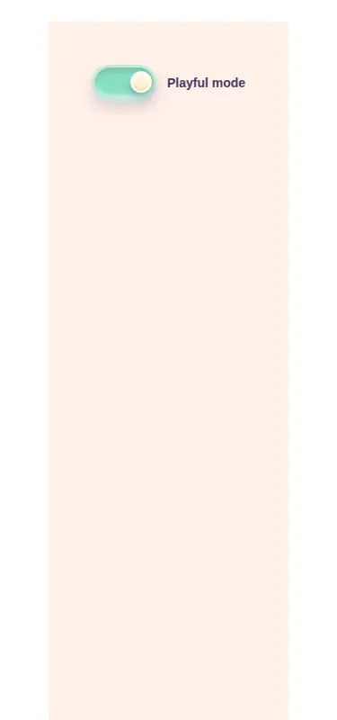
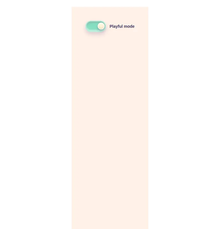
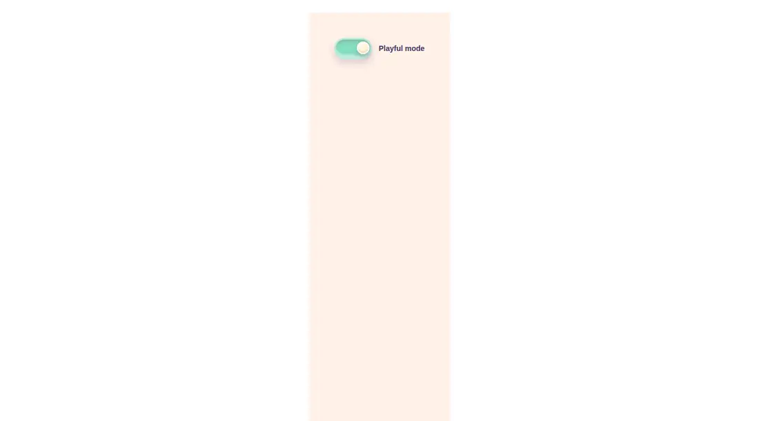
Measured
Every value below was written by the harness on the run that produced the frames above. None of it is derived from the prose.
| Build | OK |
|---|---|
| Mount | OK |
| Console errors | 0 |
| Uncaught page errors | 0 |
| Horizontal overflow | clean at 375, 768, 1440 |
| Axe critical | 0 |
| Axe serious | 0 |
| Axe moderate | 0 |
| Axe minor | 0 |
| Gzip marginal | 18.2 KB (83.6 KB build, 65.4 KB baseline) |
| Bare mode | OK |
| Provider required | NO |
| Demo used | written from the component source API |
Verdict
A sound, focused toggle for playful Tailwind interfaces. It builds and mounts without extra packages or providers, offers sensible state options, and keeps native input behavior. The fixed visual language makes it a selective design fit rather than a neutral system primitive.
Use it if
- You need a labeled on-or-off control that works in either controlled or uncontrolled React forms.
- Your interface already uses Tailwind and can accommodate the component's pastel claymorphism styling.
- You want a dependency-light toggle with visible keyboard focus and native checkbox behavior.
Skip it if
- Your project does not use Tailwind and you do not want to translate the utility classes into CSS.
- Your design system requires theme tokens instead of fixed pastel colors, shadows, and sizing.
- You require assistive technology to announce a switch role rather than a native checkbox.
Install
| Declared dependencies | none declared |
|---|---|
| Missing on install | none |
| Bare install | builds and mounts without the shadcn-style helpers |
| Provider | no provider required in the harness |
First-party component from the sir-originals set. In a non-shadcn React project, add Tailwind CSS and ensure arbitrary values, peer state variants, focus-visible variants, and screen-reader-only utilities are available. Copy the JSX component into the project; no shadcn provider or extra package is required.
Source and credit
This page is a review, not a copy. The component source lives with its author and this site does not republish it. Read the license before you use anything.
Author repository
mrkeyoor/sir-originalsAlternatives
Other published entries for the switch pattern, ordered by what they measured: mounts first, then clean axe scans, then bare-mode passes, then the smaller bundle.
- neu-toggleneumorphism
- Renders
- YES
- A11y
- 0
- Gzip
- 17.8KB
- Bare
- pass
- Prov
- NO
- ruixen-scrub-datetimeunclassified
- Renders
- YES
- A11y
- 0
- Gzip
- 22.2KB
- Bare
- pass
- Prov
- NO
- shadcn-switchunclassified
- Renders
- YES
- A11y
- 0
- Gzip
- 34.4KB
- Bare
- pass
- Prov
- NO
- hextaui-switchminimal-flat
- Renders
- YES
- A11y
- 0
- Gzip
- 34.5KB
- Bare
- pass
- Prov
- NO
- hextaui-tabsminimal-flat
- Renders
- YES
- A11y
- 0
- Gzip
- 39.0KB
- Bare
- pass
- Prov
- NO
- ruixen-animated-theme-togglerunclassified
- Renders
- YES
- A11y
- 0
- Gzip
- 61.8KB
- Bare
- pass
- Prov
- NO