Measured entry
ruixen-scrub-datetime
switchunclassifiedmotion on file
A compact React client component that turns each part of a date and time into a draggable or scrollable text segment, with a clickable AM/PM toggle and optional audio ticks. It ships as shadcn registry source, imports only React, and relies on Tailwind utility classes plus browser pointer, wheel, and audio APIs.

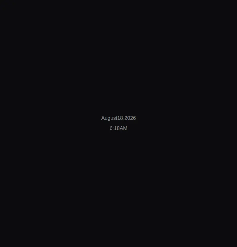
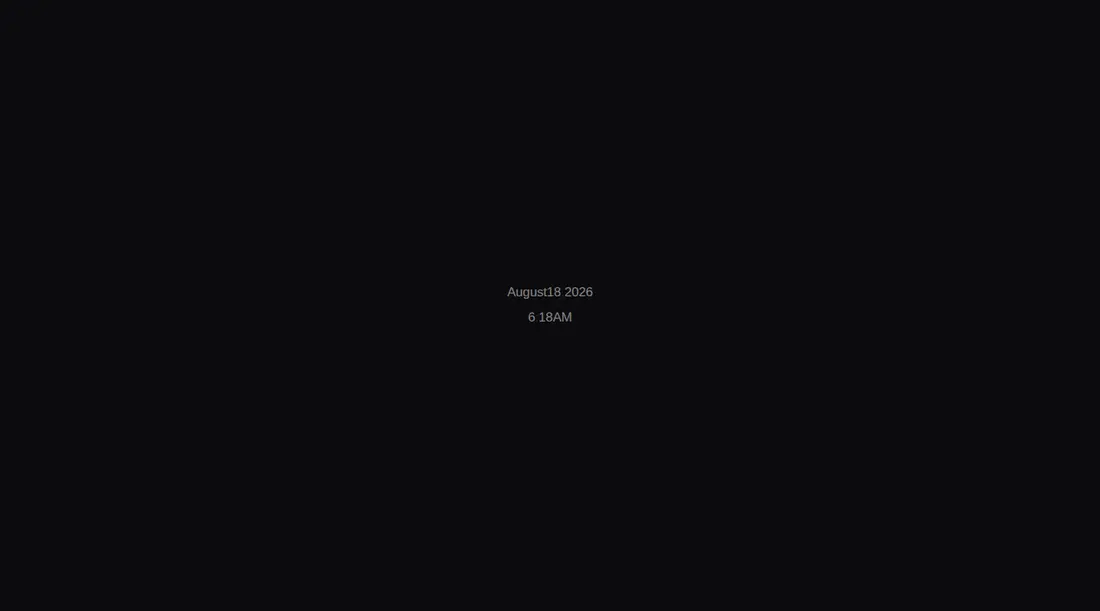
Measured
Every value below was written by the harness on the run that produced the frames above. None of it is derived from the prose.
| Build | OK |
|---|---|
| Mount | OK |
| Console errors | 0 |
| Uncaught page errors | 0 |
| Horizontal overflow | clean at 375, 768, 1440 |
| Axe critical | 0 |
| Axe serious | 0 |
| Axe moderate | 0 |
| Axe minor | 0 |
| Gzip marginal | 22.2 KB (87.7 KB build, 65.5 KB baseline) |
| Bare mode | OK |
| Provider required | NO |
| Demo used | written from the component source API |
Verdict
A clever, focused picker for dark creative tools, but not a general form control. It builds and mounts cleanly without extra packages, yet appeared blank in the harness because the source fixes its text to translucent white. Adopt it only with deliberate surface styling and an accessibility plan.
Use it if
- You need a compact date-time control for a dark, pointer-first interface.
- You want controlled or uncontrolled Date state with month and leap-year clamping.
- Horizontal scrubbing and wheel adjustment fit your users better than a calendar popover.
Skip it if
- The control must be fully operable by keyboard or expose native form semantics.
- It will sit on a light surface without restyling, because its translucent white text can disappear.
- Users need direct typing, a calendar view, timezone selection, or granular validation feedback.
- Default interaction sounds are inappropriate and your integration may forget to disable them.
Install
| Declared dependencies | none declared |
|---|---|
| Missing on install | none |
| Bare install | builds and mounts without the shadcn-style helpers |
| Provider | no provider required in the harness |
In a non-shadcn project, copy the client component into your source tree, ensure React client components and Tailwind utilities are supported, or replace its utility classes with local CSS. Provide a dark parent surface or revise the hard-coded white colors, and disable sound when audio feedback is unwanted.
Source and credit
This page is a review, not a copy. The component source lives with its author and this site does not republish it. Read the license before you use anything.
Author repository
github.com/ruixenui/ruixen.comAlternatives
Other published entries for the switch pattern, ordered by what they measured: mounts first, then clean axe scans, then bare-mode passes, then the smaller bundle.
- neu-toggleneumorphism
- Renders
- YES
- A11y
- 0
- Gzip
- 17.8KB
- Bare
- pass
- Prov
- NO
- clay-toggleclaymorphism
- Renders
- YES
- A11y
- 0
- Gzip
- 18.2KB
- Bare
- pass
- Prov
- NO
- shadcn-switchunclassified
- Renders
- YES
- A11y
- 0
- Gzip
- 34.4KB
- Bare
- pass
- Prov
- NO
- hextaui-switchminimal-flat
- Renders
- YES
- A11y
- 0
- Gzip
- 34.5KB
- Bare
- pass
- Prov
- NO
- hextaui-tabsminimal-flat
- Renders
- YES
- A11y
- 0
- Gzip
- 39.0KB
- Bare
- pass
- Prov
- NO
- ruixen-animated-theme-togglerunclassified
- Renders
- YES
- A11y
- 0
- Gzip
- 61.8KB
- Bare
- pass
- Prov
- NO