Measured entry
cultui-hero-heatmap
hero-effectgradient-glowmotion on file
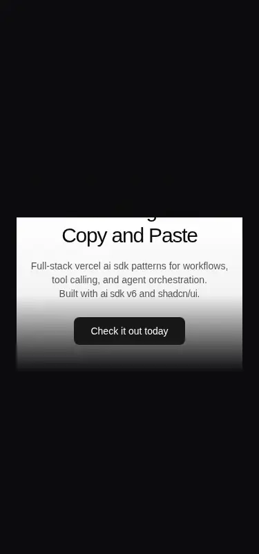
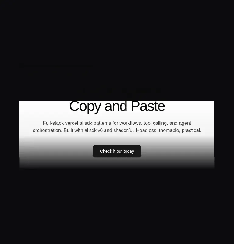
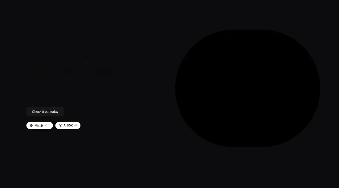
A client-side, split-layout hero with configurable copy, call to action, badges, and responsive animated heatmap shaders. It ships as a shadcn registry component and imports the Paper Design React shader, a cn utility, plus local shadcn Button and Badge components.
Measured
Every value below was written by the harness on the run that produced the frames above. None of it is derived from the prose.
| Build | OK |
|---|---|
| Mount | OK |
| Console errors | 1 |
| Uncaught page errors | 2 |
| Horizontal overflow | clean at 375, 768, 1440 |
| Axe critical | 0 |
| Axe serious | 1 |
| Axe moderate | 2 |
| Axe minor | 0 |
| Gzip marginal | 43.1 KB (108.5 KB build, 65.4 KB baseline) |
| Bare mode | FAIL |
| Provider required | NO |
| Demo used | written from the component source API |
What the harness recorded
PAGE ERROR
Error: Failed to load image
PAGE ERROR
Error: Failed to load image
CONSOLE
Failed to load resource: the server responded with a status of 404 (Not Found)
Verdict
A flexible, visually distinctive hero for teams already invested in shadcn, but it needs a shadcn-style setup and is not drop-in elsewhere. Fix the default image path and review text contrast before shipping.
Use it if
- You want a dark campaign or product hero whose visual can be tuned through shader props.
- Your app already uses shadcn conventions and can supply the expected icon asset.
- You need composable slots for custom copy, actions, badges, or desktop and mobile visuals.
Skip it if
- You need a lightweight static hero without a shader dependency.
- Your accessibility bar requires acceptable contrast without a design pass.
- You cannot host or replace the default cult icon image, which otherwise produces image-load errors.
- Your project does not use Tailwind and you do not want to translate its extensive utility styling.
Install
| Declared dependencies | @paper-design/shaders-react, radix-ui |
|---|---|
| Missing on install | none |
| Bare install | fails once the shadcn-style helpers are removed, so it needs that setup |
| Provider | no provider required in the harness |
In a non-shadcn project, add the Paper Design shader package and Radix UI, provide a cn class-merging utility, recreate the Button and Badge components, configure Tailwind with the referenced theme tokens, and host or override the cult icon asset. Keep it in a client-capable React boundary.
Source and credit
This page is a review, not a copy. The component source lives with its author and this site does not republish it. Read the license before you use anything.
Author repository
github.com/nolly-studio/cult-uiAlternatives
Other published entries for the hero-effect pattern, ordered by what they measured: mounts first, then clean axe scans, then bare-mode passes, then the smaller bundle.
- ruixen-hero-title-animationunclassified
- Renders
- YES
- A11y
- 0
- Gzip
- 18.7KB
- Bare
- pass
- Prov
- NO
- tripled-glassmorphism-hero-block-shadcnuiglassmorphism
- Renders
- YES
- A11y
- 0
- Gzip
- 30.4KB
- Bare
- fail
- Prov
- NO
- cultui-three-d-carousel3d
- Renders
- YES
- A11y
- 0
- Gzip
- 61.2KB
- Bare
- fail
- Prov
- NO
- ruixen-card-carousel-herounclassified
- Renders
- YES
- A11y
- 0
- Gzip
- 63.3KB
- Bare
- fail
- Prov
- NO
- fancy-circling-elements3d
- Renders
- YES
- A11y
- 0
- Gzip
- 66.5KB
- Bare
- fail
- Prov
- NO
- motion-primitives-spotlightgradient-glow
- Renders
- YES
- A11y
- 0
- Gzip
- 67.8KB
- Bare
- fail
- Prov
- NO