Measured entry
hextaui-collapsible
A thin client-side React wrapper around the Radix Collapsible root, trigger, and content primitives. It ships as a shadcn registry TypeScript file, adds a touch interaction utility to the trigger, and depends on Radix plus the project-local cn helper.
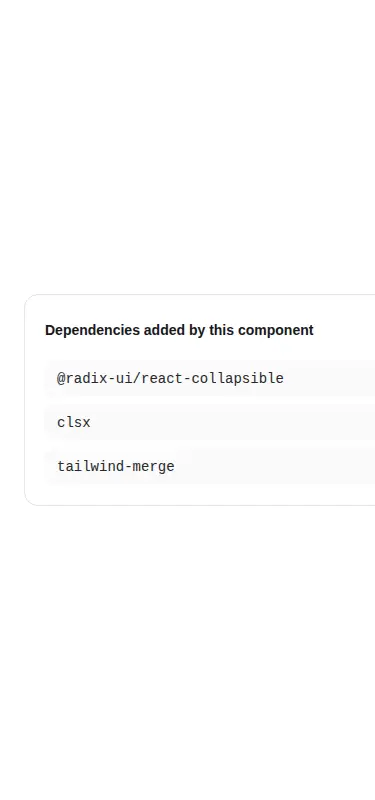
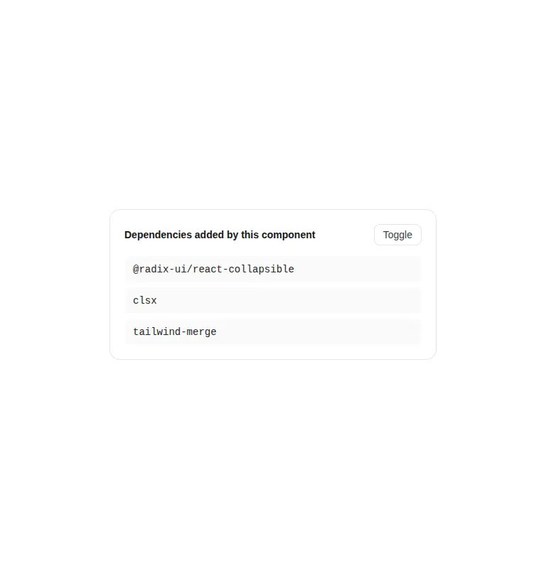
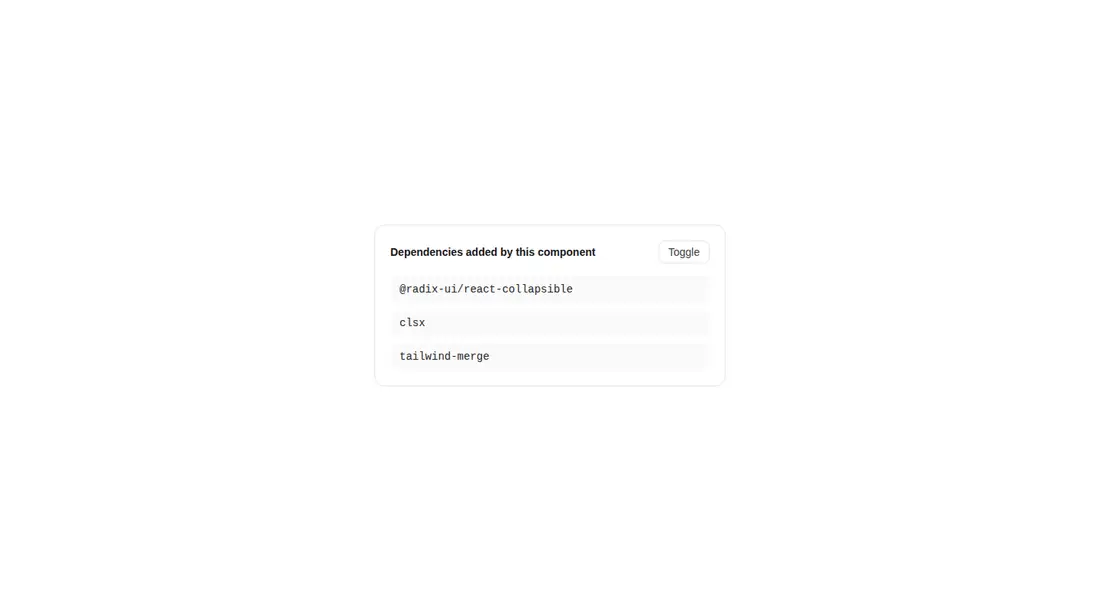
Measured
Every value below was written by the harness on the run that produced the frames above. None of it is derived from the prose.
| Build | OK |
|---|---|
| Mount | OK |
| Console errors | 0 |
| Uncaught page errors | 0 |
| Horizontal overflow | flagged at 375 |
| Axe critical | 0 |
| Axe serious | 0 |
| Axe moderate | 0 |
| Axe minor | 0 |
| Gzip marginal | 34.3 KB (99.8 KB build, 65.5 KB baseline) |
| Bare mode | OK |
| Provider required | NO |
| Demo used | written from the component source API |
Verdict
A dependable but intentionally spare Radix adapter. It builds and mounts cleanly without a provider and showed no accessibility violations, but the tested narrow layout overflowed and the dependency cost is substantial for such a small wrapper. Best for teams already using this stack.
Use it if
- You need an accessible disclosure primitive that leaves layout and visual styling to the calling screen.
- Your React app already follows shadcn conventions or can provide the expected cn utility and import alias.
- You want controlled and uncontrolled open state through the underlying Radix API.
Skip it if
- You need built-in expand and collapse animation rather than supplying your own styles.
- You want a complete accordion with multiple coordinated sections and selection rules.
- Your dependency budget cannot justify adding Radix for a small disclosure behavior.
- You need a styled, narrow-screen-ready panel without auditing the surrounding width classes.
Install
| Declared dependencies | @radix-ui/react-collapsible, clsx, tailwind-merge |
|---|---|
| Missing on install | none |
| Bare install | builds and mounts without the shadcn-style helpers |
| Provider | no provider required in the harness |
Install the Radix collapsible package, add the cn helper backed by clsx and tailwind-merge, and configure the at-sign import alias or replace it with a relative path. Ensure Tailwind includes the touch-manipulation utility, or substitute equivalent CSS.
Source and credit
This page is a review, not a copy. The component source lives with its author and this site does not republish it. Read the license before you use anything.
Author repository
github.com/preetsuthar17/HextaUIAlternatives
Other published entries for the accordion pattern, ordered by what they measured: mounts first, then clean axe scans, then bare-mode passes, then the smaller bundle.
- neobrutalism-collapsiblebrutalism
- Renders
- YES
- A11y
- 0
- Gzip
- 22.1KB
- Bare
- pass
- Prov
- NO
- shadcn-collapsibleunclassified
- Renders
- YES
- A11y
- 0
- Gzip
- 22.1KB
- Bare
- pass
- Prov
- NO
- 8bitcn-collapsibleskeuomorphism
- Renders
- YES
- A11y
- 0
- Gzip
- 34.3KB
- Bare
- pass
- Prov
- NO
- hextaui-ai-citationsminimal-flat
- Renders
- YES
- A11y
- 0
- Gzip
- 35.6KB
- Bare
- fail
- Prov
- NO
- neobrutalism-accordionbrutalism
- Renders
- YES
- A11y
- 0
- Gzip
- 35.7KB
- Bare
- fail
- Prov
- NO
- shadcn-accordionunclassified
- Renders
- YES
- A11y
- 0
- Gzip
- 35.8KB
- Bare
- fail
- Prov
- NO