Measured entry
shadcn-collapsible
A client-side React wrapper around Radix UI's collapsible root, trigger, and content primitives. It ships as copy-in source from the shadcn registry, adds data-slot hooks, and depends on the radix-ui package. Styling and layout remain the consuming application's responsibility.
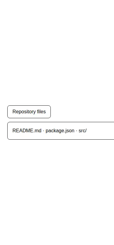
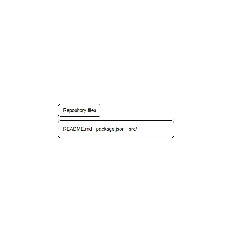
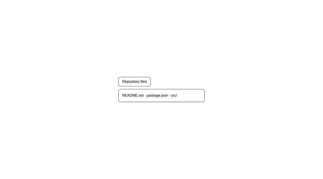
Measured
Every value below was written by the harness on the run that produced the frames above. None of it is derived from the prose.
| Build | OK |
|---|---|
| Mount | OK |
| Console errors | 0 |
| Uncaught page errors | 0 |
| Horizontal overflow | flagged at 375 |
| Axe critical | 0 |
| Axe serious | 0 |
| Axe moderate | 0 |
| Axe minor | 0 |
| Gzip marginal | 22.1 KB (87.5 KB build, 65.4 KB baseline) |
| Bare mode | OK |
| Provider required | NO |
| Demo used | written from the component source API |
Verdict
A dependable, intentionally thin disclosure primitive that builds and mounts cleanly without provider wiring. Choose it when Radix behavior plus local styling is the goal, but address narrow-screen overflow and do not mistake it for a complete accordion.
Use it if
- You need an accessible disclosure for optional details, filters, or compact supporting content.
- Your React app already uses Radix UI or is comfortable owning styles around unstyled primitives.
- You want source-level control over a very small wrapper instead of a packaged visual component.
Skip it if
- You need a full accordion with coordinated multiple sections and exclusive-open behavior.
- You expect finished visuals, spacing, icons, or motion without adding application styles.
- Your narrow layout cannot accommodate content that may overflow unless you revise the demo sizing and content wrapping.
Install
| Declared dependencies | radix-ui |
|---|---|
| Missing on install | none |
| Bare install | builds and mounts without the shadcn-style helpers |
| Provider | no provider required in the harness |
In a non-shadcn React project, install radix-ui, copy the wrapper module, and ensure the app supports client components and the source's TypeScript JSX syntax. Add your own trigger, content, focus, spacing, overflow, and optional motion styles.
Source and credit
This page is a review, not a copy. The component source lives with its author and this site does not republish it. Read the license before you use anything.
Author repository
github.com/shadcn-ui/uiAlternatives
Other published entries for the accordion pattern, ordered by what they measured: mounts first, then clean axe scans, then bare-mode passes, then the smaller bundle.
- neobrutalism-collapsiblebrutalism
- Renders
- YES
- A11y
- 0
- Gzip
- 22.1KB
- Bare
- pass
- Prov
- NO
- 8bitcn-collapsibleskeuomorphism
- Renders
- YES
- A11y
- 0
- Gzip
- 34.3KB
- Bare
- pass
- Prov
- NO
- hextaui-collapsibleminimal-flat
- Renders
- YES
- A11y
- 0
- Gzip
- 34.3KB
- Bare
- pass
- Prov
- NO
- hextaui-ai-citationsminimal-flat
- Renders
- YES
- A11y
- 0
- Gzip
- 35.6KB
- Bare
- fail
- Prov
- NO
- neobrutalism-accordionbrutalism
- Renders
- YES
- A11y
- 0
- Gzip
- 35.7KB
- Bare
- fail
- Prov
- NO
- shadcn-accordionunclassified
- Renders
- YES
- A11y
- 0
- Gzip
- 35.8KB
- Bare
- fail
- Prov
- NO