Measured entry
hextaui-dropdown-menu
A copy-in React dropdown menu built on Radix Dropdown Menu primitives. It ships as a shadcn registry TypeScript component with trigger, item, checkbox, radio, submenu, label, separator, and shortcut exports. Its styling expects Tailwind utilities, project theme tokens, a cn helper, and Lucide icons.


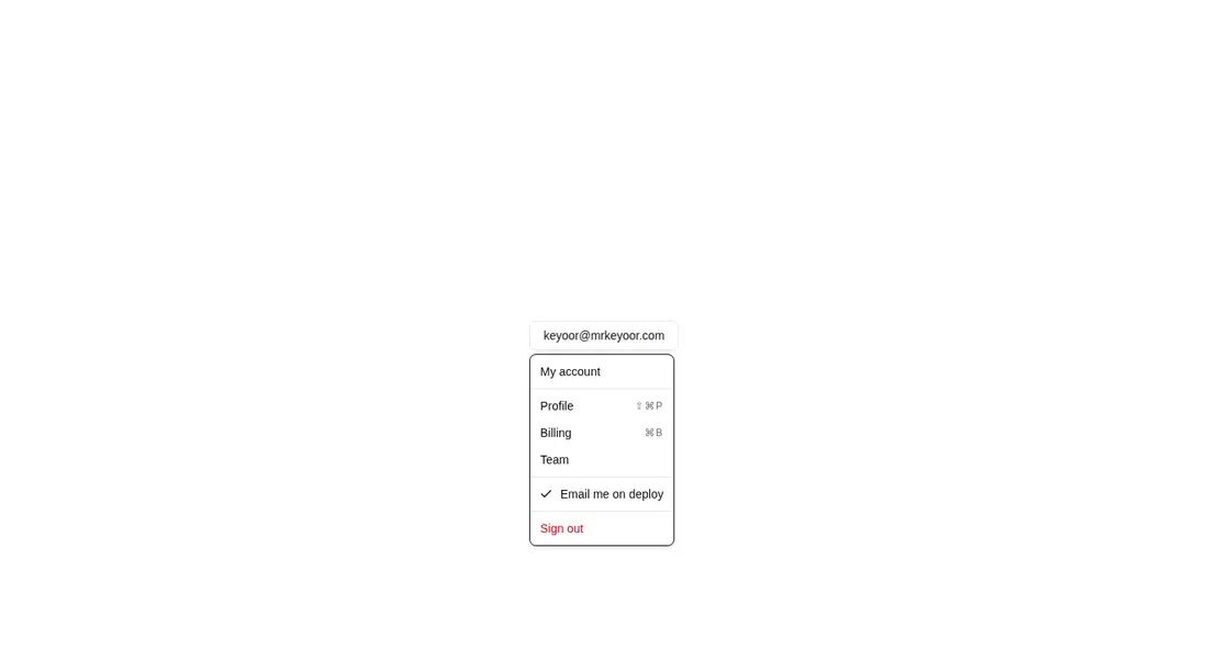
Measured
Every value below was written by the harness on the run that produced the frames above. None of it is derived from the prose.
| Build | OK |
|---|---|
| Mount | OK |
| Console errors | 0 |
| Uncaught page errors | 0 |
| Horizontal overflow | clean at 375, 768, 1440 |
| Axe critical | 0 |
| Axe serious | 0 |
| Axe moderate | 0 |
| Axe minor | 0 |
| Gzip marginal | 61.9 KB (127.4 KB build, 65.5 KB baseline) |
| Bare mode | FAIL |
| Provider required | NO |
| Demo used | written from the component source API |
What the harness recorded
BARE BUILD
spawnSync npx ETIMEDOUT
Verdict
A capable, complete Radix wrapper for teams already using shadcn conventions. The verified harness build and mount succeeded, but the bare-project check did not, so it needs a shadcn-style setup rather than being dropped into an unprepared React app.
Use it if
- You need an accessible account or action menu with keyboard behavior handled by Radix.
- Your interface needs checkbox items, radio choices, nested menus, or destructive actions in one consistent API.
- Your project already follows shadcn conventions and you want source code that can be customized locally.
Skip it if
- You want a dependency-free dropdown or a component delivered as a standalone package.
- Your project does not use Tailwind or shadcn theme tokens and you do not want to translate the styling.
- You only need a simple navigation link list and do not need menu selection semantics.
Install
| Declared dependencies | @radix-ui/react-dropdown-menu, clsx, tailwind-merge |
|---|---|
| Missing on install | none |
| Bare install | fails once the shadcn-style helpers are removed, so it needs that setup |
| Provider | no provider required in the harness |
In a non-shadcn project, add Radix Dropdown Menu and Lucide React, provide the cn class-merging helper, configure Tailwind, define the referenced color and border theme tokens, and include the animation utilities used by the open and closed states. Preserve the client-component boundary where your framework requires it.
Source and credit
This page is a review, not a copy. The component source lives with its author and this site does not republish it. Read the license before you use anything.
Author repository
github.com/preetsuthar17/HextaUIAlternatives
Other published entries for the dropdown pattern, ordered by what they measured: mounts first, then clean axe scans, then bare-mode passes, then the smaller bundle.
- tripled-context-menu-shadcnuiminimal-flat
- Renders
- YES
- A11y
- 0
- Gzip
- 61.1KB
- Bare
- pass
- Prov
- NO
- shadcn-dropdown-menuunclassified
- Renders
- YES
- A11y
- 0
- Gzip
- 44.4KB
- Bare
- fail
- Prov
- NO
- originui-comp-131minimal-flat
- Renders
- YES
- A11y
- 0
- Gzip
- 58.1KB
- Bare
- fail
- Prov
- NO
- neobrutalism-dropdown-menubrutalism
- Renders
- YES
- A11y
- 0
- Gzip
- 58.5KB
- Bare
- fail
- Prov
- NO
- shadcn-context-menuunclassified
- Renders
- YES
- A11y
- 0
- Gzip
- 58.7KB
- Bare
- fail
- Prov
- NO
- neobrutalism-context-menubrutalism
- Renders
- YES
- A11y
- 0
- Gzip
- 58.8KB
- Bare
- fail
- Prov
- NO