Measured entry
kibo-calendar
A client-side feature calendar that renders items in a month grid on their end dates, with locale-aware weekday labels and month and year controls. It ships as a shadcn registry component and depends on React, date-fns, Jotai, Lucide icons, utility classes, and the shadcn button, command, and popover primitives.
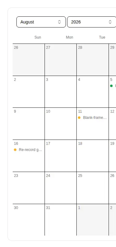
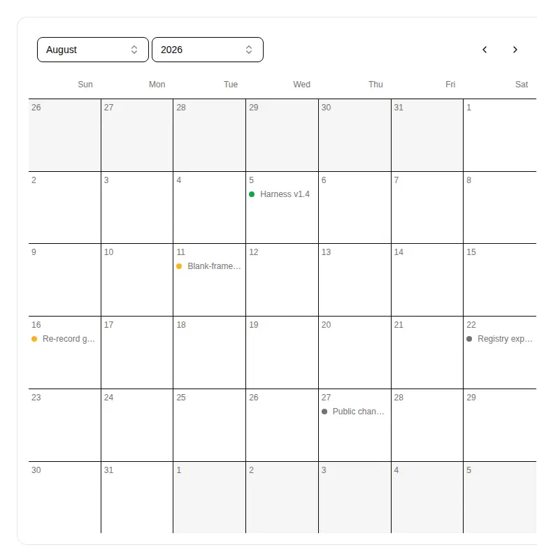
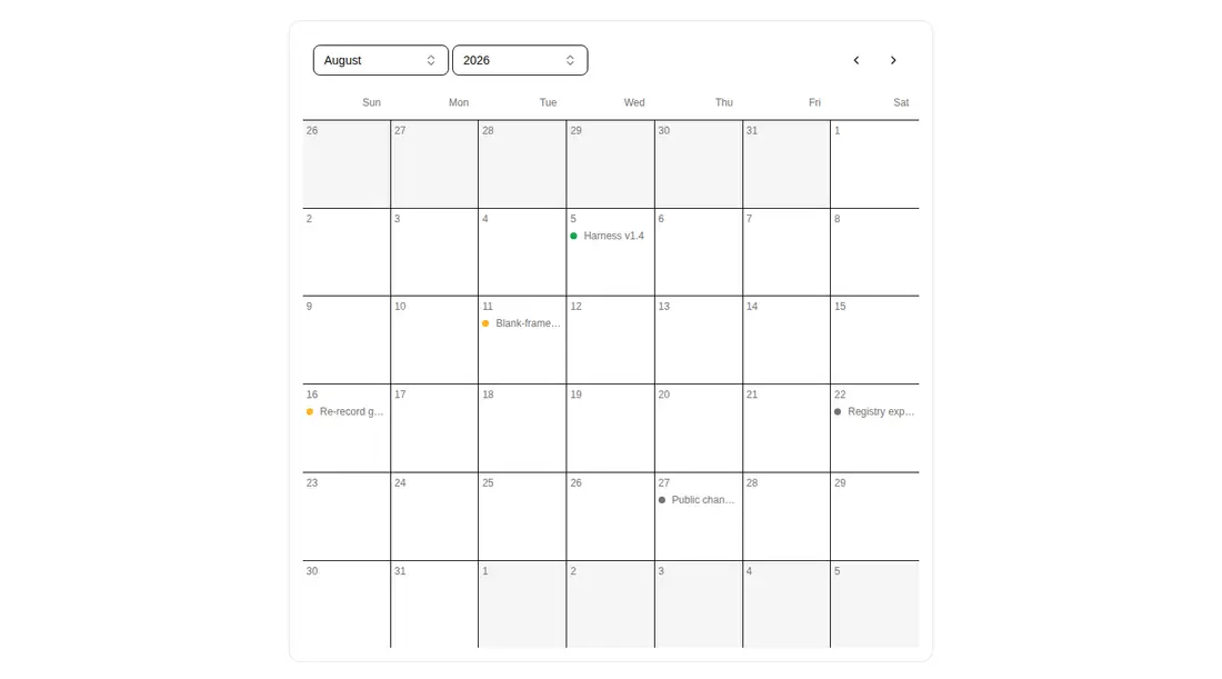
Measured
Every value below was written by the harness on the run that produced the frames above. None of it is derived from the prose.
| Build | OK |
|---|---|
| Mount | OK |
| Console errors | 0 |
| Uncaught page errors | 0 |
| Horizontal overflow | flagged at 375, 768 |
| Axe critical | 1 |
| Axe serious | 1 |
| Axe moderate | 0 |
| Axe minor | 0 |
| Gzip marginal | 65.2 KB (130.7 KB build, 65.5 KB baseline) |
| Bare mode | FAIL |
| Provider required | NO |
| Demo used | written from the component source API |
What the harness recorded
BARE BUILD
✗ Build failed in 1.78s
error during build:
[vite]: Rollup failed to resolve import "class-variance-authority" from "<sandbox>re-a1b77cbb3004/src/components/ui/button.tsx".
Verdict
A solid starting point for desktop feature planning, but not drop-in production UI. It needs a shadcn-style setup, a deliberate responsive wrapper, and accessibility fixes for the pagination buttons and muted text before release.
Use it if
- You need a desktop-oriented month grid for milestones or feature completion dates.
- Your app already uses shadcn primitives and utility-class styling.
- You want composable item rendering plus controllable locale and week-start behavior.
Skip it if
- The calendar must fit narrow or mid-sized screens without a horizontal scrolling treatment.
- You need events displayed across their full date ranges rather than only on their end dates.
- You need an accessibility-ready component without first labeling icon controls and correcting contrast.
- You want a lightweight calendar with no state, command-menu, or popover dependencies.
Install
| Declared dependencies | date-fns, jotai, lucide-react, radix-ui, cmdk, clsx, tailwind-merge |
|---|---|
| Missing on install | none |
| Bare install | fails once the shadcn-style helpers are removed, so it needs that setup |
| Provider | no provider required in the harness |
In a non-shadcn project, add the button, command, and popover primitives, the shared class-name utility, Tailwind theme tokens, and their Radix, command-menu, and class-variance dependencies. Also install React, date-fns, Jotai, and Lucide React, then preserve the client-component boundary and configured import alias.
Source and credit
This page is a review, not a copy. The component source lives with its author and this site does not republish it. Read the license before you use anything.
Author repository
github.com/shadcnblocks/kiboAlternatives
Other published entries for the feature-grid pattern, ordered by what they measured: mounts first, then clean axe scans, then bare-mode passes, then the smaller bundle.
- hyperui-feature-grids-3editorial
- Renders
- YES
- A11y
- 0
- Gzip
- 17.7KB
- Bare
- pass
- Prov
- NO
- hyperui-feature-grids-1editorial
- Renders
- YES
- A11y
- 0
- Gzip
- 17.9KB
- Bare
- pass
- Prov
- NO
- hyperui-feature-grids-4editorial
- Renders
- YES
- A11y
- 0
- Gzip
- 17.9KB
- Bare
- pass
- Prov
- NO
- hyperui-feature-grids-2editorial
- Renders
- YES
- A11y
- 0
- Gzip
- 18.3KB
- Bare
- pass
- Prov
- NO
- meraki-feature-grid-list-with-imageminimal-flat
- Renders
- YES
- A11y
- 0
- Gzip
- 18.5KB
- Bare
- pass
- Prov
- NO
- meraki-feature-simpleminimal-flat
- Renders
- YES
- A11y
- 0
- Gzip
- 20.2KB
- Bare
- pass
- Prov
- NO