Measured entry
kibo-combobox
A client-side, compound React combobox that copies into your codebase through a shadcn registry item. It composes local Button, Command, and Popover primitives, uses controlled or uncontrolled state, matches the popup to the trigger, and depends on Radix state utilities, cmdk, Radix UI, Lucide icons, Tailwind classes, and a cn helper.
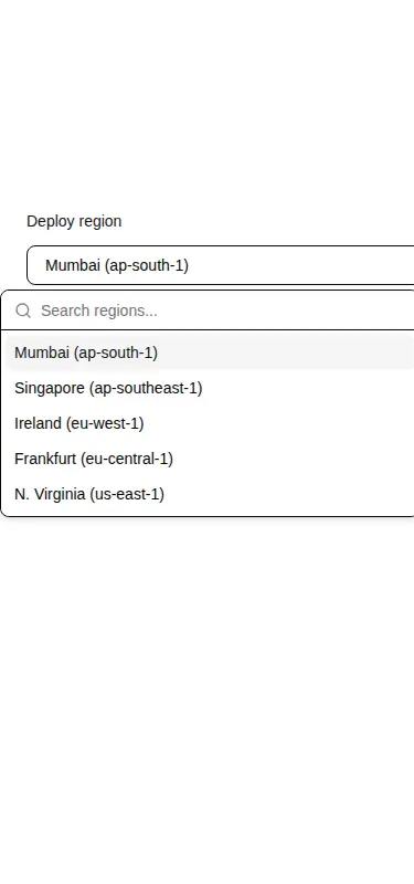
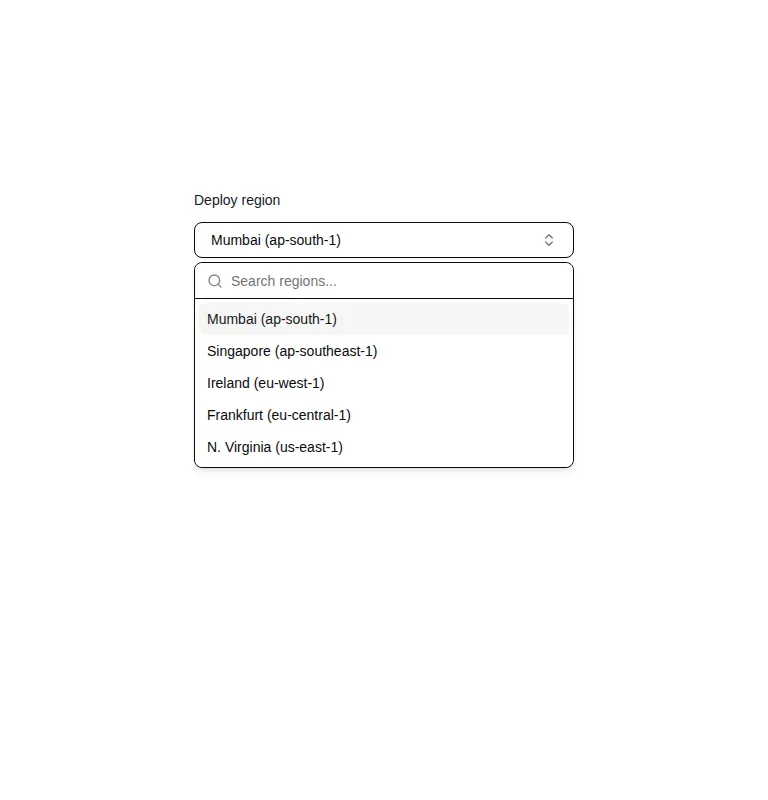
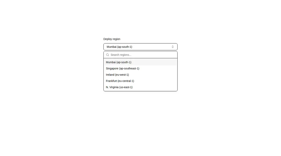
Measured
Every value below was written by the harness on the run that produced the frames above. None of it is derived from the prose.
| Build | OK |
|---|---|
| Mount | OK |
| Console errors | 0 |
| Uncaught page errors | 0 |
| Horizontal overflow | flagged at 375 |
| Axe critical | 0 |
| Axe serious | 0 |
| Axe moderate | 0 |
| Axe minor | 0 |
| Gzip marginal | 60.3 KB (125.8 KB build, 65.5 KB baseline) |
| Bare mode | FAIL |
| Provider required | NO |
| Demo used | written from the component source API |
What the harness recorded
BARE BUILD
✗ Build failed in 2.88s
error during build:
[vite]: Rollup failed to resolve import "class-variance-authority" from "<sandbox>re-b9abf5b063c9/src/components/ui/button.tsx".
Verdict
A solid fit for an existing shadcn-style application: it builds, mounts, and exposes useful composition points with a clean accessibility run. It needs a shadcn-style setup, and its narrow-screen overflow plus substantial dependency cost make it a poor default for small forms or bare React projects.
Use it if
- You already use shadcn-style local primitives and want a searchable single-select field that fits that structure.
- You need controlled or uncontrolled selection and open state without writing the coordination layer yourself.
- You want composable groups, empty states, separators, custom items, or a create-new action in the same menu.
Skip it if
- Your narrow layout cannot tolerate horizontal overflow without adjusting the demo container and surrounding sizing.
- You want a lightweight native select and do not otherwise need the command palette and popover dependency stack.
- Your options are remote or paginated and you need built-in async loading, cancellation, or virtualization.
- You expect a standalone package that works without local shadcn primitives, aliases, theme tokens, and utility conventions.
Install
| Declared dependencies | @radix-ui/react-use-controllable-state, lucide-react, radix-ui, cmdk, clsx, tailwind-merge |
|---|---|
| Missing on install | none |
| Bare install | fails once the shadcn-style helpers are removed, so it needs that setup |
| Provider | no provider required in the harness |
In a non-shadcn project, add compatible Button, Command, and Popover primitives; configure the local component and utility import aliases; provide the cn helper, Tailwind theme tokens, and client-component support; and install the Radix state utility, Radix UI, cmdk, Lucide, clsx, tailwind-merge, and class-variance-authority packages.
Source and credit
This page is a review, not a copy. The component source lives with its author and this site does not republish it. Read the license before you use anything.
Author repository
github.com/shadcnblocks/kiboAlternatives
Other published entries for the input pattern, ordered by what they measured: mounts first, then clean axe scans, then bare-mode passes, then the smaller bundle.
- clay-inputclaymorphism
- Renders
- YES
- A11y
- 0
- Gzip
- 17.9KB
- Bare
- pass
- Prov
- NO
- neu-search-inputneumorphism
- Renders
- YES
- A11y
- 0
- Gzip
- 18.1KB
- Bare
- pass
- Prov
- NO
- clay-search-inputclaymorphism
- Renders
- YES
- A11y
- 0
- Gzip
- 18.3KB
- Bare
- pass
- Prov
- NO
- originui-comp-33minimal-flat
- Renders
- YES
- A11y
- 0
- Gzip
- 20.7KB
- Bare
- pass
- Prov
- NO
- hextaui-labelminimal-flat
- Renders
- YES
- A11y
- 0
- Gzip
- 31.3KB
- Bare
- pass
- Prov
- NO
- ruixen-circular-stepper-inputliquid-glass
- Renders
- YES
- A11y
- 0
- Gzip
- 61.1KB
- Bare
- pass
- Prov
- NO